Meet Elizabeth. She’s one of your many visitors who visits your ecommerce store daily. She likes the design of your site. She even likes your products. “That looks so beautiful,” she says, even showing it to a friend while browsing. But…she doesn’t buy anything.
A real tragedy for any ecommerce store owner, and one most of us suffer all too often, whether we know it or not.
Elizabeth decides to take her wallet somewhere else for any number of reasons. Maybe she’s not so into your products after all. Or it could be that it’s just not the right time to buy for her, as her budget’s a little tight this month.
Whatever the case, visitors like Elizabeth may like, even love, your ecommerce store design, but that doesn’t necessarily translate to sales? Why not?
The key is, you need to have a store design that’s not only beautiful, but one that converts.
Every element of your site should lead to the basket (ca-ching!). Even if you bought a fancy template from a top-rated company, you don’t want to sit back and depend on it. You need to know which elements are driving conversions, and which aren’t, and use that knowledge to maximize your success.
Take control of your store’s design, and you will take control of your revenue.
Let’s dive into how to design an ecommerce store for maximum conversions…
Table of Contents
Bring Your Products to Life with Magnetic Images
Showcase Your Brand With Your Product Photography
Describe Your Products With Passion
Help Them Cross the Puddle (aka, Lead Them to the Cart)
Keep It Simple (For Your Own Good)
Design Your Ecommerce Store for High Conversions
Bring Your Products to Life with Magnetic Images
Have you ever bought a pair of shoes, and as you handed out your credit card to the cashier, you felt a weird feeling of satisfaction?
It’s strange because you aren’t doing something that’s pleasurable in itself, like playing with your dog or eating a bagel; you are giving away your money to someone else.
Why this happens isn’t as important as the simple fact that shopping feels great. In the United States alone, it’s estimated that two-thirds of the gross domestic product comes from retail consumption. Literally, a huge portion of the world’s largest economy comes from people buying stuff.
People like shopping so much that more than a third of adults have said shopping makes them feel better than working out.
If people like shopping so much, then you should think of your design in a way that it makes the most out of that pleasurable experience.
This means engaging your visitor’s senses.
When you visit a brick-and-mortar retail shop, you not only get to see and touch a product, you also get to hear relaxing music, enjoy the beautiful decor, and even smell the blooming fragrance of flowers or a scented candle.
While you can’t add music or light a candle in your online store, you can still add a multi-dimensional feeling by using your product images and copy in a way that affects their senses.
Here’s how you do it.
Great Images Help Buyers Envision Using Your Product
Ecommerce store owners know that having great product photography matters. How do you expect people to want your products if they can’t even see them?
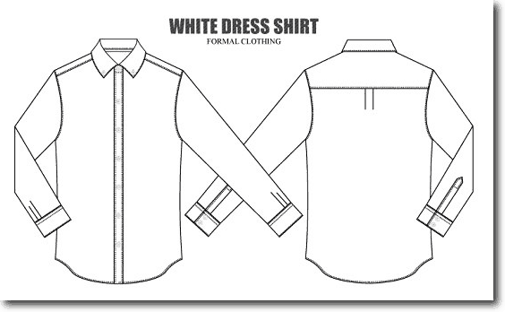
Imagine you were interested in buying a shirt for your next job interview and you found a store you liked that had seemingly high-quality shirts at a low price. You are ready to buy; you only need the right shirt that looks the part.
Then, you check the product pages, and you see this:
How would you buy a shirt with that image? I hardly would!
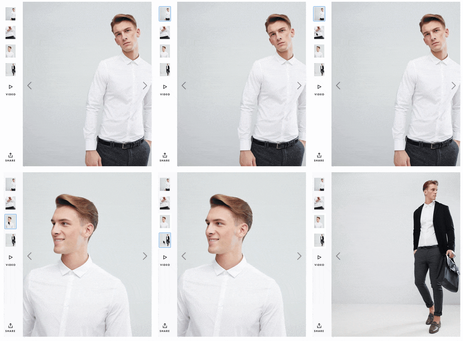
Compare that with the following images taken from ASOS.
That’s what I’m talking about! I can see myself wearing that shirt, going to my job interview, and nailing it.
While you can’t change your store’s lightning and smell like an offline store would, you can still influence one important thing: your visitor’s psychology.
By this I mean using your photos to make them a part of your visitors’ future life; having them picture themselves using them and enjoying them.
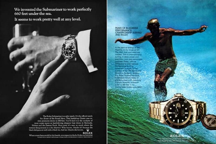
The best companies that know how to use this visualization trick are luxury brands. Think Rolex: they sell watches. You can buy a $50 watch anywhere, yet a Rolex costs over $5,000. Why would you commit such a significant amount of money to something you can get for a fraction of that price?
Status.
In order to sell you that status, Rolex uses their photography in a smart way.
Caption: Look how they sell sophistication and adventure through their photography.
You don’t have to sell luxury products to use this style of photography, however.
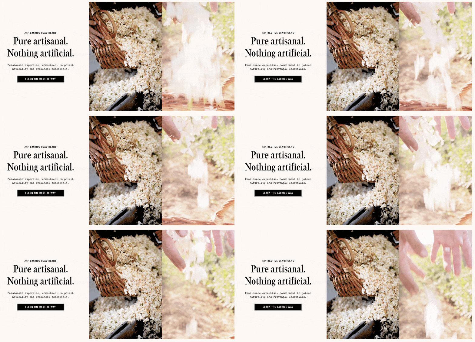
Bastide, a company that sells artisan-like fragrances and lotions, uses the following images in their homepage.
Besides their fantastic copy, the images they use throughout the site sell you more than their fragrances. With the help of images like the ones above, they don’t just sell the scent; they sell what it would feel like to wear the fragrance and experience its full effect on your mind and senses.
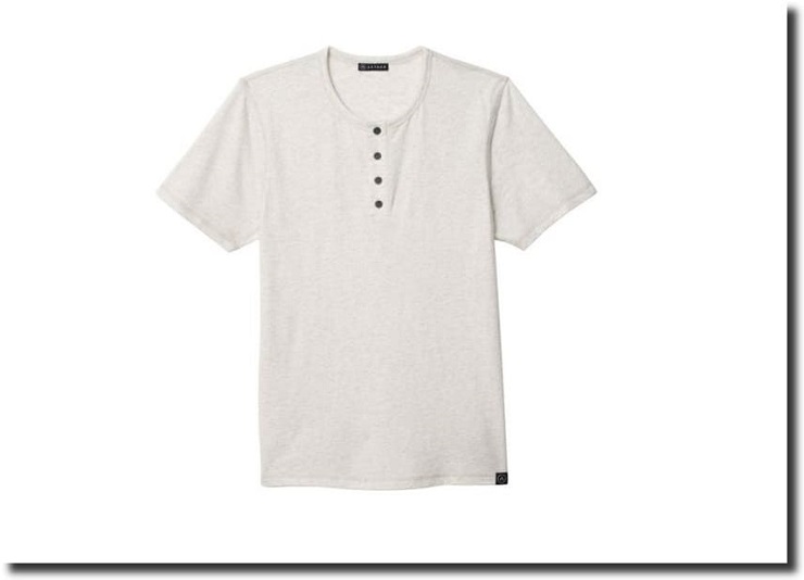
AETHER is an apparel company that sells performance clothing (e.g., clothing that doesn’t get wet or smell easily). Here’s the photo for one of their Hanley t-shirts:
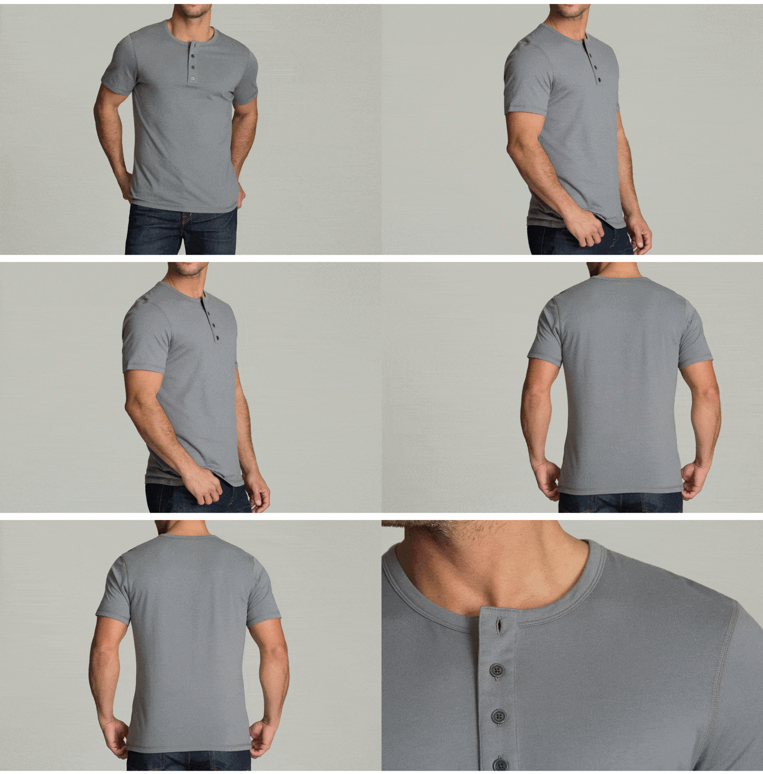
The image is fine, but it doesn’t stand a chance with the other dozen companies in their industry. Fortunately, they have more photos of that t-shirt with a model.
Once again, these images are good, but not enough to sell the lifestyle they are trying to convey.
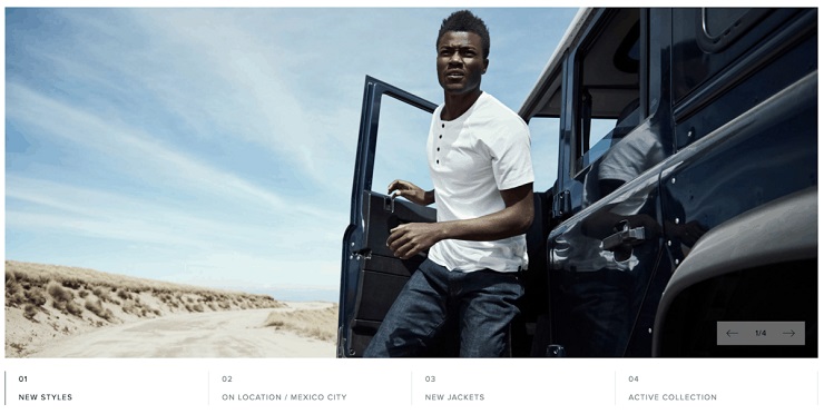
It turns out, the people at AETHER are actually brilliant, and know how to represent their brand really well through product photography:
That’s the picture of the same Hanley t-shirt you saw above. In this image, however, you can see how the model is in the middle of an adventure, somewhere in the Mexican desert, riding a Jeep (a car associated with adventures).
With this one image, they took the concept of a performance t-shirt and made it real. They don’t tell you how they sell t-shirts that are for people who like adventures; they show you their t-shirt in the middle of one.
Showcase Your Brand With Your Product Photography
Let’s talk more about expanding your visitors’ imaginations with product images.
Most successful ecommerce stores use their product photography to show not only their products, but the brand they represent and the customers they serve. Let’s see some examples.
WP Standard does a wonderful job with their product photos, using models wearing their shirts:
Adding different angles, and even some texture, to your photos is another great way of displaying your products. For example, take a look at what Glitty does with their wood Apple Macbook cover:
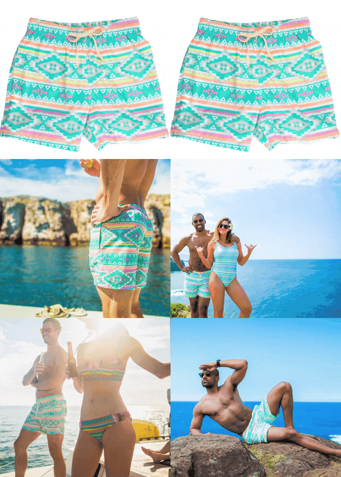
Besides showing how your products look like when used, you can add some personality to your photos, which is what Chubbies does so well:
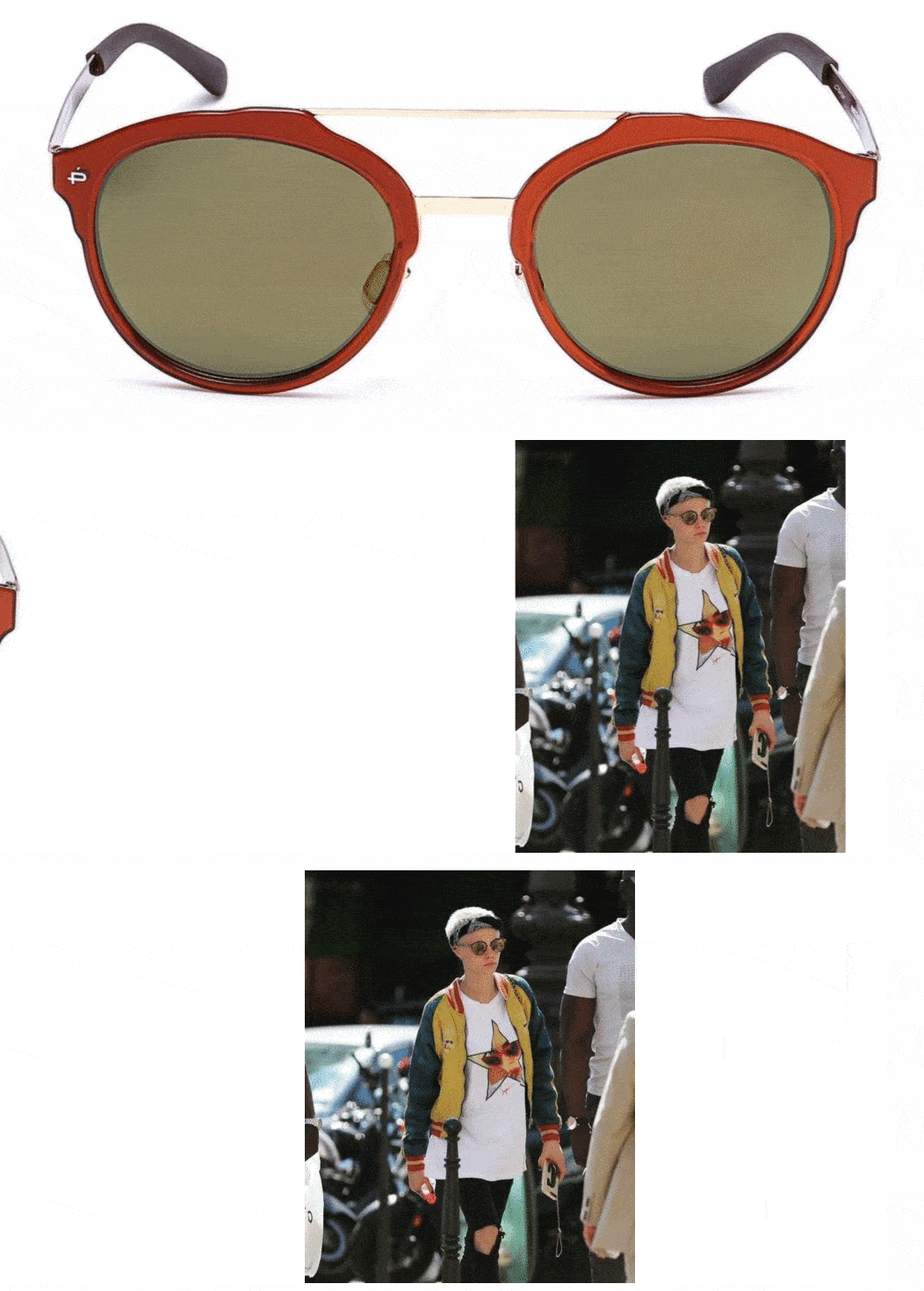
In the case of Privé Revaux, they took the idea a step further, and show how their sunglasses look on an influential person such as Cara Delevingne:
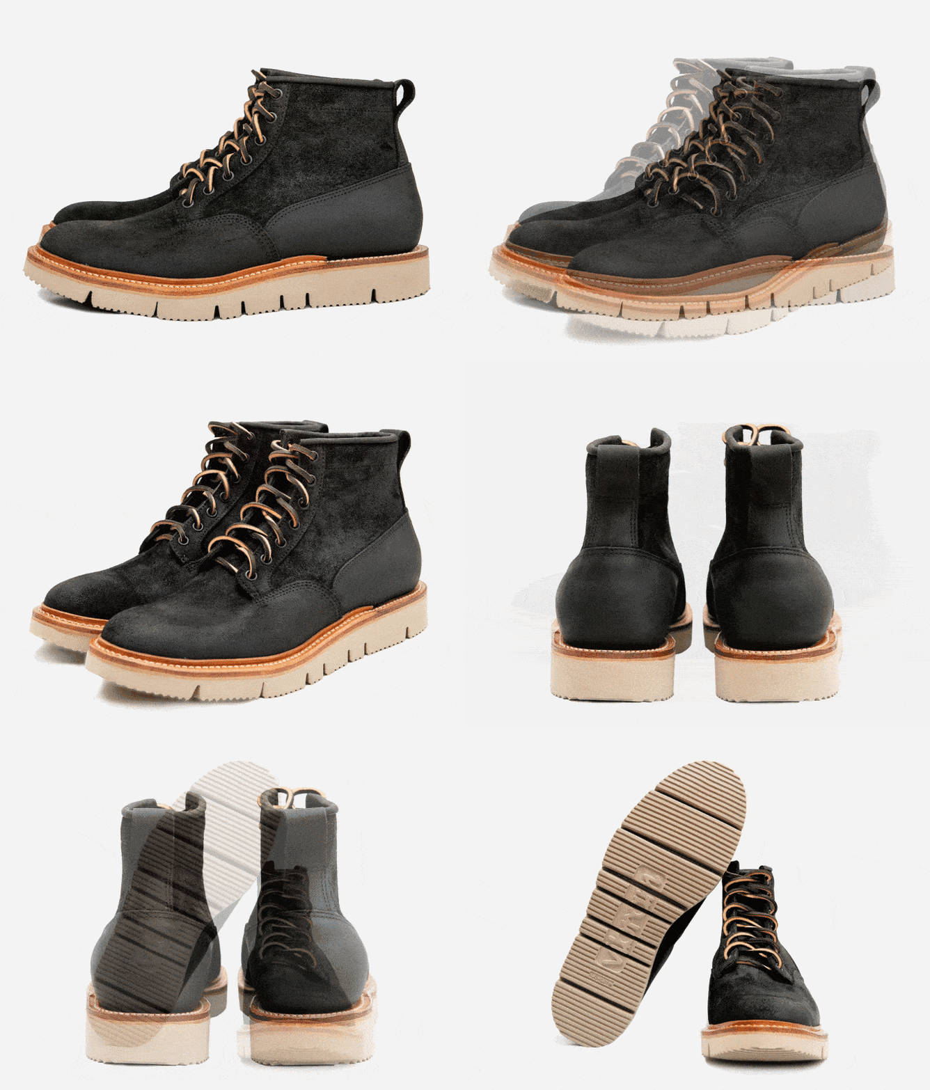
You don’t have to use models or exotic locales, however. You can go the simpler route and take high-quality photos of your products against a white background. While this won’t help you stand out as much and improve your branding, at least it will help your visitors know what your products are about. This is what 3sixteen does with their products:
While every visitor will experience your photography in a different way, the use of photography takes your products to a new dimension; one where your visitors can experience them in their minds.
Want to Learn How to Start & Grow a Profitable Online Store in 12 weeks? Sign Up for Our FREE Masterclass!
Learn How to Start a Profitable Store in 12 Weeks or Less. Join our FREE Ecommerce Masterclass!
Go Beyond Photos
Having high-quality product photography and benefit- or outcome-based copy is the bare minimum you need to do to have a high-converting store. You can use a wide variety of media formats, like videos, 360-degree photos, and user-generated photos.
Videos
Videos are particularly important. According to Wyzowl, 81% of people have been convinced to buy a product or service after watching a video. Better yet, companies that use videos see on average 34% higher conversion rates than those that don’t use them.
One company that does an outstanding job is theory11. Their videos look like mini-movies, which probably explains why they are one of the most popular stores in the magic industry.
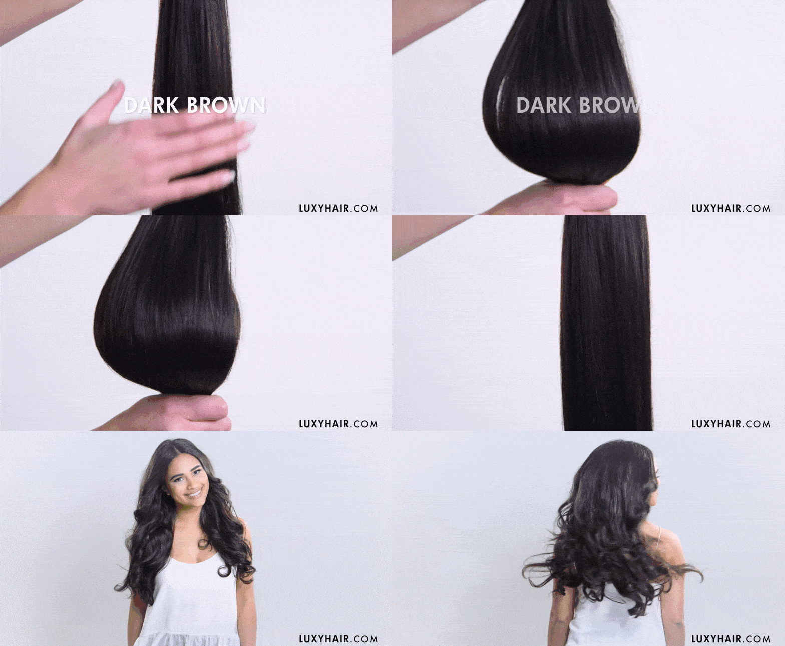
Luxy Hair, on the other hand, is a company that uses video marketing to make their product descriptions the most detailed and engaging in the competitive hair extension industry.
Another interesting way to leverage videos is by mixing tutorials with customer reviews, like in the case of LivSo.
Beardbrand is another company that does outstanding work with their videos. Since the beard grooming industry has become so competitive, the founder Eric Bandholz has created useful tutorials in their YouTube channel, which currently boasts over 700,000 followers. The interesting thing is that he adds Bearbrand’s products in his tutorials, and uses those tutorials in the product pages, a powerful way to promote his products.
360-Degree Photos
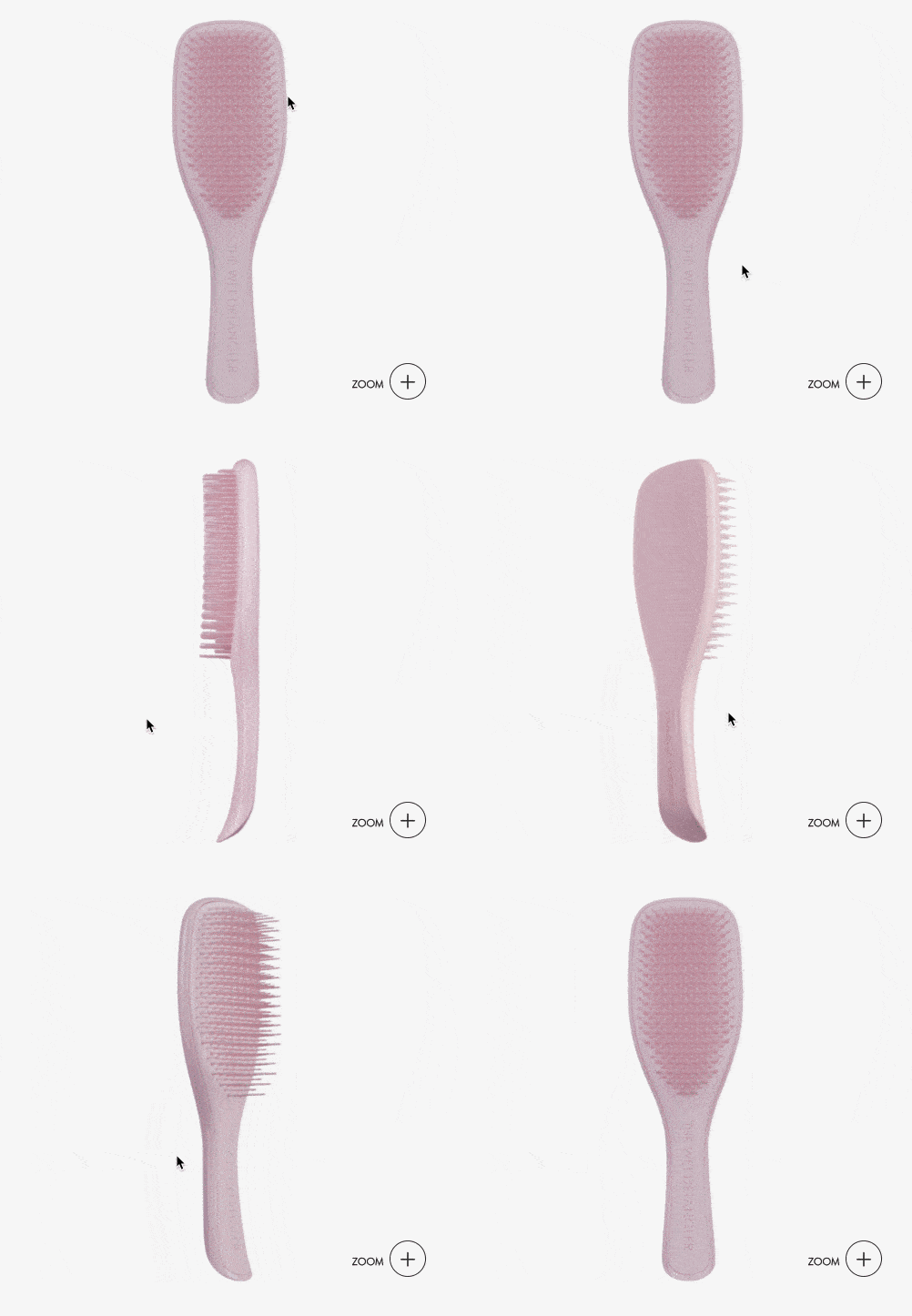
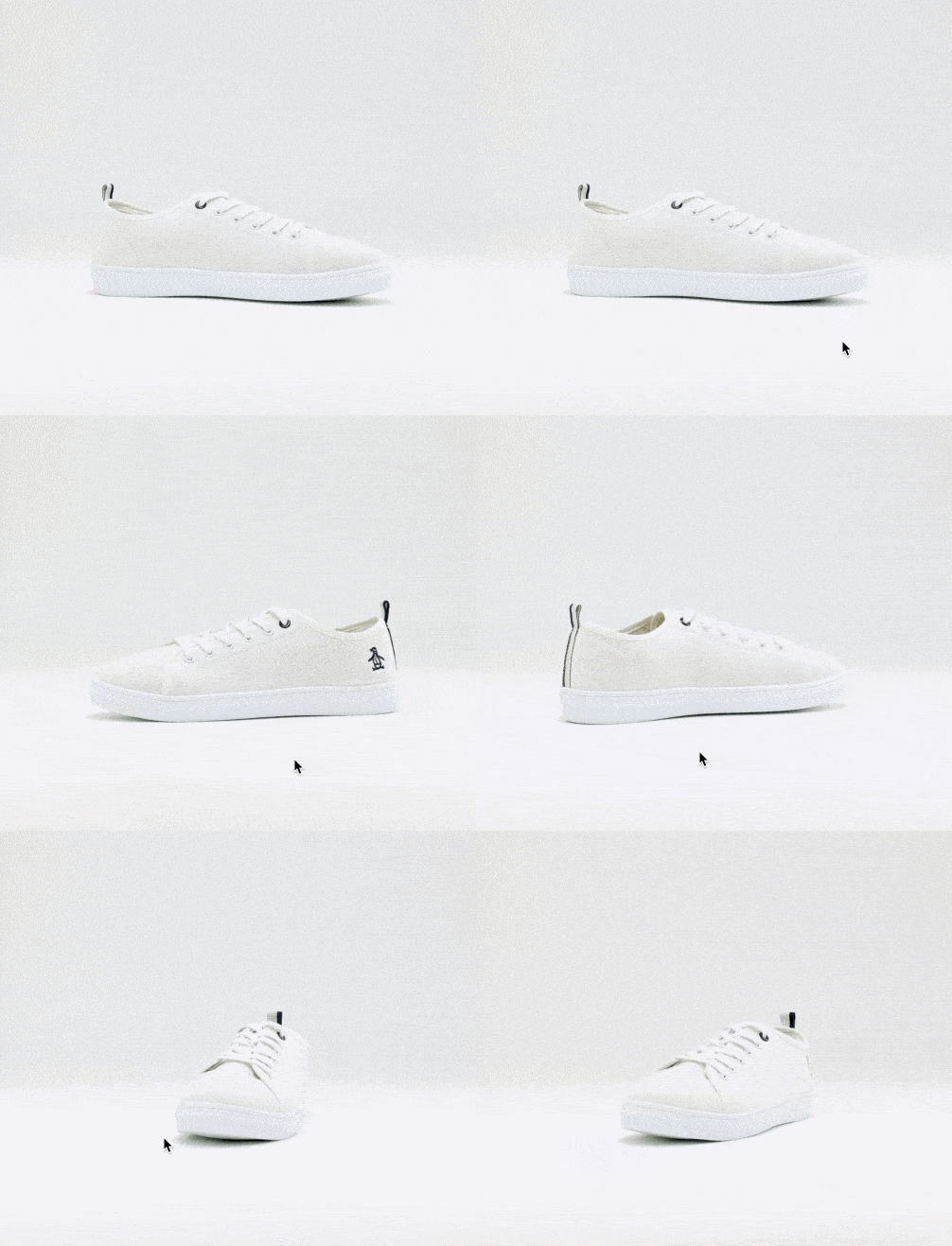
360-degree photos are another way to add a more realistic view to your products. Grainger, a retailer of industrial supplies,increased their conversion rates by 47% thanks to the use of 360-degree photos.
Tangle Teezer uses 360-degree photos in their product pages, as you can see in the example below:
ASOS has also implemented 360-degree photos for some of their products:
Creating 360-degree photos isn’t as technically challenging as you may think. With the help of a rotating turntable, you won’t need more than what you already have to photograph your products (e.g., a camera, a tripod, lighting equipment, etc.).
You can also pivot your products manually and edit the photos together like in a stop-motion movie.
If you want to ramp up your product photography, check out this guide where we explain the technical details and how to do it on your own.
User-Generated Content
Finally, you can use a mix of photos and user-generated content (UGC). UGC is exactly what the name suggests: it’s any kind of content that your users create about your products.
The simplest example is a testimonial where they talk about how they used one of your products.
To understand the power behind UGC, imagine one of your visitors, good old Elizabeth, looking at your products (let’s say, shoes) and thinking, “These shoes look good, but should I really buy these?”
Just before she clicks the X in the browser’s tab, she sees a photo from another customer wearing your shoes. They look great on that woman; she’d love to be that woman.
The power of UGC lies in social proof—people like doing what other people do. This holds particularly true for millennials, many of whom grew up with Facebook accounts and phones in their hands.
A study done by Crowdtap and Ipsos found millennials think UGC is 35% more memorable and 50% more trustworthy than other marketing media.
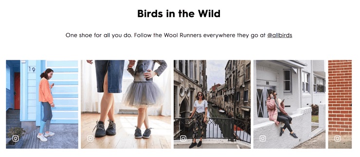
Allbirds uses UGC to promote their women’s wool running shoes, which show how other women around the world use that same model.
You can also see how MVMT‘s customers use their watches in their product pages, as shown here:
Fortunately, implementing UGC in your store is easier than you may think with the help of a tool like Yotpo. If you want to learn how to tap into the power of UGC, this guide from Optimizely will help you get started.
Describe Your Products With Passion
Believe it or not, people love product descriptions.
According to Salsify’s Consumer Research Report, after your prices, the most important factor that influences purchases is detailed product descriptions. Another study by Episerver found 76% of online shoppers find product descriptions to be the most important element of a product page when considering buying from a store.
Writing product descriptions that make your products feel real can play a key role in making people confident that what they are looking at is right for them.
It’s easy to get distracted by the minutiae of running an ecommerce store and leave the product description as an afterthought. Worse yet, you copy and paste your manufacturer’s product description. But you’d be making a huge mistake by ignoring such an essential element of your store.
Just like photos, your product description can help them imagine using your products. Here’s what you need to know before you create your next product description.
Show Don’t Tell
This is a core rule of copywriting. Instead of telling people about your products, you should help them visualize them, beyond describing features.
An effective way to put this into action is by asking yourself, “So what?” after every sentence of your copy. In other words, think why would anyone care about your product description. What’s it in for the visitors? Why would they believe you or care what you are writing?
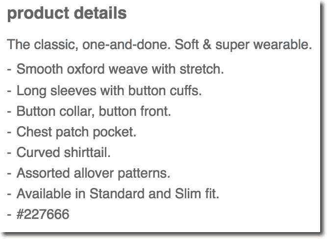
Here’s the typical example of a product description that tells people what their product is all about:
Each of these lines is a description of a feature in a men’s shirt. But how would this specific shirt differentiate itself from the millions of other shirts around the world? Can you answer the “So what?” for each line? Probably not.
Compare that rather mediocre description with this one:
The description for this moisturizer shows how using it can hydrate and soften your skin—the ultimate goal of using a product of that nature. At no point does it talk about the technical details of it, something few people care about.
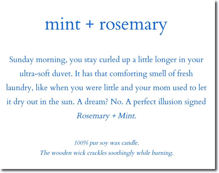
Here’s another wonderful example of a product description with a touch of storytelling:
It’s interesting to see that in their product page, the people of Flambette decided not to show any feature list or technical description. This gives an interesting twist to their products, which are represented not as candles, but as nostalgic memories that you enjoy.
Explaining the context in which a specific product can be used is another fantastic way to show how the product can be used.
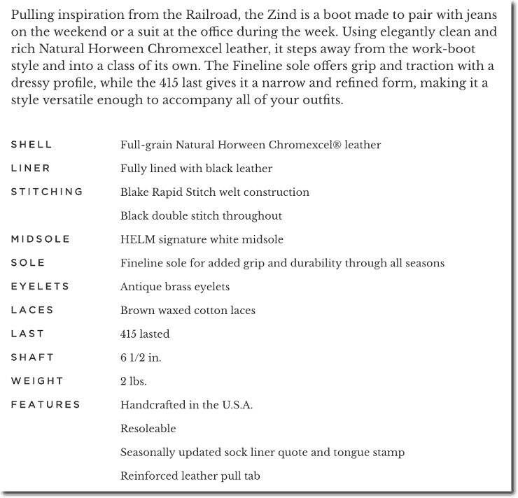
Instead of jumping right into the technical details of their boots, Helm first depicts an image of how their boots can be used in real life, and how their features affect the overall look of them. Once they have painted a picture of your life with their boots, then they show their technical details.
As the case of Helm shows, if you sell products where technical specifications matter, you shouldn’t avoid adding them. Rather, you should be creative in the way you present them, telling a story and then explaining the technical side of your product.
Outcomes, Not Benefits
Knowing what the visitor gets out of your product descriptions is a great way to start improving your product pages, but it’s not enough. If you can pull it off, instead of thinking about features and benefits, think about outcomes.
Here’s a simple differentiation between features, benefits, and outcomes:
- Features are product-related (e.g., “our t-shirts are made out of 100% Merino wool”)
- Benefits are emotional and lifestyle-focused (e.g., “our t-shirts will help you sweat less”)
- Outcomes are measurable ways to depict the life the prospect gets out of the product (e.g., “our t-shirts will make you sweat 28% less”)
Outcomes are the specific ways that your product makes your customer’s life better. However, to offer outcomes, you need real-life examples of how your products have delivered specific results to your customers.
In many cases, this is hard to achieve. For example, if your product has more of a lifestyle focus and is less tangible in its benefits—like a fashion product—you can just use the benefits alone.
But if you can use an outcome, you will be able to make your product description way more effective.
You won’t be telling your visitors how great your products are; you will show them how they will actually make their lives better.
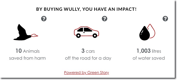
For example, Wully Outerwear uses the ecological impact of purchasing their jackets as a specific outcome.
Another way you can use outcomes is by showing customer reviews in which they explain how your product has helped them.
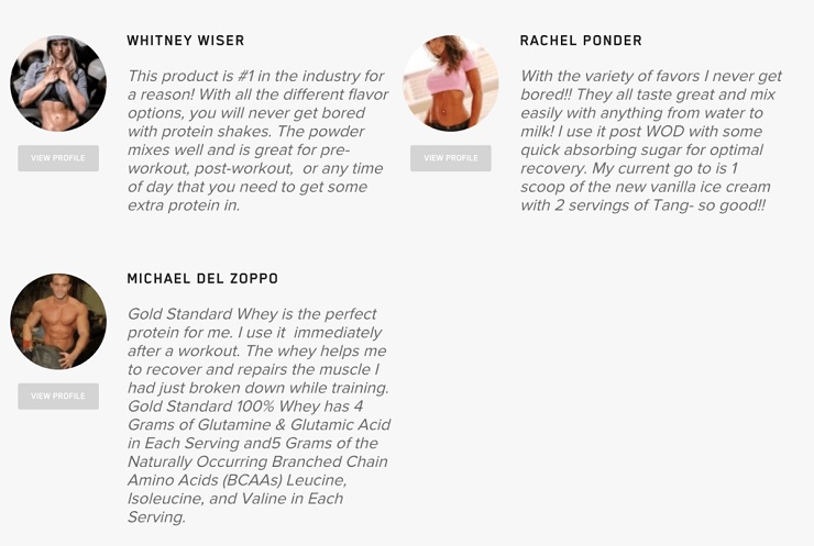
In this example, Optimum Nutrition does a fantastic job of showing how real athletes use their products to recover from their workouts and enjoy their meals. That’s a 1-2 powerful combo that combines the power of social proof with outcomes.
Vary the Lengths of Your Descriptions
Your store will attract all sorts of people; some who love to make impulse purchases, others who take their time to consider all the aspects of a product. Some browse strictly on mobile, while others do it on their 30” iMacs.
This means each group will have different needs when it comes to reading your descriptions. The former group will like shorter descriptions, while the latter will prefer longer ones. Playing with your product descriptions’ lengths will help you influence both audiences.
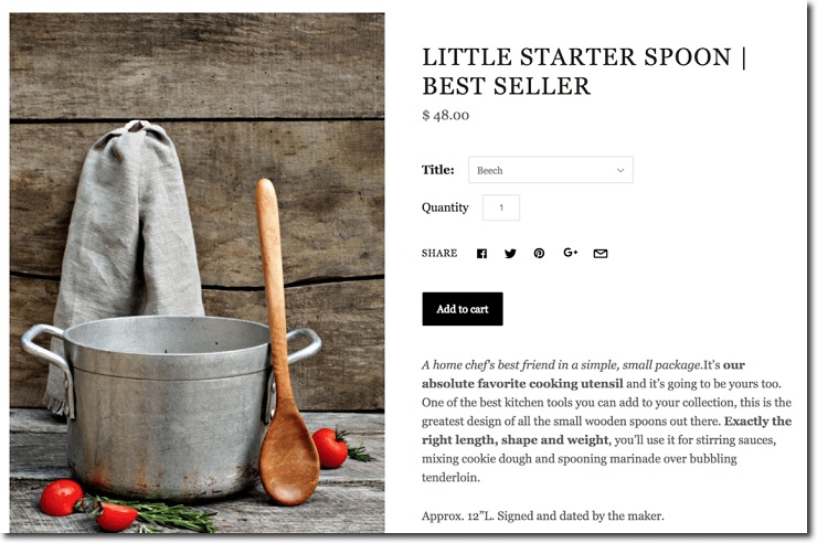
In most cases, online stores have short descriptions next to the product images and calls-to-action.
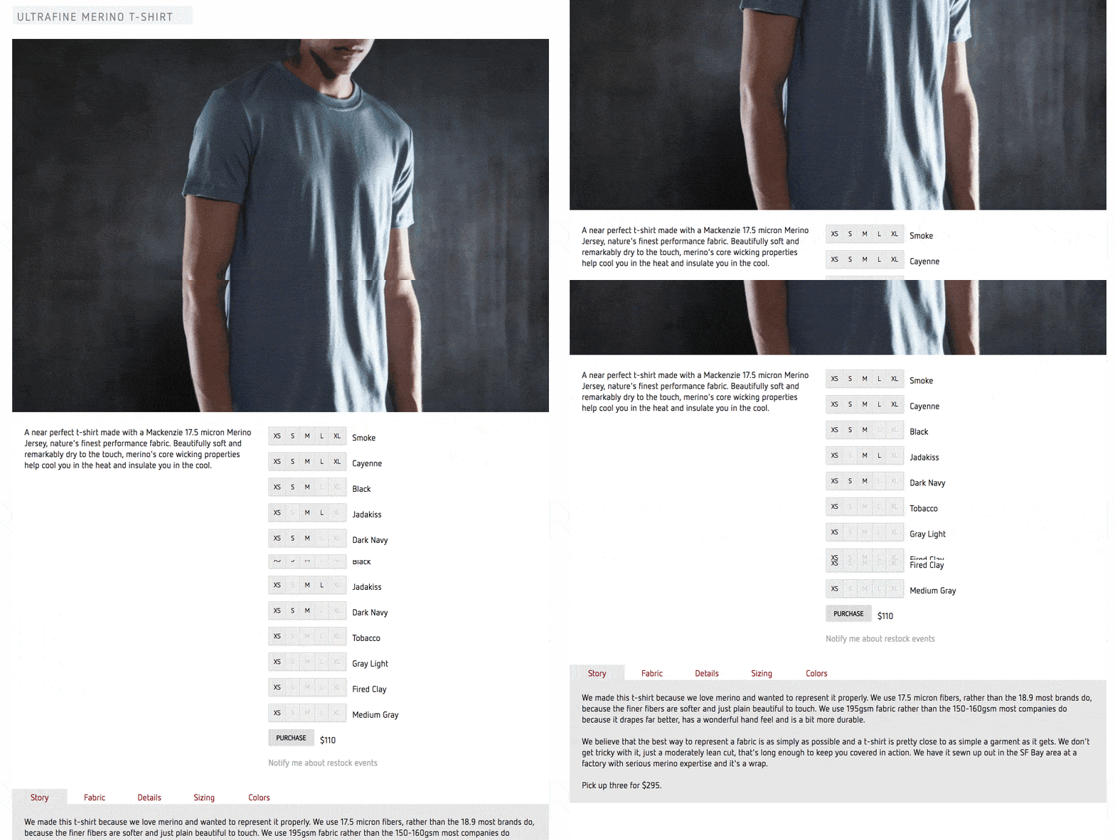
Others pair short product description with longer ones below the product photos, like in the case of Outlier.
At the end of the day, you need to test what works best for your site. Here’s a great resource on carrying out A/B testing in your e-commerce store.
If you run a small operation, start with short copy, but make it benefit- or outcome-focused. Then, you can increase the length to a couple of paragraphs next to the product photos. Once you have time, you can go crazy with longer copy.
Want to Learn How to Start & Grow a Profitable Online Store in 12 weeks? Sign Up for Our FREE Masterclass!
Learn How to Start a Profitable Store in 12 Weeks or Less. Join our FREE Ecommerce Masterclass!
Help Them Cross the Puddle (aka, Lead Them to the Cart)
Remember how much people like shopping, and how you can use that to your advantage? Well, here’s something else you may have never considered.
Your visitors love your product pages.
Wait, what? Did I just write that?
Look, when your visitors get to your product pages, it means they are interested in what you have to sell.
If they got this far, it’s because they liked your homepage and your category pages. Better yet, if they got to your category or product page through Google, that means they were already interested in what you have to sell when they made the search.
They may not be interested in purchasing right this second, or may not be entirely confident in your capacity to meet their expectations, but they still love being on your product pages.
This is a good thing because those visitors who don’t want to buy right now are still your friends. But those who are ready to buy only need one thing:
The add-to-cart button.
The question isn’t how you make your visitors click on it; it’s what’s stopping them from clicking it?
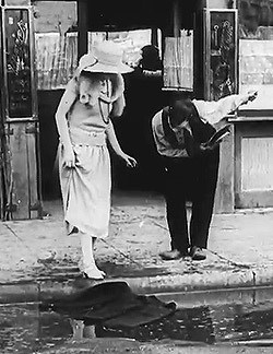
Here’s an analogy. Remember how back in the day, men were supposed to do “gentlemanly” things like putting their jacket over a puddle for a woman to walk over it?
Let’s say one of your visitors wanted to cross the street (i.e., buy one of your products). The problem is, there’s a big puddle that doesn’t let them step cross it.
What would you do?
If you were an old-timey gentleman, you’d put your jacket over the puddle so the visitor could walk over it and get to the other side of the street (i.e., make the purchase).
I know, I know, it’s an outdated custom, but your goal should similarly be to take every bit of friction out of your visitor’s shopping experience. Even if you have to ruin your jacket by putting it on a dirty puddle, your goal is to help the visitor complete the transaction with maximum ease.
But how do you actually help your visitors cross the puddle?
I can tell you right now it takes more than an add-to-cart button. It even takes more than a large button with great contrast, like some experts recommend.
You need to do way more than that.
I mentioned earlier that there are two reasons why the visitors that frequent your product pages don’t actually make purchases:
- They aren’t ready right now (e.g., have no budget, your store is too expensive, they are bored drinking a glass of wine before going to sleep and want to window shop, etc.)
- They aren’t convinced that you are the company that can fulfill their expectations
In the second case, when your visitors are ready to buy now but choose not to buy from you, the problem is personal:
They don’t buy because they don’t trust you.
Why would a visitor doubt you?
Lack of Clear Trustworthiness
If you ask your mother to buy from your store, she’d do it without a second thought, right? Why? Because, above everything else, she trusts you. The same applies to other relatives or friends (we hope).
Your visitors? Not so much.
Trust is the bond upon which human relationships are built. Consequently, it’s easy to get people to buy from your store if they trust you.
But how can they trust you when they don’t know anything about you?
Sure, it’s easier to sell on Amazon through the Fulfilled by Amazon (FBA) program. The same can be said if you work for a company like Sephora or Nike. The monumental work behind these brands has built the trust needed for people to purchase from them without much thought.
Alas, you need to build that trust before you can consistently generate conversions, and before you can bring your customers back to purchase again.
Here’s how you do it:
Show Them Who You Are
The “About Us” page is one of most important pages on your site. In the simplest terms, the goal of your about page is to showcase your values. While it’s hard for you to compete against a company like Nike, you can stand out by relying on the values that drive your company.
For example, people buy Nike’s products because they consider them to be great for their intended uses (running or other sports activities). But Nike is also notorious for its use of sweatshops.
If you want to compete against a company like Nike, you can stand out by showing your visitors how you hand-make each shoe, use fair labor practices, and use organic materials.
You can also mention who founded the company, the challenging path it took them to do so, who your employees are, what makes your manufacturing different from your competitors, among other things.
The ultimate goal of your “About Us” page is to be the bridge on which your customers can go from knowing you to believing in you.
Better yet, this page can help you increase your conversions: visitors who visited one were five times more likely to make a purchase and spent 22.5% more than those who didn’t visit an About Us page.
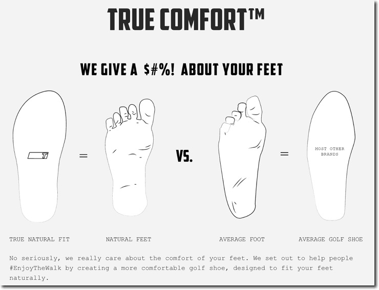
TRUE linkswear understands the idea of out-competing companies like Nike through their values. Instead of just having one page, they decided to extend it into four pages where they explain:
- Their story
- Why creating comfortable shoes matter (as you can see below)
- Their business model
- Why picking the right shoe materials matter
Their pages are all extensive, well-written, and super original in their approach. They clearly stand out among shoe manufacturers.
Being a bit vulnerable here works great. Remember that to get people to trust you, you need to open up. While you don’t have to get into the ugly details (sorry, no one cares about your ex), you can still talk about your struggles, your dreams as a founder, and what led you to start your company.
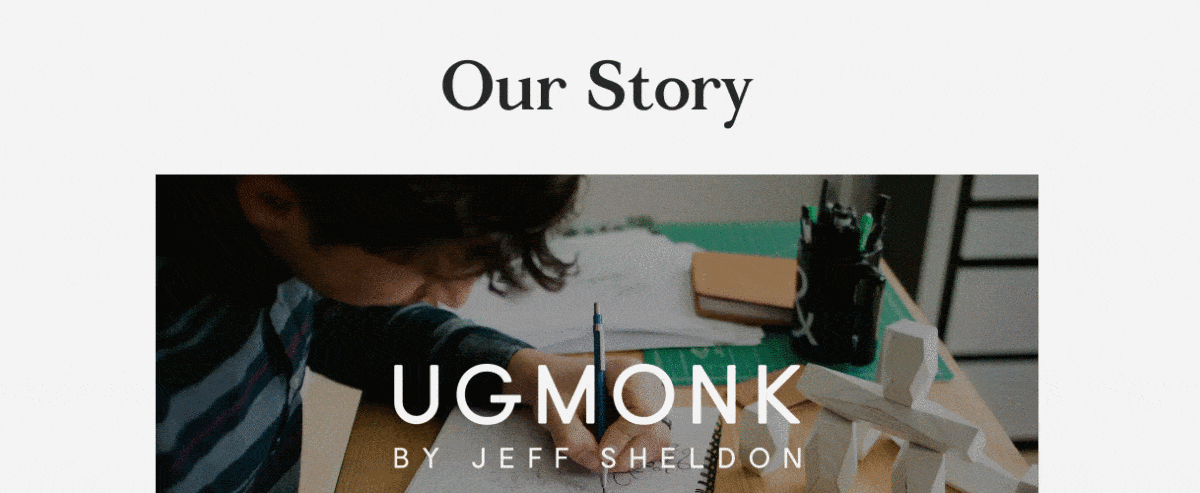
That’s what Ugmonk does so brilliantly. It starts with a beautiful video about their story, while the rest of the page explains it with more detail and great photography.
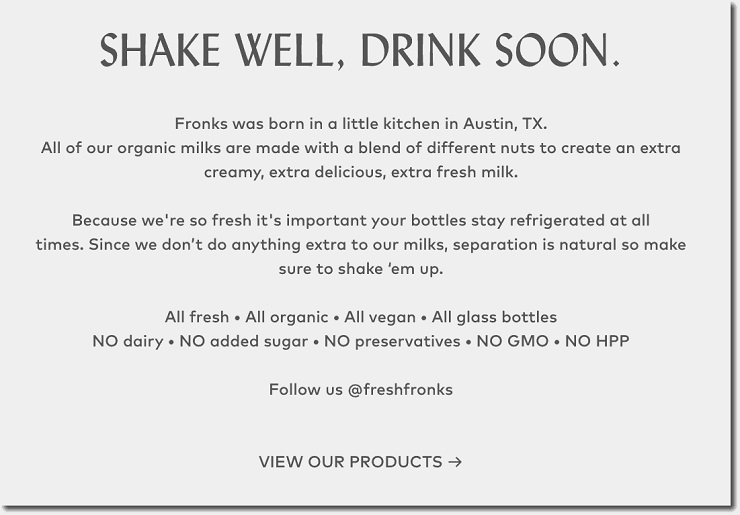
Still, your about page doesn’t have to be long and detailed. For example, Fronks has a minimalist page where they just mention how unique their juices are and how they are made.
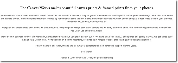
You can also focus this page on your value proposition and how it ties to your values, like The Canvas Works:
Lead with your values and your brand personality, and you will get a great about page that will become a source of trust in your company.
Show Me the Badge
Another unexpected thing people love? Authority. Or, at least, they respect it.
Just like Mulder and Scully flashing that FBI badge, you want to show your own authority badges to your visitors to inspire respect.
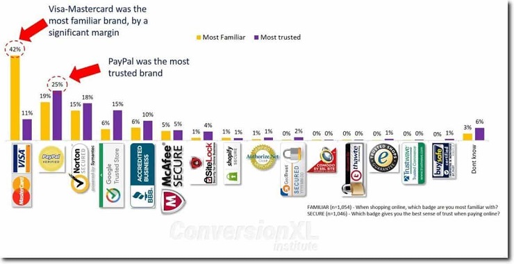
In 2017, Conversion XL expanded on a popular study done a few years before by the Baymard Institute, on which they analyzed the badges that provided the most trust with visitors.
Here’s what they found:
Payment badges, security badges, and business badges are the most popular. In other words, people like knowing they are doing business with a company that:
1. Accepts payments they can use
2. Protects their personal information
3. Is respected in their community and/or industry
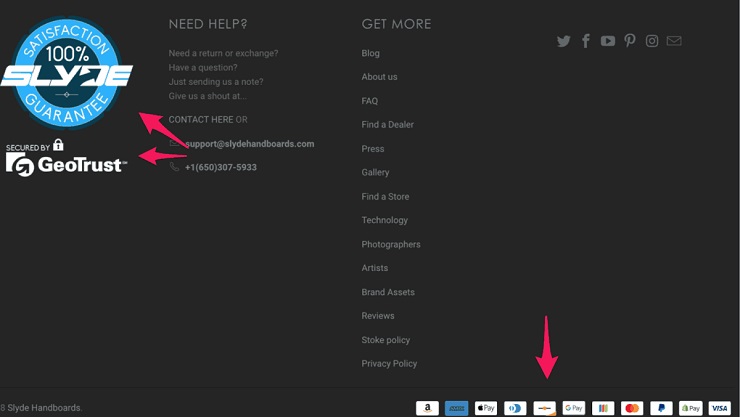
These badges shouldn’t take up a lot of space on your product pages. For example, Ada Blackjack features some of the trust badges at the end of their pages:
Slyde Handboards does a similar job, but adds more of them:
An interesting twist BlackButterly implements is adding their Trustpilot reviews at the end of every page. This clearly increases trust in the company.
One Shopify app that’s great for trust badges is Free Trust Badge, and with just a few clicks, lets you add the most important badges to your product pages.
“Show, don’t tell,” the saying goes. Show them your trust badges, and you’ll get your conversions up.
No Surprises, Please
Know what people hate, especially when shopping online? Surprises.
One study showed that 56% of shoppers leave without purchasing after being presented with unexpected costs.
There’s another from 2014, in which the A/B testing tool Visual Website Optimizer found 28% of shoppers would abandon their carts if they were presented with unexpected shipping costs.
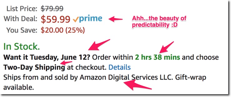
If there’s one reason Amazon has become the king of ecommerce, and why their Prime program is so popular, it’s because of predictability.
When you order from Amazon you know what you will get (the product you ordered), how you will get it (USPS in most cases), and when you will get it (in 48 hours or less).
While you can’t offer the same predictability as Amazon (unless you sell through their Fulfilled by Amazon program), you can still reduce the surprises substantially if you tell your visitors what they can expect up front.
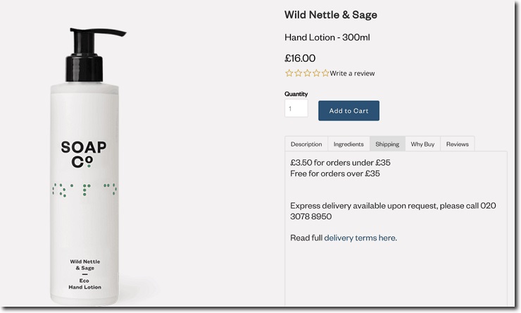
The first thing people want to know is how they’ll get their products. You should show your shipping policy right in your product page, as in the case of The Soap Co:
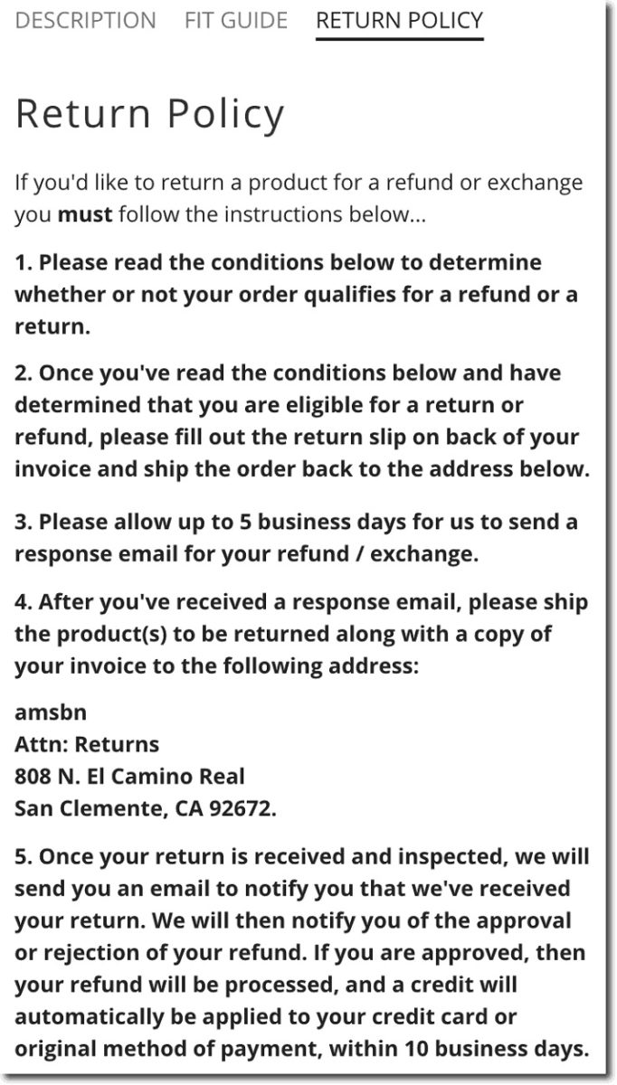
Some people will want to return your products. Since this is usually a pretty annoying process, you want to minimize this problem by explicitly showing your return policy.
ambsn shows theirs in one of the tabs of their product page, and explain it thoroughly:
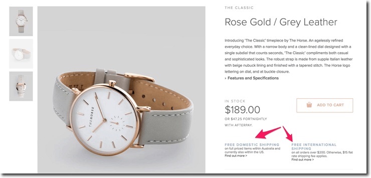
If you offer free shipping, or if it has a threshold, you want to show it as clearly as possible, as RYDER does:
If you can’t show it in the top of your site like in the image above, you can still show it on your product page:
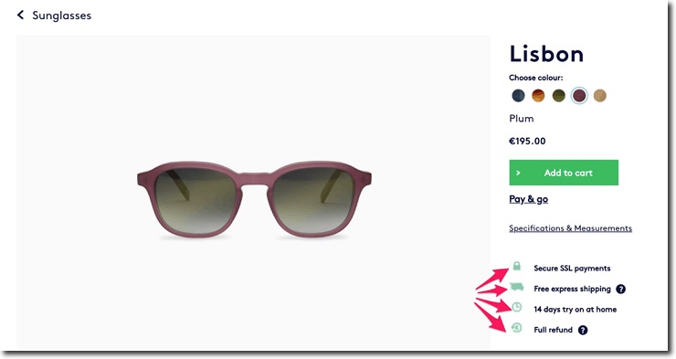
One company that does a great job of avoiding surprises is Dick Moby:
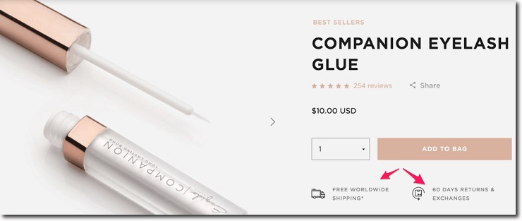
While simpler, Esqido also explains what their shipping and return policies are:
The more and the sooner you explain how your shipping and return policies work, the better.
Your loved one may appreciate a surprise box of chocolate, a bottle of wine, or in my case, a book (just don’t tell anyone).
When it comes to your customers, however, leave the surprises out.
Want to Learn How to Start & Grow a Profitable Online Store in 12 weeks? Sign Up for Our FREE Masterclass!
Learn How to Start a Profitable Store in 12 Weeks or Less. Join our FREE Ecommerce Masterclass!
Keep It Simple (For Your Own Good)
I know you are super proud of your ecommerce store and how awesome your products are and want to go the extra mile to prove it.
But when it comes to designing an ecommerce store, remember the KISS philosophy: keep it simple, stupid.
When you have a Shopify store, it’s easy to install dozens of apps that promise better conversions, less stress, and more happiness and rainbows in your life.
The truth is, if you start installing a ton of cool-looking apps, you’ll end up with a Frankenstein’s monster of a design that scares people away.
Don’t do it.
Your ecommerce store design needs to be simple and easy to navigate. Remember, your store should lead your visitors to the cart. As the Metallica songs goes, “nothing else matters.”
Whatever element you add to your store, it has to fit that primary goal. If something doesn’t lead to the conversion, it must go.
Since you are likely to use a pre-made Shopify theme or modify an existing one, I won’t touch on the do’s and don’ts of an ecommerce shop design. Every single premium Shopify theme is built around the principles of simplicity and good-UI, so it’s hard to mess that up.
What you need to focus on is on one thing: using the design elements you have at your disposal to make your visitor’s life easier.
Make it Personal (Without Being Creepy)
Personalization is one of the most popular topics in the marketing world right now. In the past, companies personalized their communications through simple merge tags that allowed them to add names to their emails.
Not bad, but nothing revolutionary.
Nowadays, companies can use big data and AI to take their visitors’ behavioral information and create shopping experiences that are custom-fit to their needs.
Evergage found 88% of U.S. marketers reported increased improvements thanks to personalization. Better yet, more than half of the people surveyed found a conversion lift above 10%.
Marketing personalization comes with one problem: creepiness.
Let’s say you were checking out some funny Pokemon onesies for a friend’s costume party. You weren’t considering buying them; it was just an idea that you had in mind.
Now, imagine the retailer at hand decided to send you an email saying “Since we saw you like this Pikachu onesie, you may want to consider this Charmander one.”
Ugh, what?
Just because you saw a Pikachu onesie doesn’t mean you love Pokemon, onesies, or even that company. You were just browsing. Period.
Through the use of clumsy personalization, companies can easily go beyond what’d be acceptable in any shopping experience.
If you are going to use personalization in your ecommerce store, you need to do it in a smart, non-creepy way. Remember, we’re keeping it simple. Not trying too hard. That creeps people out.
Let’s discuss product recommendations.
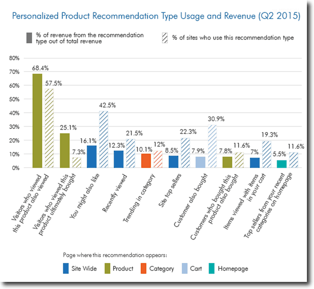
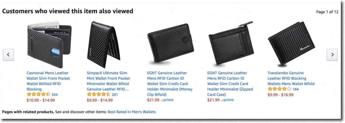
According to Smart Insights, the most effective kind of product recommendations are “similar products viewed” and “purchased by similar people.”
That means people like purchasing things other people like him would view or buy. Otherwise, people like seeing what they might like or what they have viewed before.
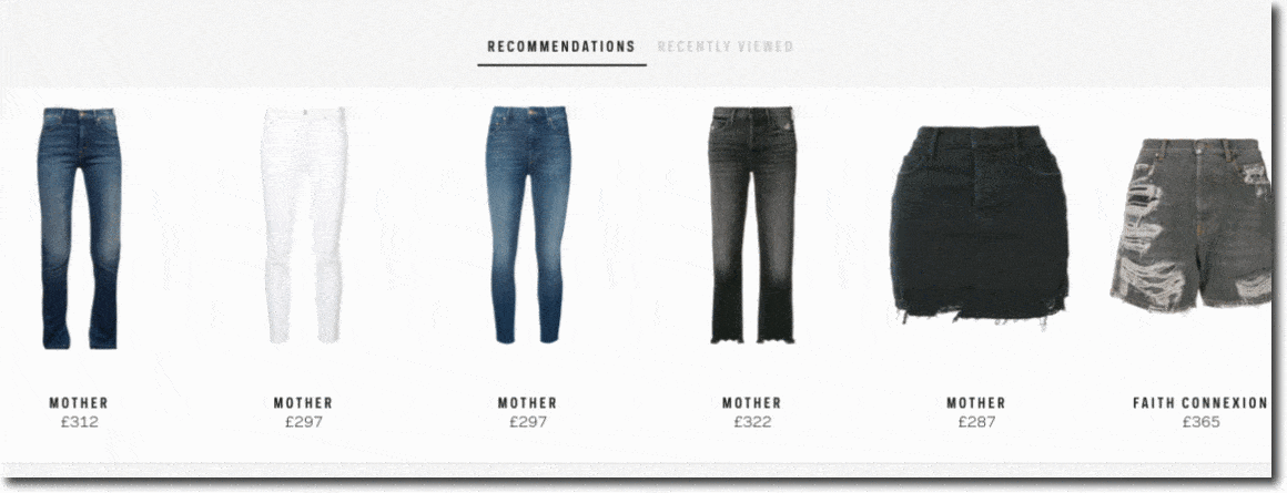
When it comes to product recommendations, Farfetch wastes no time and shows you what they believe you should buy based on your previous visits and what you have seen before.
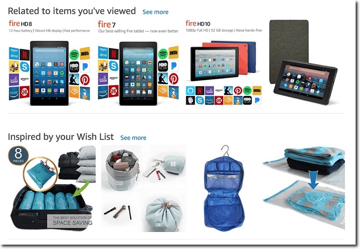
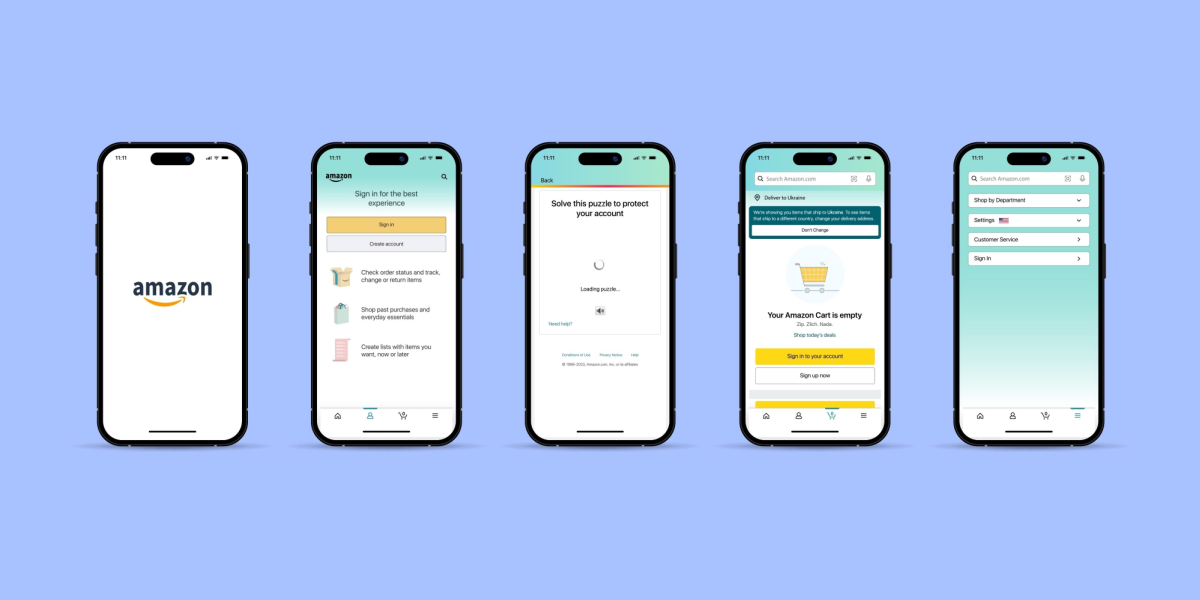
While I don’t like using Amazon as an example, I couldn’t resist showing the fantastic work they do with their recommendations. They basically wrote the rules of this game. In short, they use every single recommendation available.
Right on the homepage, I found two different recommendations:
Then, when I visit one of their products, this is what I see below the fold:
After I checked another product from that list, I found they recommended me another product in a slightly different way:
Below that recommendation, I find these:
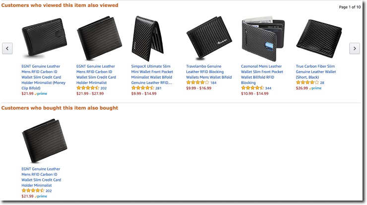
I scrolled down to the end of that page, and guess what? They keep recommending me products!
Some of them are related to the product at hand, some are related to past views, and some are about past purchases.
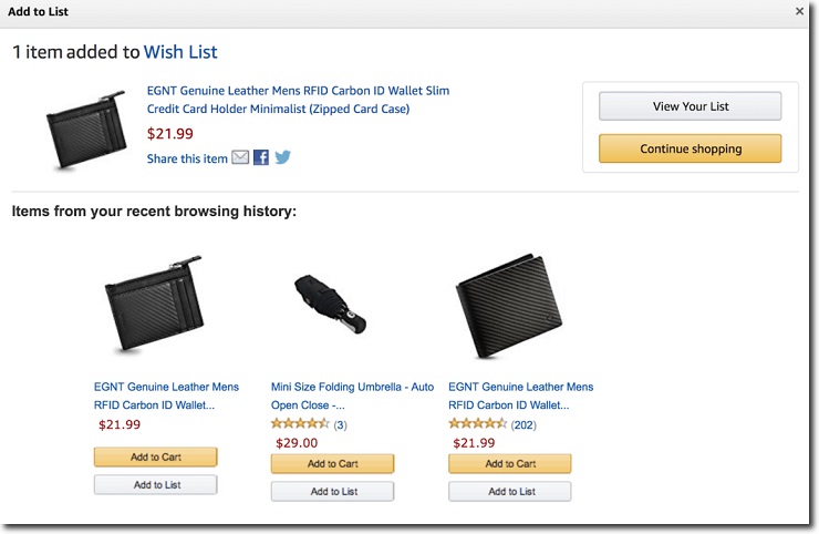
I took this situation a bit further and decided to add one of the products to my cart. Look what happened:
More recommendations!
When it comes to personalization, Amazon doesn’t leave any stone unturned. This extent of recommendations is almost certainly overkill in the case of your store (remember KISS), but you get the idea. It works.
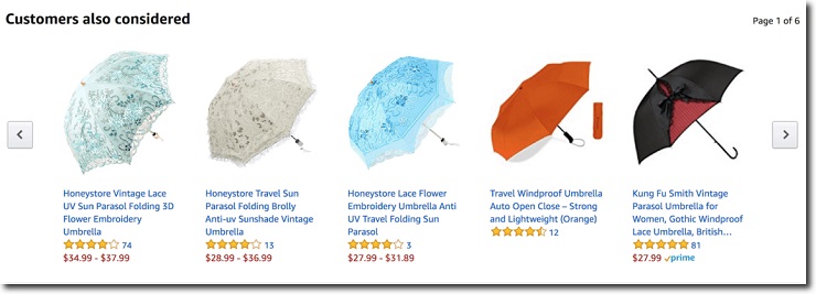
I also found interesting how they test different wordings for their recommendations. In some product pages, as in the one below, instead of saying “Customers who bought this item also bought,” they use a more polite and shorter copy:
If Amazon tests so many different variations for their product recommendations, it’s probably because it works.
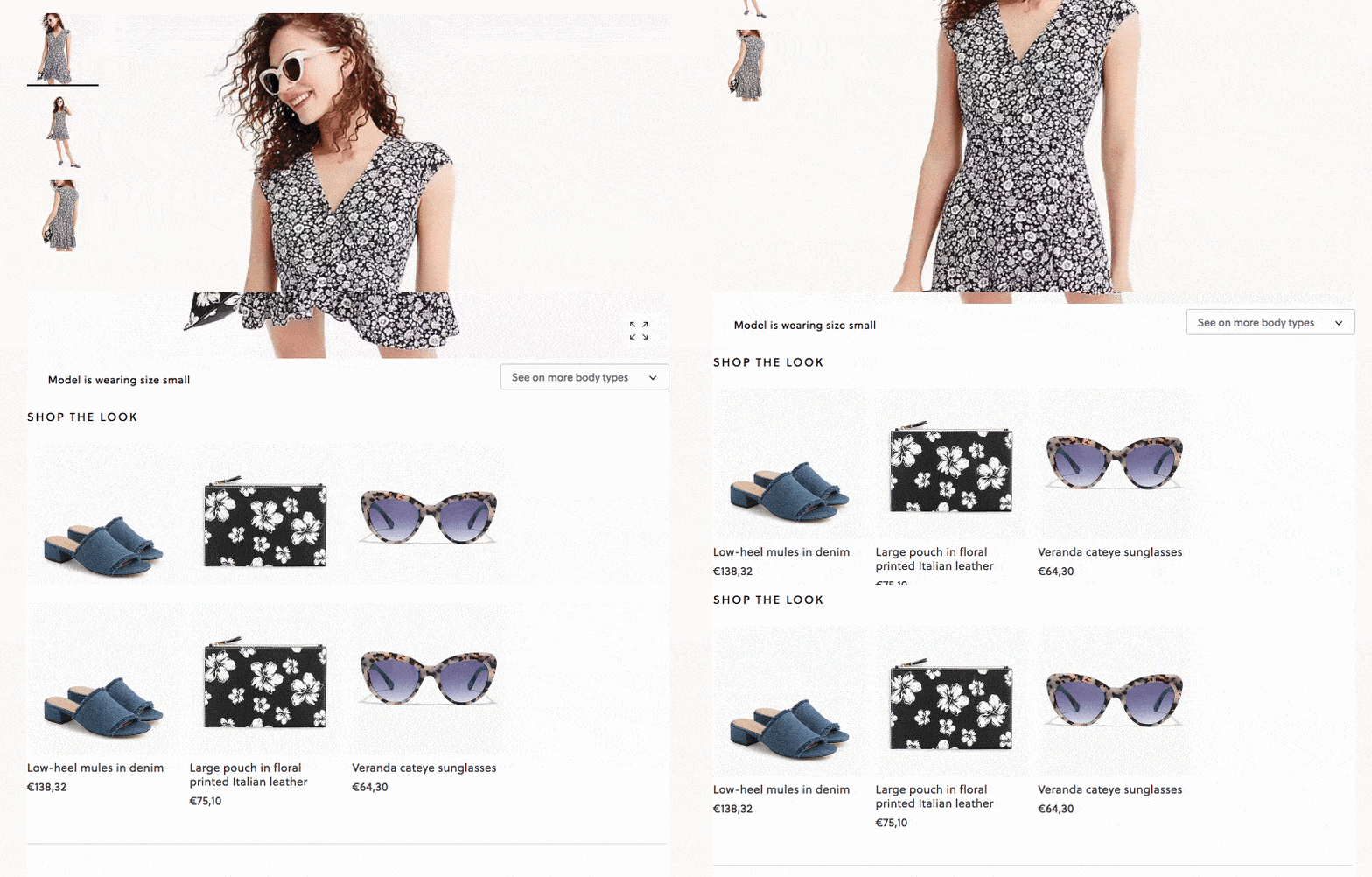
An interesting concept that many fashion retailers implement is the “Shop the Look” recommendation. In this case, they recommend other clothes that “complete” the look of the product you are looking, as in the case of J.Crew:
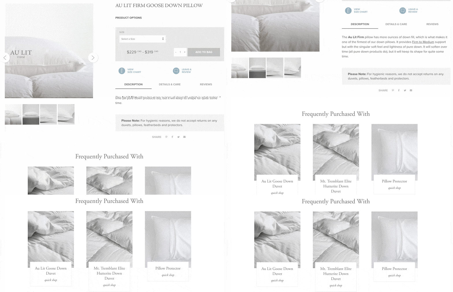
Au Lit Fine Linens takes a similar approach, recommending duvets and pillow protectors to the pillow I was checking out:
There are a lot of ways you can implement product recommendations. You already saw which ones people supposedly like. You can start with that list. As always, test until you find what works.
If you are going to get started with your product recommendations, you can use apps like Linkcious and Automatic Related Products. These tools have algorithms that automatically do the product recommendation for you.
If you don’t use Shopify, you can implement product recommendations manually with the help of tools like Barilliance or Monetate. While they will take a bit longer to implement, they will bring highly advanced personalization engines to your store, making them more effective in the long run than the simpler Shopify apps.
Be Consistent…Like, Always
Whenever a new visitor lands in your store, they are complete strangers. Just like when you meet a stranger (like a friend of a friend, or a funny Dutch guy in a hostel), the first few minutes of your interaction matter a lot.
First impressions matter, particularly if you run an ecommerce store. And even more if you have a small brand that few people know.
When someone visits Nike’s online store, everyone knows what they are all about. There are no surprises there.
The way they create the feeling of familiarity is through brand consistency.
By brand consistency, I mean creating an idea in your visitor’s mind that connects your company with a particular feeling or idea.
What do you think when you see the following image?
If the words “Nike” and “just do it” popped into your head, you know how consistent Nike is with their brand.
What’s more, Nike has been so successful with their brand, that you probably know what players have used their products (e.g., Michael Jordan, Roger Federer, etc.), and what Nike stands for (i.e., hard work, discipline, success).
That’s the final goal of any brand: tying a feeling or idea to a company.
The key to achieving brand consistency is that you need to communicate the same values and feelings every single time.
You can’t have all your brand’s values in your about page and forget them everywhere else. You need to transmit those values in every page, in every email, and in every product that you sell.
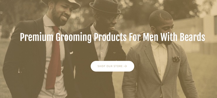
Take a look at the following image:
Besides knowing what they sell, you can imagine a few things about this brand:
- It’s vintage
- It’s fashionable
- It’s a bit hipster
- It’s focused on, or at least offers products for, black men
That’s the site of Fresh Heritage—run by one of Foundr Start & Scale’s most successful students, Gamal Codner—which sells grooming products made for men of color.
Grooming products for men tend to have an old school appeal, so by using that color palette and image, they are doing a great job of tying those sentiments to their offering.
You can also see comparable brand values in the copy of one of their beard oils:
The Fresh Heritage Classic Beard Oil was created by taking an ancient hair recipe from our African roots and modernizing it to groom today’s man.
Go to their About page, and you will see all about their story, how they got their inspiration from “traditions of our African Ancestors,” and the values they believe in.
They have consistently developed their brand, which has allowed them to grow in just a few months to $60,000 a month in revenue.
How to Develop a Brand Identity
While you don’t have the budget to achieve the level of consistency companies like Nike or Coca-Cola have, you can still do a few simple things to develop your brand.
Start with exactly who your target audience is and what they stand for. There’s a lot that goes into this process, which you can read about here. But once you’ve hammered it out, you want the results to determine the design of your store.
In the case of Gamal, mentioned above, he knew he was going to target men of color who like grooming products. He also knew grooming products have an old-school feeling attached to them, that’s why the color palette he used is so consistent with the feelings he’s trying to evoke.
You need to define a group of colors and typography that best represent your values, voice, and tone, all determined by your audience. In the case of Fresh Heritage, we saw how they used sepia colors that give it an antique feeling.
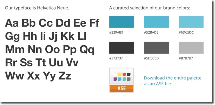
In many cases, companies share their brand assets openly, like MailChimp:
Once you have defined your brand assets, as in the case of Mailchimp, it will be easy for you to maintain your brand consistency throughout your product line and your site.
Want to Learn How to Start & Grow a Profitable Online Store in 12 weeks? Sign Up for Our FREE Masterclass!
Learn How to Start a Profitable Store in 12 Weeks or Less. Join our FREE Ecommerce Masterclass!
Design Your Ecommerce Store for High Conversions
We covered a lot in this article.
- You saw how to bring your products to life through the use of great product photography and descriptions.
- You also learned how to lower the fears and doubts of your visitors by making it easier for them to trust you. Once they trust you, your conversion rates will grow.
- Finally, you saw how to make your ecommerce store design simpler with the help of smart personalization and brand consistency.
With so much info to work with, you may be having trouble deciding where to start.
Here’s the main thing you need to remember:
You need to make your visitor’s shopping experience easier.
If they are in your store, they’re probably intrigued with what you have to sell. Some won’t be ready to buy. But those who hold their wallets in one hand and the touchpad in the other should be drawn to one place:
Your add-to-cart button.
Every part of your design should lead them there. If you can keep that in mind, anything you take from this article will increase your conversions.
Now it’s time to hear from you.
What’s the #1 design element you think will lead your visitors to the add-to-cart button? Why do you think that will make it easier for them to purchase? Share your thoughts in the comments below!
