Picture this: You’re looking to hire someone to create a brand strategy for your business, and a consultant shows up to your office with an impressive portfolio, a real understanding of your business, and different offerings he can customize based on your needs. He says all the right things, shows you case studies of how he has helped other clients, and then he goes in for the close and asks if you’d like to work with him.
But there’s only one problem: He’s inexplicably wearing a mask that hides his face, and he hasn’t even told you his name.
Would you trust him?
That example may seem dramatic, but it’s basically what businesses do online every day by failing to optimize their About Us pages. Many businesses slap a few lines of generic corporate-speak onto the About page and call it a day—no faces, no names, no real information about the people their customers will be interacting with.
If your landing page is where you draw customers in and get them interested in buying, your About Us page is where you seal the deal. It’s especially crucial for anyone with a service-based business. Unlike buying products, when people buy a service, they know they will be working directly with a person, and they want to get to know that person before they invest in the service.
Given its importance in the sales process, the About Us page gets remarkably little attention. And I think that’s because businesses underestimate its power to convert prospects into buyers.
If you fail to optimize your business About Us page, you are losing sales. Read on to find out how to fix this all-too-common mistake.
Why Your Business ‘About Us’ Page Is So Important
Your website is a marketing tool. When used correctly, it can attract your ideal audience, draw them into your offer, and convert them to paying customers.
But it doesn’t happen without intention, and it usually doesn’t happen by just having one stellar landing page.
To illustrate what I mean, let’s revisit one of the most basic concepts: the sales funnel. Your landing page gets your site’s visitors to the Awareness and Interest stage. But often, that’s not enough. To get them to the Consideration and Action stages, you need a killer About Us page. Here’s why:
It Increases Conversions
Want proof? Digital commerce agency Blue Acorn analyzed its client data and found that, on average, visitors who went to an About Us page were five times more likely to make a purchase and spent 22.5% more than those who didn’t visit an About Us page. That’s huge!
It Builds Trust
Do you buy from companies you don’t know anything about? When you stumble upon a new ecommerce website, for example, do you instantly trust it with your credit card details? Probably not. You search around for reviews from people who have used that site before, or you look into that company’s details to make sure it’s a reputable business.
Trust is essential to buyers. Before they fork over their hard-earned cash, they want to make sure you won’t rip them off. This is where your About Us page comes in. Unlike your landing page or product/services pages, which tell the prospect what you have to offer, your About Us page tells them why they should trust you.
It Builds Credibility
Closely related to the first point, the About Us page builds your credibility. This is your place to “show off” more of your credentials and experience. You can do this through customer testimonials, awards, licenses, or other accomplishments.
In the next section, I’ll show you how you can write a business About Us page that builds trust and credibility, ultimately leading to more conversions.
Get Free Instant Access To 28 Proven Marketing Strategies For Startups Here!
How to Write an ‘About Us’ Page That Converts
1. Show Your Face (And Your Team’s Faces)
Remember that masked consultant example I mentioned in the introduction? It’s hard for anyone to trust someone they can’t see.
That’s why you need to include a photo of yourself on your About page. It doesn’t need to be anything fancy; just a simple headshot will suffice.
While this may not seem relevant to your business, it is. Including your photo can increase conversions. Jason Thompson did an A/B test to see if placing his photo, instead of a generic icon, on his Contact page would increase the number of people contacting him.
The results? His conversions increased by 48%!
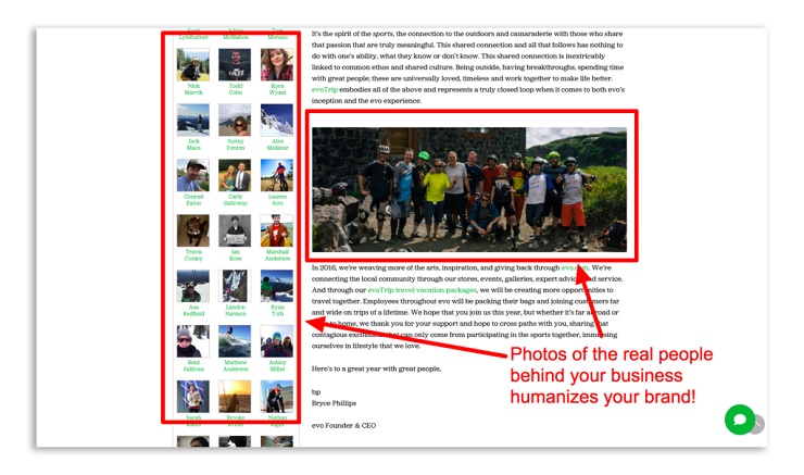
Another amazing example of the power of showing faces is in the MarketingSherpa case study on Evogear (now known simply as “evo”), a sporting goods company based in Seattle. The company carried products that weren’t really exclusive to the site, so it was difficult for them to compete with bigger brands.
So how did they decide to differentiate? They focused their energy on improving their About Us page! They added a mission statement, core values, and laidback photos and profiles for every one of their employees.
After humanizing their About Us page, Evogear found that the conversion rate for shoppers who viewed that page was 30% higher than the rate for shoppers who didn’t view that page.
That case study was done back in 2006, but a peek at evo’s About Us page today shows they’re still doing it right! It includes tons of casual photos of the people working at evo.
2. Tell a Compelling Story
You know what humans love even more than faces? A good story. So give that to your site’s visitors. The best place for this is the About Us page. But don’t just tell any story, tell a story that weaves in your core values and shows the visitor why you do what you do.
The best About Us pages boil down to this simple formula:
- A problem you had. Start out with a short story that illustrates a frustration you had. This often goes back to your business’s “origin story,” where you tell how it all came about.
- How you solved that problem for yourself. Every good story needs a resolution. You must tell the reader how you solved this frustration that you had.
- How you now solve that problem for others. Okay, you’ve told the reader how you had a problem and how you solved it. That’s a decent story! But if you leave off there, your reader is left wondering, “What’s in it for me?” To bridge this gap, you need to now tell your reader how you solve that problem for others through your business.
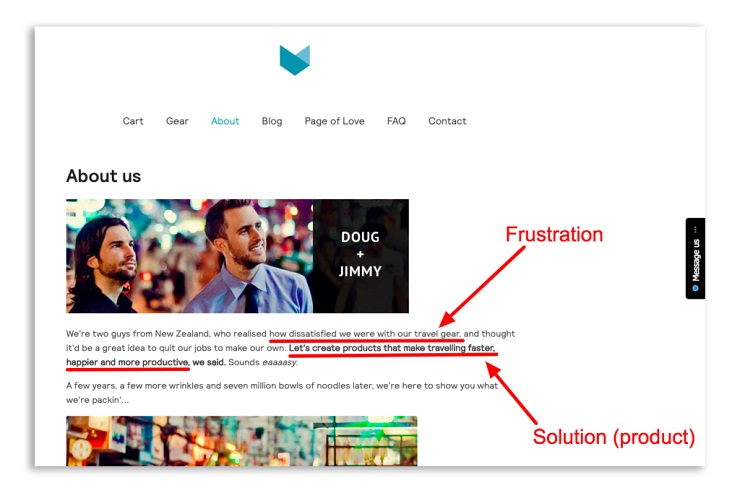
Let’s see that formula in action! Here’s a good example of an About Us page story from Minaal, the makers of travel backpacks. It’s simple, but packed with personality.
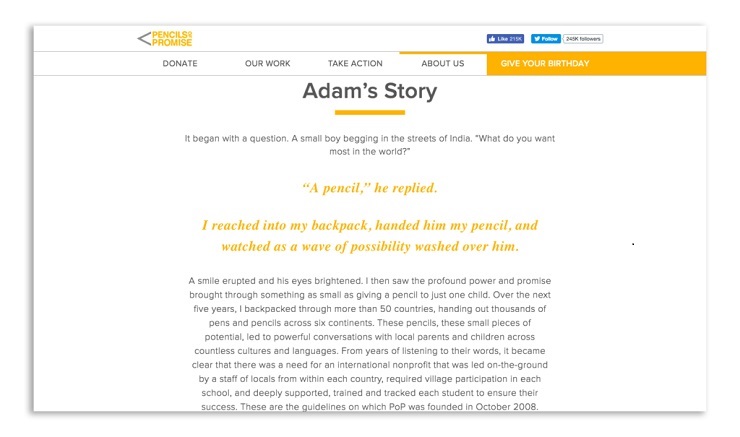
Here’s another About page example from Pencils of Promise, a nonprofit that builds schools in developing countries. It tells the story of how founder Adam Braun encountered a street beggar in India whose greatest desire was a pencil. That story highlights the bigger frustration of a lack of access to education that Braun witnessed in developing countries. This example just goes to show that a compelling story on your About Us page doesn’t necessarily need to be a frustration you personally experienced; it could be one that you witnessed and that inspired you to start your business.
Again, this formula works especially well for service-based businesses. Your prospects will want to relate to you on a deeper level, because they’ll be working directly with you.
Bottom line: Tell a good story that weaves your business’s mission into it.
Get Free Instant Access To 28 Proven Marketing Strategies For Startups Here!
3. Restate Your Value Proposition
Because you need to think of your About Us page as your secret conversion-boosting tool, you need to restate your value proposition. What’s a value proposition? It tells the reader how they will benefit from your product or service. When a visitor gets to your About Us page, you want to make sure they don’t forget what you’re offering. After all, your goal is not just to help them get to know you better, it’s to get them to buy your product or service.
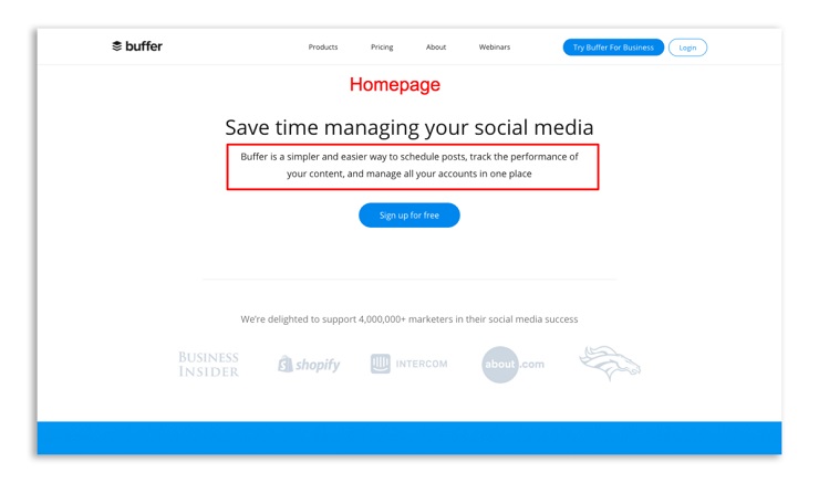
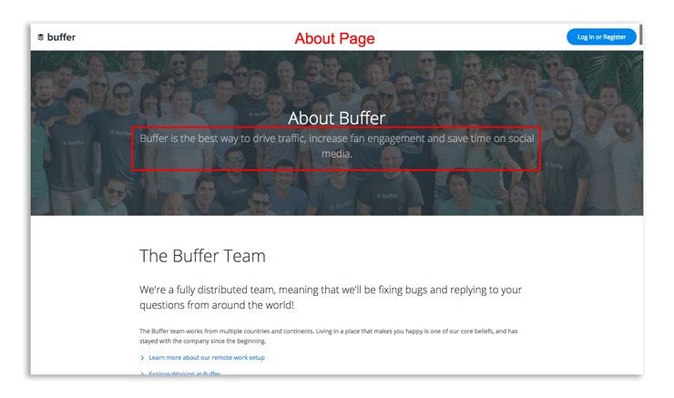
Buffer does a great job of including a clear value proposition on their homepage and restating it on their About page.
As you can see from the Buffer example, you don’t have to use the same wording each time; in fact, it’s better if you don’t, so you don’t sound redundant.
4. Include a Lead Magnet
Most visitors to your site are not going to buy right away. They might be interested. They might even tell themselves they’ll revisit your business later when they’re ready to make a decision. But what happens when prospects like those leave your site without giving you a way to contact them?
Well, unless you have a tracking pixel on your site that allows you to remarket to those prospects on social media later—you may have lost them forever.
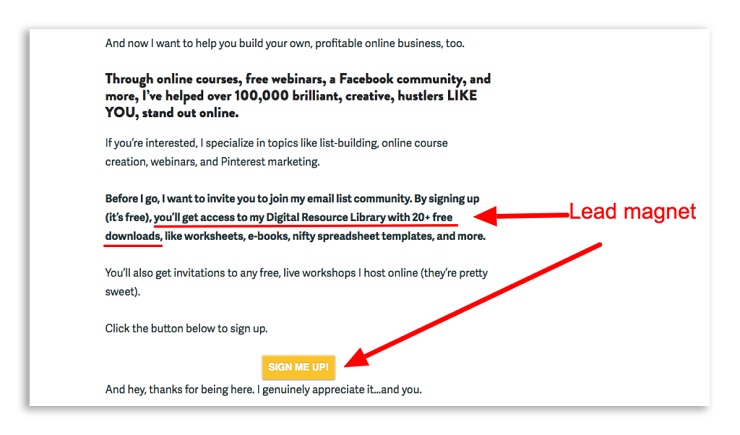
But there’s a way to prevent that from happening: Create a drool-worthy lead magnet. A lead magnet is something you offer your website visitors for free in exchange for their email addresses. This could be an ebook, an email course, a checklist, a workbook, or a free trial of your software. Whatever it is, the most important part is that it needs to be something that attracts your ideal customers. It needs to relate to your paid product or service, but not give it all away for free.
Online entrepreneur Melyssa Griffin does a fantastic job of using a lead magnet on her About page. After she’s done explaining how she helps her target audience (people who want to start online businesses), she offers free resources in exchange for an email address.
The idea is to draw in your ideal customers with a lead magnet tailored for them and then add their email address to your marketing list so you can keep sending them valuable content and stay at the forefronts of their minds. That way, when these leads are ready to buy—you’ll be the first business they go to.
Get Free Instant Access To 28 Proven Marketing Strategies For Startups Here!
5. Have a Clear Call to Action
Okay, you’ve shown your face, told a compelling story, restated your value proposition, and included a lead magnet—but all of that careful planning could fall apart without this one final piece: your call to action.
Once your ideal customer has read your About Us page, you need to tell them what to do next. This isn’t pushy or salesy—it’s crucial. AdRoll found that when Facebook ads included a CTA button, viewers were 2.85 times more likely to click through. You’d be surprised what people will do when you give them clear directions.
What CTAs could you put on your About Us page? The most obvious one is “Contact us.” Tell the reader how they can reach you to get more information, whether that’s via an email address, phone number, or contact form.
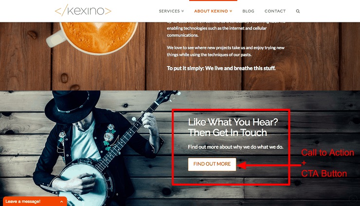
Startup marketing agency Kexino puts a clear CTA at the bottom of their About page, urging prospects to get in touch.
You could also prompt your visitors to click to other pages on your site, such as your product page or your blog.
Examples of Amazing ‘About’ Pages
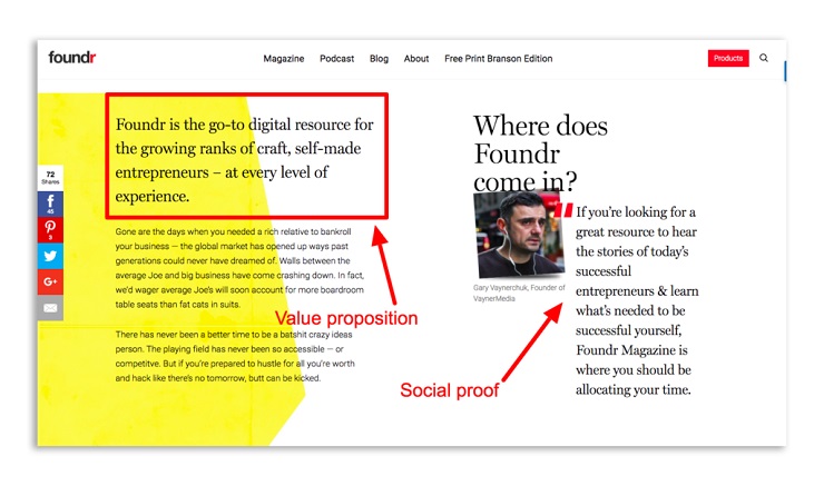
Not to toot our own horn, but since we at Foundr like to practice what we preach, let’s deconstruct the Foundr.com About page and see how we’re making the most of this little-used conversion tool.
First, you’ll notice a value proposition that identifies our ideal audience and says how we can help them. Next, as an added bonus, we throw in some social proof with a testimonial from renowned entrepreneur Gary Vaynerchuk, and if you scroll down, you’ll see even more social proof.
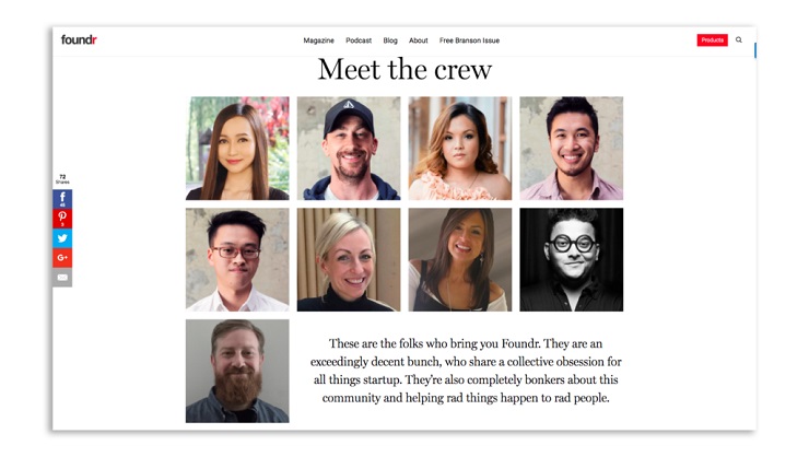
Next, you’ll see photos of our awesome team.
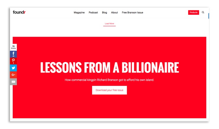
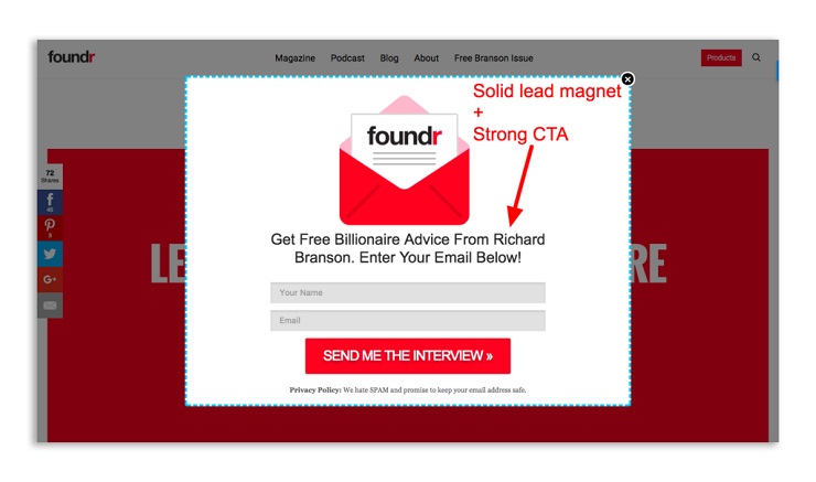
Finally, we top it all off with an irresistible lead magnet asking the reader to grab their free issue of Foundr magazine.
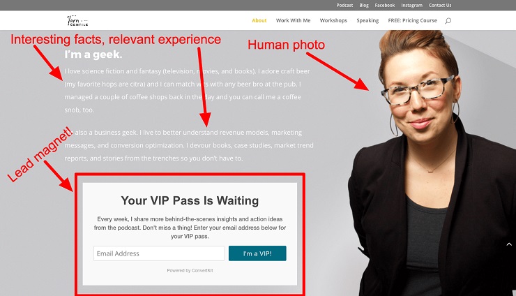
Let’s take a look at another great example. Business consultant Tara Gentile is rocking her About page! She’s got all the elements I talked about above, including:
- Photo of herself. She’s got a huge, professional photo of herself as the background image on her About page. This makes her real and relatable to prospective clients.
- Fun facts. She includes some non-business-related facts about herself. This makes her more human since it showcases her personality.
- Relevant information. Then she swoops in with some business-related facts about herself that make her qualified to work with your business.
- Lead magnet. Last but not least, she ends with a clear call to action and a lead magnet that her ideal clients would likely devour.
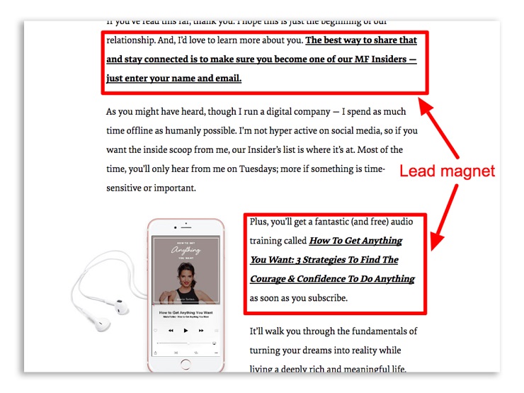
One more example comes from Marie Forleo. The top of her About page shows her face and a succinct statement that defines her value proposition.
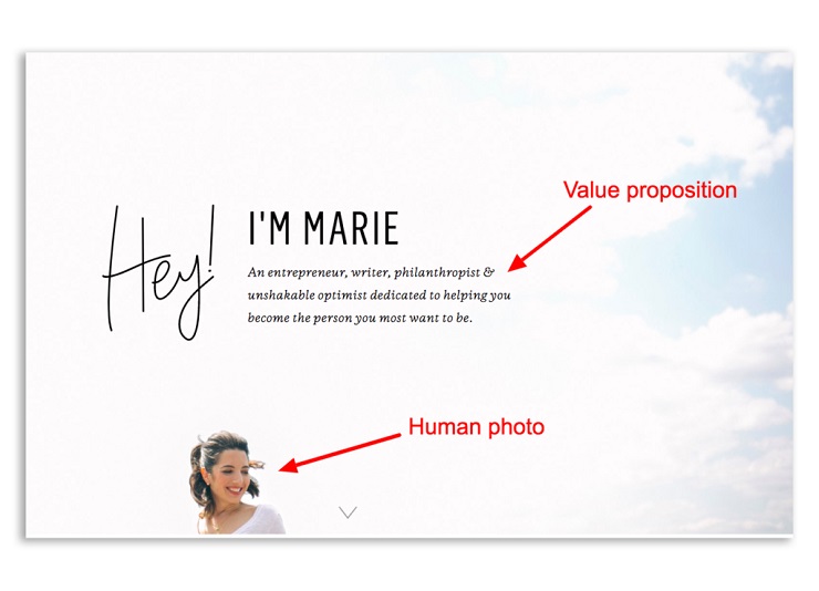
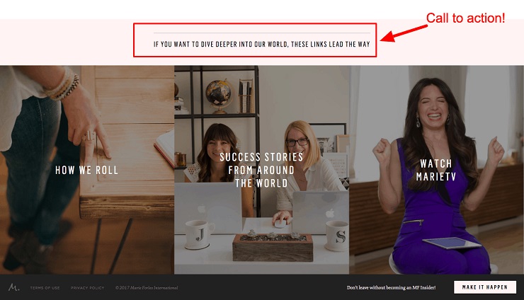
Lastly, Forleo ends with a call to action, encouraging her readers to explore the site further via the links provided below.
Get Free Instant Access To 28 Proven Marketing Strategies For Startups Here!
Don’t Neglect Your ‘About Us’ Page
Your About Us page deserves more than just a few lines of haphazard copy. It is a powerful conversion tool—if you wield it correctly.
When done right, your About Us page can make your visitors five times more likely to buy, as we saw in Blue Acorn’s case study. It’s the place where you can build trust, increase your credibility, and boost your conversions by moving those prospects through the sales funnel.
To make the most of your About Us page:
- Show your face.
- Tell a compelling story.
- Restate your value proposition.
- Include a lead magnet.
- Have a clear call to action.
Follow these five steps, and you’ll have a huge advantage over your competition, because you won’t be some faceless company—you’ll be a trusted resource your ideal customers will choose when it’s time to make a purchase.
What are some of your favorite business About Us pages? Share them in the comments below to give your fellow entrepreneurs some inspiration!
