Congratulations on your newly launched ecommerce store! After studying your favorite brands for inspiration, your million-dollar idea is now open to the public. No doubt you’ve had tons of traffic and sales since you hit the “publish” button.
Not quite? Your online store has no sales yet? Or maybe you’re hesitant to launch in the first place, afraid of flopping.
Don’t lose heart. You’re far from alone. In fact, it takes the average Shopify store owner 20 days to make their first sale. Even after you get a steady stream of traffic, the average conversion rate for a small ecommerce store hovers around 1.75%.
While such stats might sound devastating, there is a silver lining: In the early days of a new ecommerce store, you’ve got lots of room to improve, and plenty of time to fine-tune your storefront and messaging as your business takes flight.
And we’ve brought in just the person to guide you down the runway.
Gretta van Riel is a four-time founder of multimillion-dollar ecommerce brands. She built her empire using best practices she’s learned and discovered over time. We’ve asked her to break down some big-brand ecommerce websites so you can learn from them, improve your own ecommerce site, and watch your sales hit the stratosphere.
Watch this video and then we’ll walk through Gretta’s insights below.
Dollar Shave Club
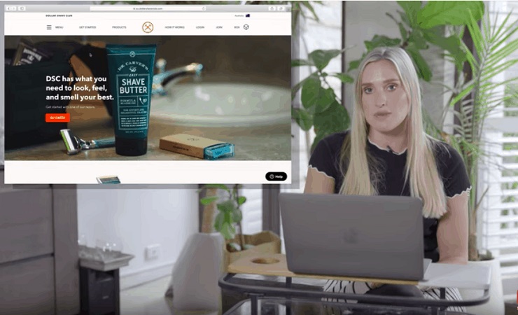
You’ve probably seen the clever ads for the industry-disrupting personal care brand, Dollar Shave Club, on social media. But does the website hold up and help close sales on the leads their ads are generating? Let’s find out.
What Works
Strong Unique Value Proposition
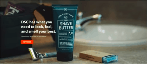
The first thing your eye is drawn to is the headline: “DSC has what you need to look, feel, and smell your best.” This is its unique value proposition.
Your unique value proposition (also known as a unique selling proposition or USP) is a brief statement about why your customers will benefit from your products. A strong selling proposition, well communicated, will help customers quickly understand what your business offers and why they should choose you over the competition.
Why it works
“It really shows what the benefit is to the customer,” Gretta says. “It’s important to have the unique value proposition, or customer benefit, at the top of the website because it’s sometimes the first time someone is landing on your website.”
How to craft a powerful UVP/USP
If you google “USP” you’ll find guides galore on communicating value to prospective buyers. But it all comes down to one thing: understanding your customers and your competitors.
- Identify your customer’s pain point: Read reviews, conduct interviews and surveys with people in your target audience, but most importantly, listen to what your customer says about the problems they’re seeking to solve with your products.
- Explain how your business solves your customer’s problem, using their own language: Once you’ve gotten into your customer’s head, you can use their own words to communicate what your product does to eliminate their pain. That way you don’t sound like everyone else trying to sell the same stuff. You sound like you *get* your customer, because you do.
- Differentiate yourself from the other guys: If you’re in a competitive market, why should your customers buy from you instead of the other guy? What are they getting wrong, and how are you better?
Here’s an exercise that can help you clarify your USP:
- For (target customer)
- who (customer pain/problem)
- (company)
- is (description of type of company)
- that . (solution)
- Unlike , (competitors)
- won’t . (the big thing that competitors get wrong)
Static Product Hero Image
There’s no question what kinds of products Dollar Shave Club offers from the moment you set eyes on their hero section. The first thing we notice is a clear, high-quality product photo.
A hero is a prominently displayed image on your home page, depicting the solution your brand seeks to provide. If you sell physical products, your hero shot can be a top-selling item (as displayed on the Dollar Shave Club site). If you’re selling a membership or service, you might show a happy customer experiencing the success they found with your product.
Designing and choosing a hero image is as much a science as it is an art form. Many first time founders don’t put much thought into the impact the hero image can have on sales.
Why it works
Dollar Shave Club’s hero image meets the criteria of a high-converting hero image framework you can use for your own website:
Keyword Relevance – In this case, the image of the men’s razor and shave butter is clearly relevant to people searching for such products.
Purpose and Clarity – The image of the toiletries makes it clear that DSC is there to supply you with necessities for shaving.
Design Support (does the image lead to the CTA?) – The neutral colors of the photo help provide contrast to the prominent headline and call-to-action button.
Authenticity – The casual image of the products lying on the bathroom counter reflects DSC’s low-key, minimal style.
Added Value – The image is clear enough for someone to read the ingredients on the shave butter. It also displays the range of DSC’s product line (razors, blades, and skin products).
Desired Emotion – The image evokes a sense of everyday reliability and simplicity, which are values that DSC’s brand communicates in its messaging.
Customer “Hero” (does the featured image depict the customer as the “hero” once equipped with this solution?) – The image doesn’t depict a customer. It features the product as the hero that equips customers with what they need to face the world.
What Needs Work
No Social Proof/User-Generated Content
While DSC’s brand messaging is on point, there’s a big element missing: social proof, or customer testimonials.
In marketing, social proof is any content that demonstrates how real people use and find success with a product or service. Such content can come in the form of reviews, testimonials, expert or influencer endorsements, even survey responses.
Why is social proof important?
Humans are impressionable, social animals. When we see people like us or people we admire finding success with a certain product or service, we want to have the same kind of outcomes.
In Influence: The Psychology of Persuasion, Robert Cialdini wrote: “We view a behavior as more correct in a given situation to the degree that we see others performing it.”
In other words? Social proof is peer pressure (but in a good way), plain and simple.
Why it needs work
DSC is a well-known brand and may not need as much proof that people are using their products, but it still helps make a buying decision to know what other people think of their membership and specific offerings. By failing to demonstrate social proof, DSC is missing an important tool that helps build trust between their brand and first-time visitors to their site.
How to fix it
“Personally, with my brands, I like to show our customers or real people because you want your website to feel as though it’s attainable and accessible,” Gretta advises.
Thanks to social media and review sites, you can collect social proof or user-generated content simply by searching for your brand. Don’t have customers yet? Send freebies to influencers or people in your circle who meet your customer profile and will give relevant feedback. Not only is this a great way to build a library of social proof, but you might also learn how you can improve your offerings.
Kurtis Eyewear
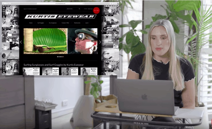
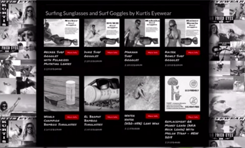
Now that we’ve seen the ups and downs of a popular personal care website like Dollar Shave Club’s, let’s take a look at a brand serving a more specific target customer. Kurtis Eyewear exclusively sells big, wraparound goggles designed to keep surfers’ eyes from getting fried. But is the website helping or hurting potential sales?
What Works
Niche Target Customers
Because Kurtis specifically serves the surfing community, they have a strong customer community around their brand, which means plenty of potential material for compelling social proof. “They have a lot of different customers doing a lot of exciting things,” Gretta says.
Why it works
There are plenty of examples of huge ecommerce brands with niche origins. Amazon, for example, started as a second-hand bookseller before gradually adding more revenue streams and hulking out into the mega-brand we know today.
When a company is first starting out, catering to a niche market is a smart way to gain word of mouth and traction within a select customer community.
What Needs Work
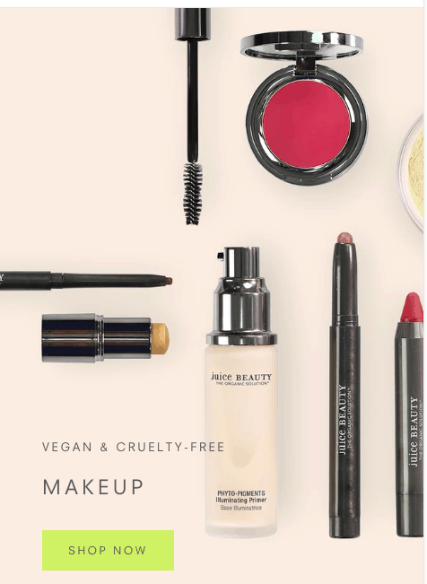
Scrolling Slider
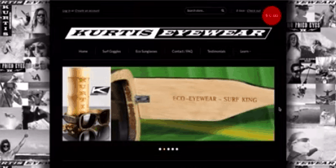
When you first land on the Kurtis Eyewear page, you see an auto-scrolling slider with images of their collections. This is a common feature on website builder templates, and designers apparently love them. After all, it makes it easy to feature more than one image in the same section and it’s an opportunity to direct visitors to different collections or services.
Only one problem: sliders kill conversions.
Why it needs work
“Through conversion optimization, we’ve always found that landers where you’re able to scroll through multiple images in a slider are not as effective as static landers,” Gretta says.
Why might that be? A little thing user experience designers call “carousel blindness.” People just don’t look at scrolling images.
Here’s what Craig Kistler at UX Stack Exchange has to say:
In all the testing I have done, home page carousels are completely ineffective. For one, anything beyond the initial view has a huge decrease in visitor interaction. And two, the chances that the information being displayed in the carousel matches what the visitor is looking for is slim. So, in that case, the carousel becomes a very large banner that gets ignored. In test after test, the first thing the visitor does when coming to a page with a large carousel is scroll right past it and start looking for triggers that will move them forward with their task.
How to fix it
The point is, they may look cool, but skip the scrolling image slider. Stick with a nice, fixed image that meets the criteria of the Hero Image Framework mentioned previously.
Too Many Featured Products
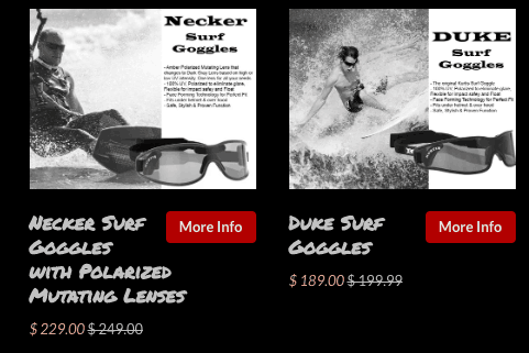
As you scroll down the page, you discover a collection of eight top-selling products. You might think that displaying more products on your home page will lead to more sales, but the opposite is true.
Why it needs work
Marketing studies show that too many options can lead to analysis paralysis or choice overload. When human beings are confronted with too much stuff to consider, it leads to feelings of anxiety or impatience, and that triggers the flight-or-fight response. The last thing you want is to have potential customers fleeing or complaining about your website!
How to fix it
There are best practices galore to improve the customer experience for featured products, but since too many options can be overwhelming, we’ll discuss two here:
Test for an optimal number of products – This is pretty straightforward. Trim down the number of top-selling products displayed to fewer than five, and then test out different combinations to see what the magic number is for your audience. “I would narrow that down to around four,” Gretta advises.
Create a personalized experience – Rather than focus on top-selling products, put the focus on what your visitor is there to find. For example, if you sell meal kits, you can create four featured categories: Paleo, Vegan, Kid-Friendly, and Gluten-Free.
Weak Call to Action
Each of Kurtis Eyewear’s product images features a button that instructs the visitor to “More Info.” Bad move, Gretta says.
Your call to action, or CTA, lets the visitor know what to do next to trigger the desired action. Short phrases like “Buy Now” or “Sign Up” may seem insignificant, but if you don’t ask people to do something, they won’t do it.
Why it needs work
Kurtis Eyewear’s CTA, “More Info,” isn’t actually a CTA. It’s a button label. Presumably, their website visitors are there to shop for sunglasses. So how would “More Info” get them closer to their goal?
How to fix it
A strong CTA is action and benefit-oriented. Focus on what your visitor is on your website to do, and make it clear what will happen after they click the button. Even the smallest change can make the biggest difference in buying behavior. “I would create the call to action button to ‘Shop Now’ rather than ‘More Info,” Gretta says.
No UVP for Products
One of the most important elements of a high-converting ecommerce site is totally missing from the Kurtis Eyewear homepage—the unique value proposition (UVP).
Why it needs work
As discussed above, the UVP helps visitors understand how your product will help them solve a problem and what makes you different from your competitors. Kurtis Eyewear is probably losing a ton of potential sales by omitting this important information.
How to fix it
See above. Articulating your unique value will help you sell. Period.
No Social Proof on Homepage
Like the Dollar Shave Club, Kurtis Eyewear’s website lacks customer testimonials and user-generated content. They have a testimonials page, but that doesn’t help when people are scrolling on the home page.
Why it needs work
As discussed above, social proof is essential to convincing visitors that your product is used and loved by people like them. Social proof is also a powerful storytelling element. Think of each testimonial or review as a mini-story of how real people interact with your products.
How to fix it
See the above section on social proof. Kurtis Eyewear’s devoted following in the surf and action sports community is at the heart of their brand, so bringing social proof elements into their homepage should be an easy fix.
If you have a strong social media presence (or are in the process of building one), featuring your latest social media posts is a smart and dynamic way to capture social proof. “Integrating their Instagram feed at the bottom of the homepage would show a lot of the different types of people using their product,” Gretta says.
Milk-Bone
Beloved doggie treats brand Milk-Bone has had its paws in the pet industry for over a century. But has this old dog learned new tricks to get website visitors’ tails a-wagging? (Paw-don the pug pun).
What Works
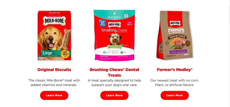
3 Most Popular Products (Visual Merchandising)
Unlike Kurtis Eyewear’s overwhelming collection of products, Milk-Bone’s simplified featured products section displays just three product images with CTA buttons.
Why it works
As discussed above, fewer choices can lead to more conversions. By distilling down to three choices of which products to browse, the customer has a more focused and direct journey to buying.
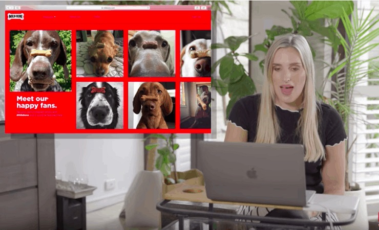
Community Pictures of Dogs With Their Treats
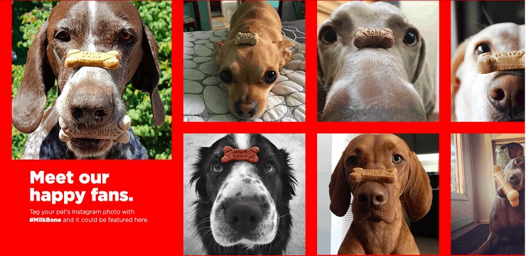
Finally, the social proof we’ve been looking for! Better yet: PUPPY SNOOTS TO BOOP!
Why it works
Do we really need to explain? We’ve got pictures of real pups being very good bois by posing with their favorite treats. What more could you need in this life?
Okay, enough panting over the puppy pics. Milk-Bone’s social proof section is a wonderful example of user-generated content. It’s a win-win: the request for photos of real dogs doing the treat-balance challenge rallied their customer community to engage in the brand and provided their marketing department with awesome imagery and social proof.
What Needs Work
UVP’s Not Clear
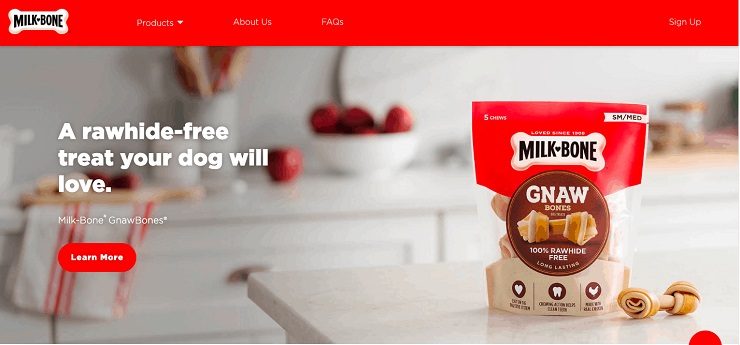
The first headline you see is “A rawhide-free treat your dog will love.” Gretta was a bit confused by this UVP. “I’m not really sure what rawhide is and why I should be excited it’s free from rawhide.”
Why it needs work
While the Milk-Bone UVP addresses a customer benefit, it has terminology that some people (depending on culture or experience) might not understand. Also, the UVP is that their product *lacks* a presumably harmful element (rawhide), so it’s important to explain why rawhide is bad for dogs.
How to fix it
When it comes to writing copy, it’s best to err on the side of clarity. Before using words that are specific to your industry, run a survey to see how many of your target customers understand what a term means. If a significant chunk isn’t familiar with it, skip it or define it in the context of your copy.
Slider Section
Milkbone’s hero section features a series of three sliders. Bad dog!
Why it doesn’t work
See above. Sliders are bad for conversions. Stop trying to make fetch happen. (Get it? Fetch?)
How to fix it
Use a hero image that sits and stays.
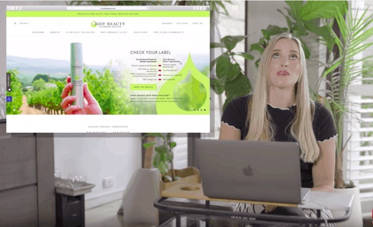
Juice Beauty
Finally, we have cosmetics brand Juice Beauty. Is their website messaging gorgeous, or does it need a makeover?
What Works
Simple Mailing List Offer
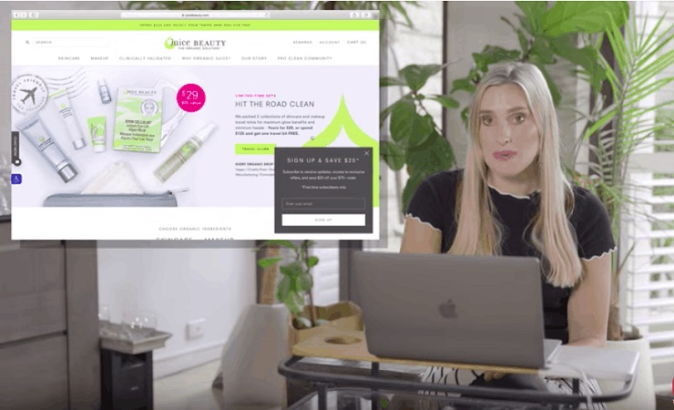
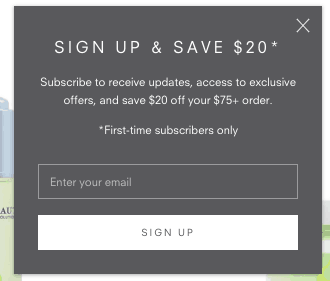
When you first land on the Juice Beauty website, you see a pop-up form offering $20 off your first purchase for joining the mailing list.
Why it works
“A round, fixed sum performs a lot better in my experience than a percentage off because it’s more tangible,” Gretta says. “People can understand straight away that they’re saving 20 dollars off a product, as opposed to 20%.”
Even if the ultimate savings with a percent-based discount might be more, Gretta says dollar figures are the easiest to understand without having to do mental calculations. “One of my favorite sayings is ‘whoever says it the simplest wins,’” Gretta says.
Strong CTA Buttons
The featured product buttons all say “Shop Now.”
Why it works
As discussed previously, a strong CTA is action and benefit-oriented. Since visitors to the Juice Beauty website are there to shop, the CTA makes perfect sense.
Founder’s Story/About Us
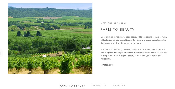
As you scroll down the home page, you see a section featuring Juice Beauty’s founder’s story and another section featuring their mission and values.
Why it works
Juice Beauty’s brand is built around the high quality and purity of its organic ingredients. Marketing studies have shown that if you’re producing a high-quality product, using provenance in your marketing copy could allow you to charge twice as much.
Featured Product + Add to Cart from Homepage
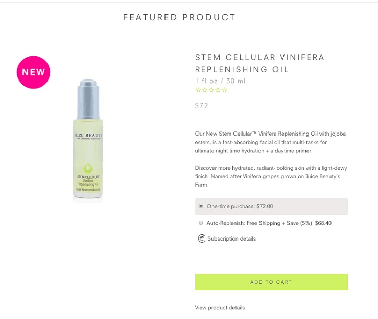
Further down on the page is a single featured product with an add-to-cart button directly from the homepage.
Why it works
“If there’s a couple of products that people go to buy from your website again and again, just having the ability to just shop them right from the home page makes it easier,” Gretta says.
Instagram Feed Integration
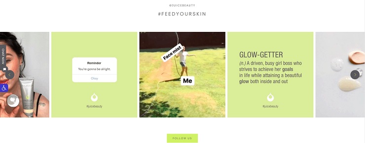
At the bottom of the page, the home page displays the Juice Beauty Instagram feed with a CTA button inviting visitors to “Follow Us.”
Why it works
Not only is the integration designed beautifully (you see the captions by hovering your cursor over each image), but the Instagram feed also supplies a lovely sprinkling of much-needed social proof.
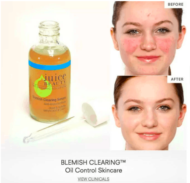
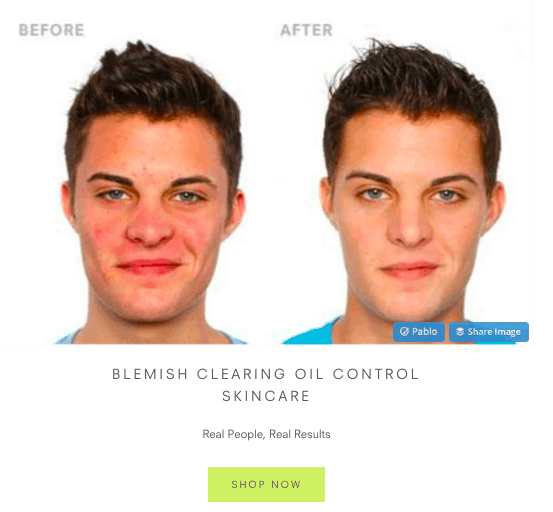
Before-and-After Pictures
In the “Clinically Validated” section of the website, you see a series of before-and-after images alongside the products responsible for the results with a “SHOP NOW” CTA button.
Why it works
Not only do before/after pictures demonstrate positive results, but they also help to personalize the user experience. “You can see the benefit right in front of you, and directly linked to that product,” Gretta says.
What Needs Work
Scrolling Slider
Again with the slider hero section! No bueno!
Why it doesn’t work
As discussed previously and even previously-er, it just doesn’t.
How to fix it
The Homepage is Really Long
Although the Juice Beauty homepage is chock-full of great content, it’s a bit too much for someone to scroll all the way through.
Why it needs work
Visitors often leave a site if they don’t know what to do or if they can’t find what they’re looking for. It all comes back to analysis paralysis: although the design of the Juice Beauty site is clean, the amount of content to review may be overwhelming to the average visitor.
How to fix it
“There shouldn’t be more than four to five sections,” Gretta says. But you don’t know for sure unless you grab some hard data on how each homepage section is performing.
You can use tools like Google Analytics and Hotjar to track how visitors behave on the page. Test to see if people are scrolling all the way to the bottom, how long they’re staying on the page before navigating away, and which sections are the most popular that people navigate to from the home page.
Learn From the Best and the Worst of Ecommerce Websites
Even the biggest brands can miss the mark, or simply overlook opportunities, on their website messaging. Even if your online store has no sales or you’ve yet to launch, if you follow these best practices recommended by Gretta, your website conversions and sales will begin to grow.
Are you guilty of any of these issues Gretta mentions? How many things are you doing “right?” Let us know below!

