The High-Converting Elements of an Online Course Sales and Landing Page
Let’s break down these pages into their various elements. This is meant to be a “buffet” of ideas and you don’t need to use every element in this guide, as some might be irrelevant or not work with your style of marketing.
Being relevant to your audience and faithful to your message is the most important thing to remember.
So, if we were in an anatomy class, how would we break down the parts of a landing or sales page?
- Value proposition or learning outcomes
- Authority and trust
- Security
- Social proof
- Call-to-Action (CTA)
All you need to do is choose and use the elements that work in your case, for your brand. Each element offers an added value, but avoid cramming everything together if it doesn’t make sense for you.
READ MORE: 30 Expert Tips on How to Get 10k More Followers on Instagram
Editor’s note: This article was originally written by Nick Malekos but has been updated and fact-checked by David Hobson, Foundr’s Head of Marketing, whilst retaining the original author’s writing style. David has worked with multiple large brands in the past and is hugely experienced in entrepreneurship and business development.
The Value Proposition: What It Is and Where to Use It
Before you create a landing page or sales page or any marketing campaign for that matter, you need to get this one question right:
What’s in it for your customers?
An online course, like any other product, is the solution to a problem. This time, you are solving the problem by teaching.
The value proposition is important because it defines your landing page’s titles, content, and message. To find the right value proposition, follow this thought process:
- Think about your ideal student. Making a buyer persona will help.
- Define the problem this group of people has as clearly as possible.
- Understand how this course is helping them solve the problem.
- Is there more than one value proposition? Find the strongest one you want to focus on.
- Write down all the value propositions. You should have a primary one and a few secondary propositions supporting the first one.
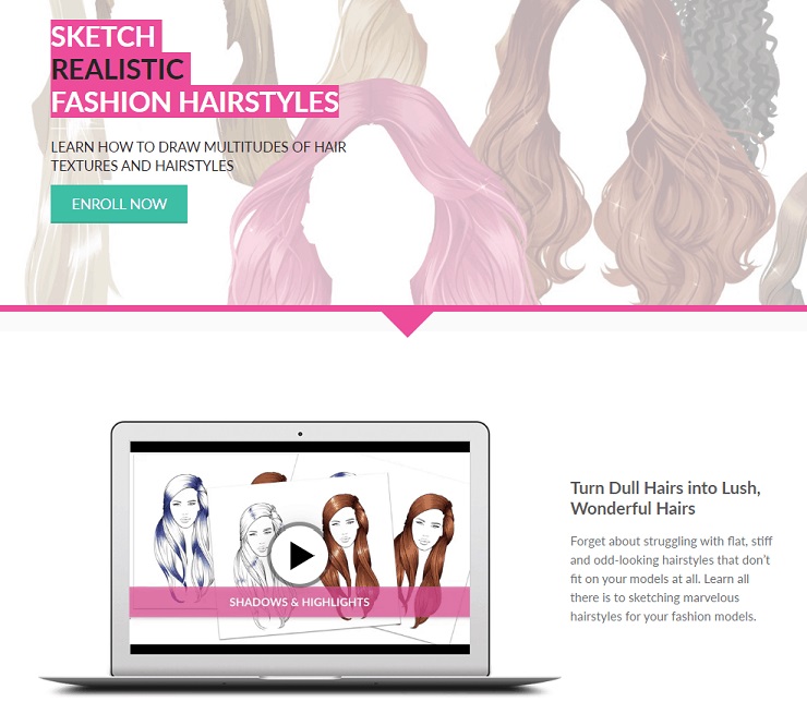
The sales page for your course should be focusing on one value proposition. Let’s take, for example, the fashion course on How to Draw Hair by IDrawFashion.
Making a descriptive buyer persona about who would be the ideal student and giving them some more information along the way to visualize your audience:
Name: Joanna
Gender: Female
Profession: College student / recent graduate
Age: 17-30 (young adult)
Short description: Joanna is an arts major who wants to work as a fashion designer or start designing her own clothes. Her college degree does not offer practical classes on digital design for fashion and she is looking to improve her skills with online education.
Then, you need to define her problem into a short sentence: “I need to improve my drawing skills, and hairstyles are a challenging part of a fashion drawing”.
Using that, you will need to create a clear, strong value proposition that solves the problem: “Sketch realistic fashion hairstyles.”
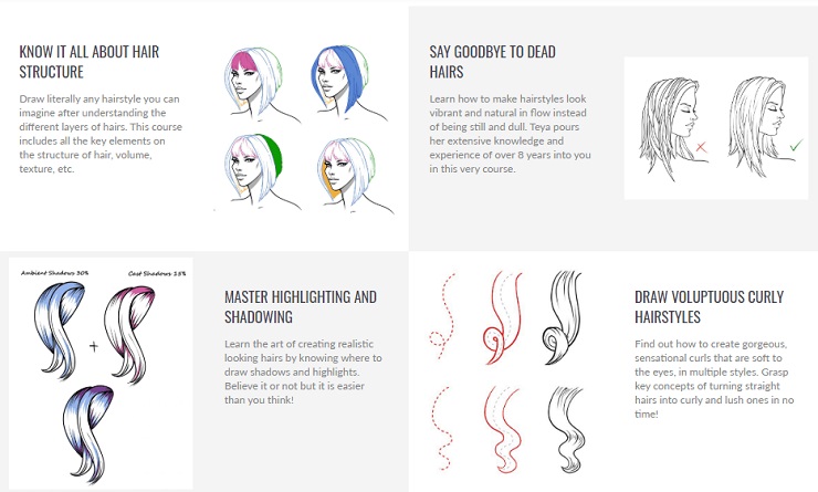
The secondary value propositions can help support your main argument: “No more blocky highlights”, or “Say Goodbye to Dead Hairs”
These can be standalone value propositions for someone who has a specific problem in that area, or a supporting argument for what you are going to teach, relevant to the main value proposition.
Don’t skip this important step. Now you have a primary and a few secondary value propositions that will be helping you focus your message.
Sell Immediately: Above the Fold
The whole point of a primary value proposition is to be above the fold. Above the fold is the area every visitor sees immediately when visiting your site, and drives most impulse decisions.
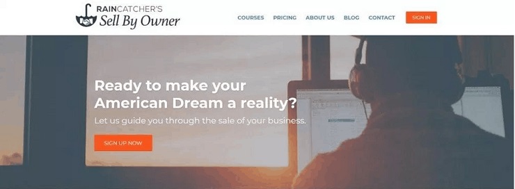
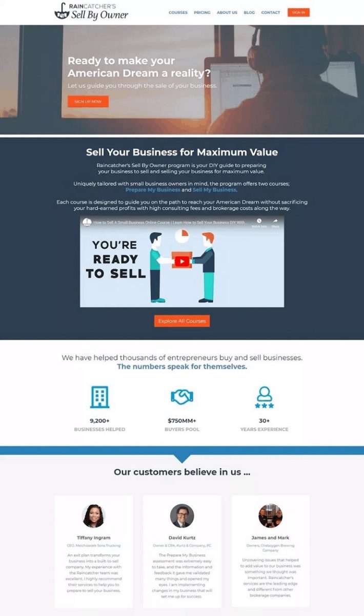
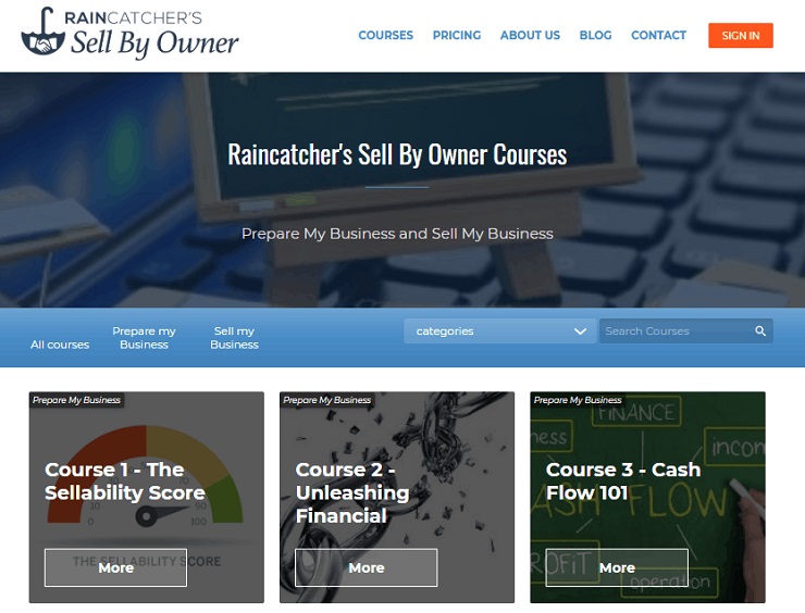
Take advantage of this and show your strongest message above the fold, in big letters, along with a button to buy immediately. Sell By Owner does this perfectly with a strong message on top and a button to sign up.
Above the fold is the prime real estate of your website and should feature your strongest argument and the main action you want a visitor to take.
A Great Introduction Video
Are you comfortable speaking in front of the camera? Even if you are not, you should try it out. An instructor’s video introduction is much more effective than text when communicating your value proposition. A study from EyeViewDigital shows an increase of up to 80% in conversions when using video.
Take advantage of the power of video by adding one to your “above the fold” message.
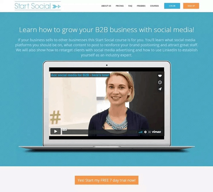
This is how Wendy Thompson from Start Social sells her course on Social Media for B2B. Her video is a personal introduction to the course, positioned just after the title, along with a short description:
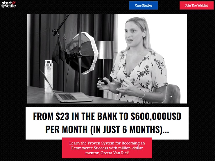
Similarly, in Foundr’s own course, Gretta van Riel is teaching how to Start and Scale an ecommerce store, and the first thing below the value proposition is a video introduction on the course. It includes her personal story, experience, and again what’s in it for the student, all in a short clip:
READ MORE: How Foundr Created it’s First Product Launch
Using Learning Outcomes in the Value Proposition
The learning outcomes of your course clearly state the skill or knowledge that will be acquired upon completion of the course and how it is going to be useful to them. Including these outcomes in the course’s landing page will help your students visualize their end goal and how your course will help them achieve that goal.
This is, in my opinion, one of the most important elements. Learning outcomes answer the question for the potential customer, “What’s in it for me?” in the most natural way possible.
So, what kind of learning outcomes can you use?
- Life improvement – This course is going to impact your students’ lives in profound ways, like finding the perfect match, becoming healthier, earning soft skills they can use in their everyday lives, etc.
- Work-related – This course is going to help them in their work by earning a promotion, landing a job, improving productivity, refreshing their knowledge, etc.
- Learning/improving a new skill – This course will help them learn a new skill and how to use that skill. You could be teaching them to paint their first paintings, learn how to meditate, or how to dance.
- Certifications – Additional benefits of a course can include certifications or continuous education (CE/CPE) credits. Certifications come with a sense of achievement and can be included in a CV, while CE credits might be needed to renew or maintain a professional license.
Since your product is education, deciding early on about the learning goals and objectives and presenting them on your online course’s landing page is essential. Tell your visitors how you have the power to positively change their lives and you will see them signing up in no time!
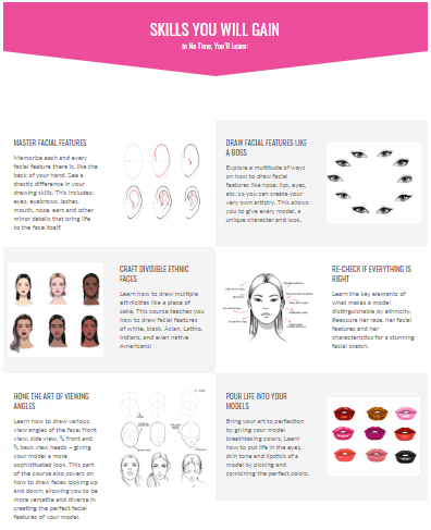
Here’s an example from someone who has mastered the art of showing learning objectives:
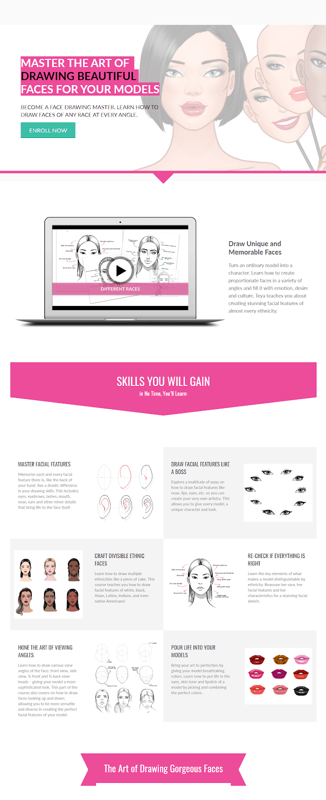
Teya Bozhilova teaches how to draw fashion. The first thing you see after her intro video is the learning outcomes of her course. She uses a combination of illustrations and texts to get her point across in a uniquely beautiful way.
READ MORE: How to Create an Online Course Like Foundr
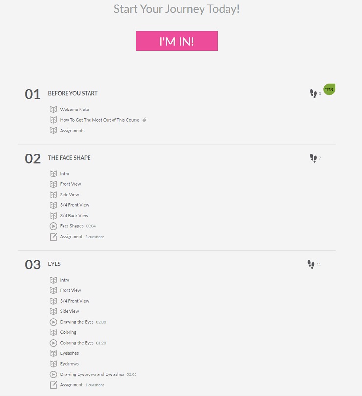
Adding a Course Outline to Support the Learning Outcomes
The course outline is a supporting element of the learning outcomes. While the learning outcome can be summarized in a sentence or two, the course outline is a detailed curriculum. Think of the learning outcomes as the address and the course outline as the directions to a destination.
The course outline, or curriculum, is usually a list or text explanation of the course’s contents. It shows the subjects discussed, any media, exams, assignments, or other important sections your course includes. You can include a description of each section or topic and how you are teaching it.
It’s a great opportunity to illustrate the value they will be getting (which is part of your value proposition). A well-planned, media-heavy course with hours of study material can really shine through its outline, demonstrating why it might be priced at a premium.
Use it to your advantage!
The Power of Authority and Trust
Why do people trust others to teach them?
Human civilization is built on systems of authority and trust. We trust teachers in schools and lecturers in university to teach us important lessons we carry with us through life. We listen to experts who command a certain authority in governments, armies, and even small social groups.
The real question is how can you position yourself as an expert, a person of authority, or someone your students can trust to teach a subject?
You can do that by using signals of authority on your course landing page. Each of the following elements should check a mental box for your visitor:
Instructor Bio
Personally, the first thing we look at in any online course is the instructor’s bio. At Foundr, we have incredibly strict criteria for our instructors, and it’s even part of our company values and core mission that we only work with the best. Before approaching a is this person an expert on the subject? Do they know more than me on the subject? What credentials do they hold?
A well-written bio that showcases your expertise is the first step toward winning the approval of your potential students.
So, your bio should answer these questions:
- How much experience do you have with the subject?
- Do you have any degrees, certifications, or recognitions?
- Have you achieved something big?
- Are you well recognized in your field?
Bonus: Your professional title also matters a lot here. Being a university professor, having work experience in the subject, or teaching something you do for a living can give you a huge amount of credibility.
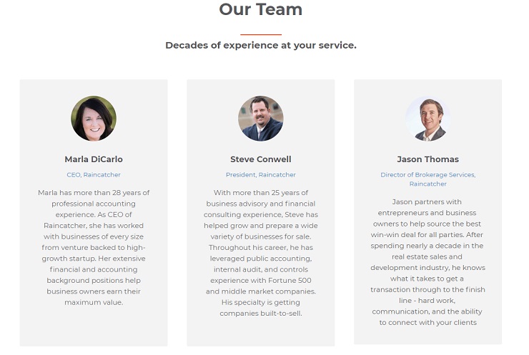
Taking the example of RainCatcher’s Sell By Owner About Page, which is focused on entrepreneurs and SMBs, you can see the instructors have strong backgrounds and professional experience in different areas of expertise.
They mention their individual specialties, and elsewhere on the about page they include their achievements in numbers, which speak stronger than degrees or certifications. For example, helping 9,200 businesses over 30+ years of experience speaks volumes for the team’s capabilities.
Leveraging Social Proof
Another must-have element of a course’s landing page is social proof. People seek out the opinions of others before making buying decisions. These may take the form of student reviews, video testimonials, or influencer shout-outs.
This is especially true when buying for the first time from a vendor. It’s all about trust and how you can build up that trust.
The principles and mechanics of social proof explain how reviews can influence buying decisions, and what people look in them:
- Uncertainty – When faced with an unfamiliar situation, an unsure individual would feel the need to refer to other people for guidance.
- Similarity – Again, in an unfamiliar experience, people tend to follow what their peers do. Similarity can be found in age, gender, school, community, physical appearance, and common experiences.
- Expertise – People also rely on experts to guide them and will turn to people with expertise on the subject. Experts with credentials or popular influencers go a long way when they promote your subject to their audience because of this.
- Number – The more people, the stronger the effect. Think of Amazon’s use of reviews on their products. Wouldn’t you choose a product with 100 reviews over 5?
READ MORE: Are You Ready For A Digital Product Launch?
Media Mentions
Traditional media still matter. TV, newspapers, radio, and digital equivalents can offer a huge credibility boost. The same goes for influential podcasts, YouTube vlogs, or interviews for big online outlets. Such media mentions show that you are an authority on your topic and the media relies on you to get more information about it.
Customer Logos
Do you have customers who work at big, recognized companies? Being a trusted trainer or teacher to employees in a highly respected company will earn you some authority points. This is incredibly important if you are selling training courses to corporate customers (B2B), because your customer logos are a source of authority, much like customer reviews.
Many trainers are selling self-paced courses to corporate teams. Ask them if you can use their company’s logo on your landing page.
Payment Security
When paying online, you have to be careful of unsafe sites and scammers. Ensuring the security of your site and the process of payments is important for many customers, and any uncertainty can be a deal-breaker.
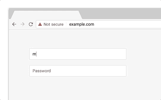
Internet browsers are adding notifications whenever you are visiting an unsecured site. Since last year, Chrome added a “not secure” message that turns red if someone adds information such as email or credit card to a non-secure website.
Make sure you have an updated SSL certificate to avoid this red flag, and ensure a safe and secure checkout for your customers. This is a minimum requirement for doing business.
Money-Back Guarantees
For more risk-averse visitors, a money-back guarantee offers a safe environment for taking the “risk” of buying a course.
Money-back guarantees might look like a headache, but they offer the following advantages:
- They radiate confidence in your product.
- They increase conversions.
- Very few people request a refund.
Refunds are even a right for consumers in many countries, so why not make the guarantee on your landing page and get a few more sales?
Student Testimonials
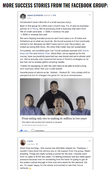
The best way to earn the trust of a potential customer is getting reviews from your current students. You probably already have some reviews in the form of personal messages, emails, or even Facebook messages, which you can ask permission to use.
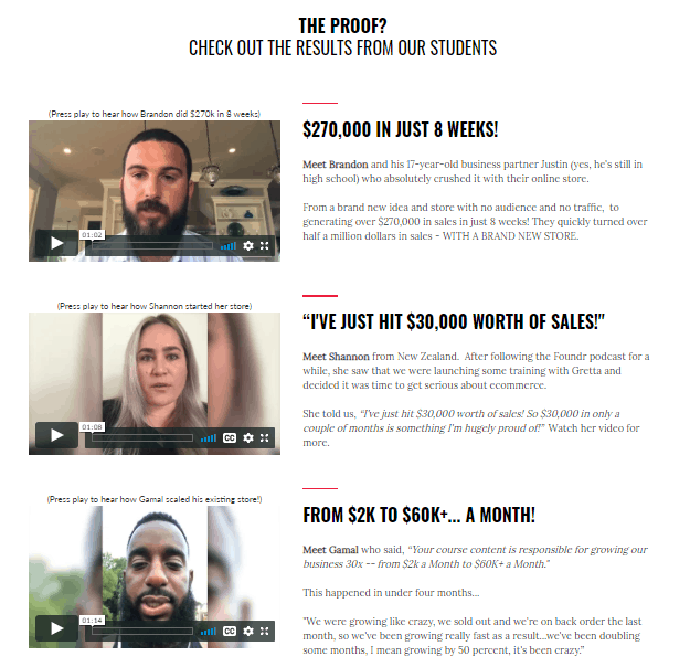
Foundr does this incredibly well! Half of Start and Scale’s course landing page is about customer reviews and testimonials.
Video reviews are even more impressive. Satisfied customers will be more than happy to send you video recordings of their experiences with the course, which is a warmer, more personal way to communicate social proof.
While all reviews can have a big impact, you need to narrow it down to the ones you want to showcase. So you should be looking for reviews that:
-
- Fit your ideal customer persona
- Feel real and exciting
- Present a problem solved or a milestone achieved
Finally, if you are launching a new course, don’t be discouraged by not having any students to offer testimonials. After your initial launch, ask your test-users (from a pre-launch test) or other people who have worked with you in the past, to offer testimonials you can add to your landing page.
The Importance of Focusing on One Call-To-Action
If you were to take one single piece of advice from this guide, I hope it’s this: Focus on your landing page’s main goal.
Every business wants to acquire more customers, but a landing page might also serve just one point in your sales funnel. This means you will need to decide between making a quick sale, getting a new subscriber, or having someone join your next webinar.
What is the ONE action you want your visitor to do?
This is the purpose of a call-to-action (CTA). It’s a not-so-subtle nudge toward the desired action. The CTA will be the focus of your landing page and all your text should be written around it.
Writing the CTA
Visitors of any course landing page will probably only scan the page and then read a few phrases before making a quick decision. So, your CTA should help them get the most information out of their visit and convince them to convert in the quickest way possible.
Here are a few tips on how to come up with a great CTA:
- Short and catchy: The call-to-action is usually a short phrase or word focusing on nudging someone to do something. For example, “Sign Up Today!” You can add more explainer text, your arguments, or a video around the CTA to support it.
- Highly visible: It should be easy to spot and preferably the first thing someone will see after the title of the page. Adding the text on a button with contrasting colors is a good tactic to follow.
- Colors: Choose the colors that convey your message. Red might mean danger and urgency, while green might indicate something relaxing or healthy.
- Multiple CTAs: Repeat the call-to-action as many times as it makes sense on your page. But, as a rule of thumb, try to only have one CTA per screen, so while your visitors are scrolling the page, they see only one of the CTAs.
- Use powerful action verbs: Using powerful words that convey action and strong meaning can help with your conversions. Think about these while writing your message.
Secondary CTAs
In some cases, it makes sense to have a secondary CTA. Especially when selling an expensive course. Your visitors might not be ready to buy immediately, so giving them another option will keep them coming back for more, and they may buy later.
These secondary actions might be lead captures like:
- Downloading an ebook or another free lead magnet
- Subscribing to a newsletter
- Watching a webinar or video
- Joining a free mini-course
- Scheduling a free call
However, not all secondary CTAs are lead captures. You might also offer an upsell or a cross-sell (another related product you offer in your sales funnel after they purchase).
Bundles, subscriptions, or premium courses can also be part of a secondary CTA. If a visitor is interested in one of your courses, they might also be interested in getting a bundle of related courses, or a premium alternative like the course with an added private coaching session.
Tip: Avoid ruining your primary CTA by losing focus and promoting a secondary action. Offer a secondary action in a less prominent way, fewer times in the text, and towards the end of your landing page. It should be an alternative action for those who won’t convert after reading most of your page.
In an example here from Sell By Owner, the primary CTA is prominently displayed in the hero image (top part) and the secondary CTA is below the video with a button to “Explore all Courses” rather than enroll to the complete bundled program.
READ MORE: How to Build a Profitable Marketing Strategy
Online Course Landing Page Examples
One thing we haven’t talked about yet is the design of a landing page. But the truth is, there is no one-size-fits-all solution here. Each course is different, and every landing page is unique to the brand, message, content, and goal.
While figuring out what works best for you, here are some successful course landing pages to inspire you!
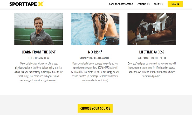
Note that examples in this section and throughout the article from IdrawFashion, Raincatcher, Sportstape, and StartSocial are our customers and they use LearnWorlds to create their academy, landing pages, and online courses.
Example 1: Masterclass.com
With a now-classic look and design, Masterclass.com has become synonymous with courses taught by some of the most famous people in the world.
The home page of the website is a landing page for a full-access subscription, a great example of how you can demonstrate authority with media mentions and well-known instructors. On top of that, it offers a modern, powerful design dominated by black:
Example 2: I Draw Fashion
I Draw Fashion communicates its brand with strong design, visual cues, and beautifully visualized learning outcomes.
It also implements almost every element that I mentioned in this guide:
- An intro video
- Clear CTA (multiple times)
- Clear learning outcomes (what’s in it for me)
- A course outline
- Authority signals with a strong instructor bio
Example 3: Raincatcher’s Sell By Owner
Here is an example of a high-ticket course targeting CEOs and business owners. This course’s landing page focuses on the value of the course and its outcomes, supported by both data and testimonials from successful students.
The main landing page for the program is the homepage, but as mentioned before, there is a secondary CTA to allow the “exploration” of individual courses for those who are not ready to buy the whole bundle, plus a call to join the newsletter at the bottom of the home page.
Example 4: Udemy
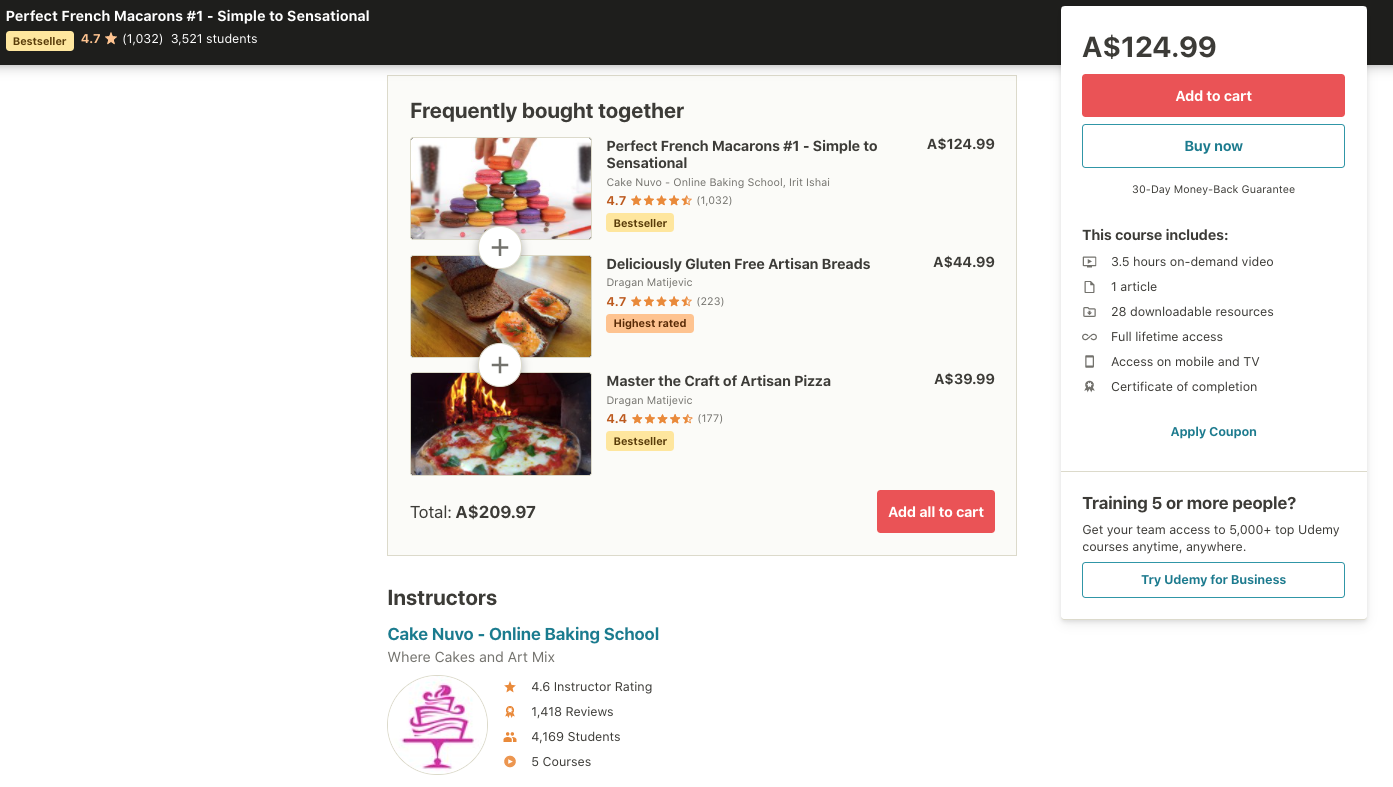
As one of the best-known course marketplaces, Udemy offers the same successful structure for each landing page. You can see that the page checks every point:
- Clear value to the student (what you will learn)
- A primary CTA: “Buy now”
- Course contents
- Authority and security (from the Udemy brand)
- Student reviews and ratings
It also goes a step further and upsells by offering similar courses (bundling them up) as frequently bought together.
When Multiple Landing and Sales Pages are Needed for an Online Course
Is there a need to create multiple landing pages to sell an online course?
Yes and no!
In most cases, you should focus all your energy and resources on a single landing page per course. For newer online schools that only sell one course, a single bundle, or all-inclusive memberships, this page should be your homepage. The fewer steps you have to check out, the easier the sell.
However, while growing a successful online academy, you may find yourself with many courses and serving multiple different markets. So, ultimately, you may need more landing pages.
Let’s explore those cases.
Segmentation
When you are communicating to different segments (groups) of your audience, you might want to create a separate campaign for each one.
Different demographics: For example, a yoga class might be suitable for both elderly and pregnant women. It might be difficult to address both of these groups’ challenges in a single page. Helping each group to better see themselves in your messaging will increase conversions.
Different ad groups: An ad you are running to bring visitors might raise some expectations you will need to address on your landing page. Even if this means just changing the headline or a few sentences on a landing page, it can help you sell more courses.
For example, a programming class to build a mobile game might offer a fun new skill for some buyers or a professional skill for others. So you might want to try different approaches and landing pages that can help you test those two approaches.
Different applications: This is when your course can be the solution for different needs. For example, a first aid course can be a requirement for getting a professional license renewal, an obligatory certification requirement for a company, or an important life skill for an individual.
Tip: Creating your buyer persona will also help you when segmenting audiences.
READ MORE: Psychographics 101: Everything You Need to Know; How It’s Used in Marketing
Translating a Course
You might have noticed that Foundr has started launching our courses in Spanish.
You might be launching your course in a different language, requiring you to translate the material or add subtitles. This is a very common and effective way of expanding your market into non-English-speaking countries, and you might even have a different pricing strategy for these countries.
Special Offers
Are you running a very specific promotion? You might want to test a different price, address a new segment, or offer different perks. A big promotion could require a new landing page for your online course, too.
Branded Corporate Landing Pages
When targeting a big corporate client, you can create a unique, branded landing page to send them. This can include additional information, different pricing, and reasons that are specific to the company. Investing time to pitch to a potential big customer is always worth it.
READ MORE: How To Develop An Online Course
Don’t Forget
You are almost ready to go live! But, wait.
There are a few more steps to remember before publishing your landing page. Here is what you need to take care of for a perfect launch:
Mind the Entrance: Desktop vs. Mobile
More than half the visitors to a website come from a mobile device. This means that you have to take care and test how your page looks on mobile devices, especially if you are targeting ads on mobile devices.
However, mobile visitors buy less often than desktop visitors. While revenue from mobile will be lower, optimizing the landing page of your online course for both desktop and mobile devices is important to get as much as possible from both.
People tend to browse and research on mobile and come back on the desktop to finally make the decision and the purchase.
Proofread the Page
Once is never enough. Proofreading is incredibly important. A typo can cost you, especially if it’s in your title or call-to-action.
Reading your page, again and again, will make you blind to small mistakes and typos. So ask your colleagues or friends to read the page carefully. A fresh pair of eyes is always better than the person who wrote the text.
READ MORE: Psychographics 101: Everything You Need to Know; How It’s Used in Marketing
Keep It Simple
When writing copy for your page, it’s easy to just throw everything in and end up cramming together every argument, button, and link you have. This is bad for sales. Simplicity here is king!
Take a look at your page:
- Is there anything you don’t need?
- Is there something that might confuse visitors?
- Do you have too many buttons?
- Do you have links to articles that might be a distraction?
Some marketers even remove the menu from certain pages to avoid distractions. Try to declutter the landing page and focus on offering a path that brings real results.
Testing
Similar to proofreading, you should ask another person to test your page before publishing it. Testing can uncover last-minute flaws or mistakes in design, text, or even technical issues.
And yes, you should also do a few payment tests. Most payment gateways and checkout systems allow testing the checkout process.
It is essential to know the whole process your visitors go through to pay you. Testing it yourself and asking a few trusted persons to do it too can l help you find hidden mistakes and avoid failed purchases.
Going Live
You are ready! After making sure that everything works, your course landing page is ready to go live and you can start signing up students for your academy.
But, your work doesn’t end there…
READ MORE:The Ultimate List of Every Tool You Need To Create Your Online Course
Always Keep Improving Your Online Course’s Pages
Launching your online course sales and landing page is just the beginning. When you first release a page into the wild world you will start getting data, information, and feedback. The next step is to improve your page based on these results.
The world is always moving, your competitors are always adjusting their strategies, and so should you.
How can you improve your results?
A/B Testing
Split testing is all about making small variations on pages. If you were to test a different word, like program instead of course, or different button colors and see which one works best, then you would be doing an a/b test. You send half the traffic to one page and the other half to the other page.
This is a great way to implement small but effective changes to your marketing strategy and improve results over time. Use analytics software to track performance and decide which landing page will become your new default!
Incremental Optimizations
Both you and your market are changing over time. You should be coming back and doing small improvements to your pages over time. Remember when we talked about reviews? If you didn’t have any when you first started, you might be adding a few from your first students.
Maybe there is a new trend in your industry and you want to incorporate this trend into your sales page. Could be new diets, jargon, memes, or even legal requirements for professional courses.Finally, always keep an eye on data from tracking and analytics software, so you can monitor how the page is doing compared to previous changes and whether new improvements work or not.
READ MORE:How to Create an Online Course Like Foundr
Updating the Content
Did you add new content?
- Videos
- Ebooks
- Certifications
- Tests
- Exercises
Update your content outline every time you add new material. You might also create huge content updates where your course is updated for a new year with new material and industry standards.
Ready, Set, Go!
This is your time to shine and start selling your courses!
Remember, an online course’s land and sales page is how you communicate the value of the product you are offering to your end customers. In some cases, it is your one and only opportunity to get their attention and make a sale.
Even if you don’t get it perfectly right the first time, it’s vital to keep working and improving the pages. You are already spending your advertising dollars and investing your time, so you might as well stick with it for the long run.
Have any questions about how to create a great landing and sales page? Run into any problems? We’d love to help you out further in the comments.

