Marketing isn’t only about generating traffic. It’s also about turning that traffic into revenue and loyal customers—conversions. And good copywriting is the key to transforming a homepage into a conversion machine.
Do you ever think about why your business has a website? Is it another avenue for you to promote your products or services? Is it your pretty little piece of online real estate?
While both of those are technically true, your website’s biggest job is to convert customers. And your homepage is the key to that conversion.
Copywriting is intimidating, as it’s somewhere between an art and a science. Bad copywriting can do outsized harm to the success of your business. But it doesn’t have to be inaccessible to those of us who have limited budgets. By sharing some lessons learned from experience, we can provide a solid foundation anyone can use for effective copywriting.
In this article, I’m going to talk about some specific tips and techniques for writing up killer homepage copy. The skills below (and the ones we’ll cover in future posts in this series) are excellent tools to add to your entrepreneurial toolbelt. And you don’t even need to be a writer to use them.
Tips for Writing a Homepage That Converts
A homepage is an interesting thing. It needs to make a cohesive, strong impression of your business, but also serves as a portal to the rest of your website’s other content. So it needs to both stand alone as a piece of work, and also persuade visitors to go a step further.
When writing for homepages, you want to reel in and hook your audience, while also encouraging them to check out the rest of your site or follow through with a clear call-to-action. It must compel readers to take another step, ideally to contact you, sign up for your email list, or keep navigating your website.
That action generated is what we mean when we say “conversion,” turning a mere visitor into a sales lead.
While conversion copywriters exist—and they’re worth every penny—not all startups and small businesses can afford them. If you’re a little short on pennies right now, there are a few techniques you can master so you can write your own copy. You might not win any awards, but the result will be sufficiently effective (and at the very least not do any damage!).
In this next section, I’m going to first review some copywriting best practices. Knowing these are essential to creating a high-converting homepage. Then, we will jump into specific homepage copy tips and strategies.
FREE Masterclass: The Genius “10-Step Copywriting Framework” Behind 11 Different 7-Figure Launches
General Copywriting Best Practices
Copywriting is different than any other type of writing. It’s typically shorter than blog and article writing, and it must pack a lot more power and punch into fewer words and phrases.
We’ve all heard the statistic about human attention mirroring that of a goldfish. Albeit a little pathetic, that statistic rings true. (In fact, how many of you have skimmed through this piece already? It’s OK—I’m guilty of the same thing.)
The hard truth is that people lose interest easily, especially once they hit a homepage. I wouldn’t take it too personally if I were you, but I’d also say that it’s partially your responsibility to get them roped back in. That’s why it’s smart to learn writing techniques and how to apply them to your homepage, product or service pages, and other spots.
Before you tackle your own homepage copy, let’s discuss some best practices that are vital to keeping your visitor’s attention and interest.
1. Keep Your Sentences Short, Even Broken
Broken, you ask? But … that goes against everything you’ve learned.
Sure, your high school English teacher most likely spent weeks lamenting about incomplete sentences. But the rules of copywriting aren’t the same as the rules of grammar school. Short sentences work best, and they don’t always have to be complete sentences (with a subject and verb that complete a thought).
That’s because short copy is easier to read, and makes life easier for its readers.
People often make the mistake of thinking their website copy needs to deliver a full description of the company’s mission or services, making it sound way too much like internal documentation or something you might include in a quarterly report.
Good homepage copy should instead sound like dialogue in your readers’ heads. Short sentences capture the rhythm of conversation and create the semblance of a tête-à-tête between you and your reader.
Right now, Foundr’s homepage reads:
Even the greatest entrepreneurs had help.
Now, what if it read like this instead?
Welcome. Foundr is a media and education company that offers a variety of helpful resources for budding entrepreneurs as they build, market, and scale their businesses.
While proper and thorough, that second sentence is way too long, slowing the reader’s momentum and excitement to a crawl. Foundr cuts right to the chase and captures a lot more attention and intrigue with its choppier homepage headline.
2. Don’t Be Fancy
Oh, you fancy, huh?
While you might’ve won your sixth-grade spelling bee, unfortunately, using too-big words in your homepage copy will only lose readers right off the bat.
Advertising exec Shirley Polykoff once said, “Copy is a direct conversation with the consumer.”
The key word here is direct. Keep your copywriting plain and to the point.
If you’re used to writing flowery copy with big words and elaborate phrases, stop. There’s no need for that in the copywriting world, especially on your homepage.
On this note, sometimes I’ll see lengthy copy used in an effort to be polite:
If you’d like to join our email newsletter, we’d love for you to enter your email address below and click Subscribe.
While that’s nice and all, readers don’t need that much to get the gist. They’re also not going to be offended by short, succinct copy. In fact, I bet they’ll be thankful for time saved.
Try this instead:
Want to join our newsletter? Enter your email to subscribe.
Honestly, there are a few hundred different ways to write that copy, but it’s not hard to choose the right angle.
The goal for this homepage copy should be: simple, straightforward language that captures the essence of the “ask” in as few words as possible.
That’s the theory of direct.
3. Ditch the Superlatives and Hyperboles
It’s not always easy to communicate passion and umph while writing. But I can tell you that the right way is not through superlatives and hyperboles. (What a mouthful, huh?)
Superlatives refer to words like best, greatest, finest, fastest…pretty much anything that ends in -est.
Hyperboles are extreme exaggerations that aren’t actually true. You’ve probably heard someone say, “That line was so long I had to wait forever!” or “I have a million things to do today!”
When you’re super passionate about your product or service, you want to tell the world about it, right? Well, in a world of “I can’t even…” and “I literally don’t believe…”, it’s easy to slip some exaggerations into your copy.
But the truth is that superlatives and hyperboles on your homepage (especially when making a first impression) can make you sound insecure, unimaginative, and lazy. It’s even worse than that, however, as it immediately makes what you’re saying suspect, as if you’re a late-night infomercial.
Instead, the best way to communicate quality is with detail. This may sound contradictory to my last points, but it’s definitely possible to include direct and short detail in your copy. Listen up.
Anyone can say this:
We offer the finest and fastest auto repair services in town—guaranteed.
But, how much better is this?
Get your car fixed in 48 hours or receive a 30% discount.
Whew. Not only is there specific detail in that sentence (without going overboard), but it also offers a distinct promise that illustrates the guarantee, instead of just making claims.
4. Use Power Words
There are some words that hold more sway than others. While superlatives don’t, here are a few that do:
- You, or a person’s name (if possible)
- Free
- Instantly
- New
Using You helps you put yourself in the mindset of the reader. While reading your homepage copy, they’ll most likely be asking themselves, “What’s in it for me?” Writing in second person will help them answer that question, with you in mind.
Words like Free, New, and Instantly tap into the reward center of your readers’ brains. They’ll associate your copy with positive outcomes and be incentivized to keep reading your homepage, researching your product or service, and possibly make a purchase.
Now that you know a few important copywriting techniques, let’s jump into specific strategy for homepage copywriting.
FREE Masterclass: The Genius “10-Step Copywriting Framework” Behind 11 Different 7-Figure Launches
Writing a Homepage that Intrigues and Converts
1. Spend Time on the Headline
Much like a news article or a blog post, your homepage needs a headline. As in these other cases, the headline is also the most important component.
The headline is where and how you define your business, in the fewest words possible, typically seven to fifteen. This is what I was talking about when saying that copywriting is packing a big punch into a little package.
Because people have such short attention spans, they won’t meticulously read your homepage copy. Instead, they’ll likely scan your page to see what’s interesting.
This means your headline—the biggest, boldest piece of copy on the page—could be your one chance to snag their interest.
No pressure! (But feel free to return to Foundr’s homepage for inspiration.)
For your homepage: Focus most of your time writing your headline. In fact, you should create 20 to 25 versions. Most of these will probably suck, but you’ve got to give your copywriting muscles a chance to warm up and put something down on paper.
What should be in your headline? Ask yourself these questions:
- What problem am I solving?
- What’s the very best feature and benefit of my product or service?
- What have my customers raved about the most, and what words have they used in reviews and testimonials?
- What keywords will help my website’s SEO?
Answer these questions, then run your answers through the best practices above. Keep your headline direct, concise, clear, and true. Again, it’s perfectly fine to have more than one variation. You can always A/B test your headlines to see which produce the best click-through and conversion rates.
2. Highlight Benefits, Not Features
As consumers, we’re not only easily distracted, but we’re also very self-centered.
Consumers are selfish creatures who really only care about how things benefit us. Sound harsh? Well, it’s important to understand this when writing for your audience.
Your audience will care more about the benefits of your product or service, not the features or the solution. Old-school tactics encouraged “solution sales,” where salesmen would push a solution and explain why it was better than a competitor’s.
While that’s good in theory, it doesn’t quite resonate with customers anymore. With advances in technology and search engines and an abundance of choices in the market, a consumer often enters the purchase decision-making process already knowing what their solution will be. They don’t need it explained.
When introducing your product or service on your homepage, focus mainly on benefits. How will consumers benefit from using your product or service? Why should they purchase it for the solution they’re seeking?
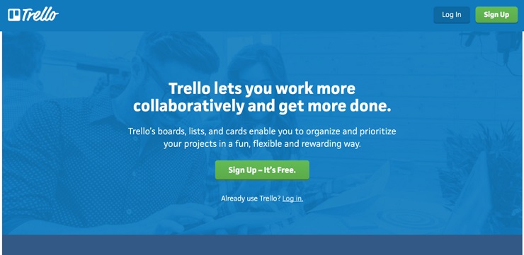
Let’s look at Trello as an example.
Trello is a web-based project management software. The solution it provides is online project management for individuals and team.
Instead of simply slapping the solution on the homepage, Trello opted to outline its benefits: Users work more collaboratively, get more done, and do all of this in a fun, flexible, and rewarding way.
Notice the words “web-based project management software” aren’t anywhere on the homepage. That’s because consumers already know what they’re searching for by the time they get to the homepage; Trello is simply telling them how their product will benefit them.
For your homepage: Take a moment and jot down the benefits of your product or service. Look back at customer reviews and testimonials. Consider asking your audience how they benefit from it. What makes the outcomes you provide special? How do they change your users’ lives for the better? Use this language when crafting your homepage copy.
3. Leverage Testimonials
It’s always a great idea to include a customer testimonial or two on your homepage. No one promotes your product or service and converts visitors better than a happy customer.
You can spend all day learning copywriting techniques and skills, but the truth is that you’ll never write copy as good as your happy customers. That’s because good copywriting isn’t only about skill, technique, and talent. It’s about the source behind it.
You can write the very best conversion copy for your homepage, and it still won’t be as powerful as authentic content written by a real customer. Consumers will simply always trust each other more than they trust advertisements.
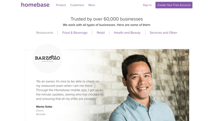
Take a look at the homepage of Homebase, an online employee management software.
This section is a few scrolls down on their website, but it’s still valuable information. Instead of taking the time to transcribe all their features and benefits, Homebase let this customer do it for them.
Better yet, they include a full name, photo, and restaurant information, further humanizing and authenticating the testimonial.
For your homepage: Review your customer testimonials. If you don’t have any, send a free survey through SurveyMonkey or Typeform, or pull some content from your Amazon or Facebook reviews (if applicable).
If you do have reviews, skim through to see which customers have commented on your benefits in a clear, concise way. (I’m not saying to edit your reviews—that’s bad! I’m simply suggesting you pick the best of the best to put on your homepage.)
Don’t feel the need to feature an entire testimonial. Remember the technique of keeping our copy short and to the point? The same thing goes for sharing reviews. Sometimes just a sentence or two will do.
4. Don’t Forget to Ask for Action
If the entire point of your homepage is to convert a lead, don’t forget to include a call-to-action.
Sure, some visitors may come to a purchase decision on their own (go, you!), but most will need a little nudge in the right direction—toward the product pages, email subscription box, or whatever the goal of your homepage is.
Your website alone should provide clear navigation through its menu and footer links, as well as various buttons as you scroll through the homepage. But in this case, I’m talking about a singular CTA that your homepage copy leads to.
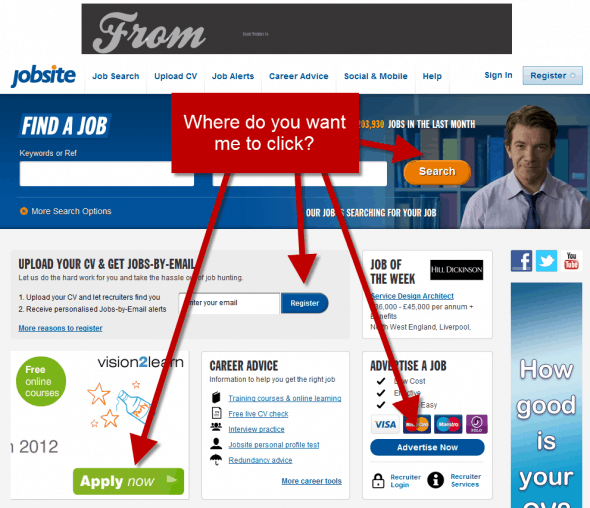
Bottom line, where do you want new visitors to click? Do you want them to sign up, subscribe, learn more, search, or purchase? While all of those may actually be options available on your site, your homepage should explicitly direct them toward just one.
Take a look at this website overhaul shared in this Yoast article. This is what Jobsite.co.uk used to look like.
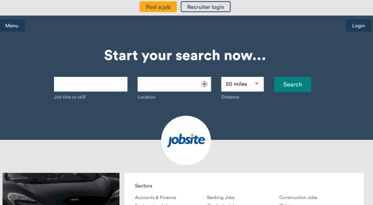
In 2016, they updated their homepage to reflect a singular call-to-action: Finding a job.
For your homepage: Ask yourself, what is the one thing you want new visitors to do when they land on your website. There’s no right answer. Just ensure your homepage copy reflects why and how they can do it.
Don’t forget to include a big, fat CTA! Those few words can literally make or break a conversion. Don’t let any slip through your fingers.
FREE Masterclass: The Genius “10-Step Copywriting Framework” Behind 11 Different 7-Figure Launches
Flex Your Own Copywriting Muscles
I hope this article gives you confidence to put on your homepage-writing cap. Like I said, professional conversion copywriters are worth every penny, but not all of us have those pennies to spend. Even if you can’t go with a professional yet, there’s no reason to produce lackluster or self-defeating copy.
Regardless, it’s smart to have these skills mastered, even if it’s just to help with hiring the right consultant. As entrepreneurs, it’s best to be jacks of as many trades as we can!
If the goal of your website is to turn visitors into customers (which it should be), employ these copywriting tips for surefire conversions.
Have you written copy for your own homepage? What’s working and what’s not working? Share with us in the comments!


