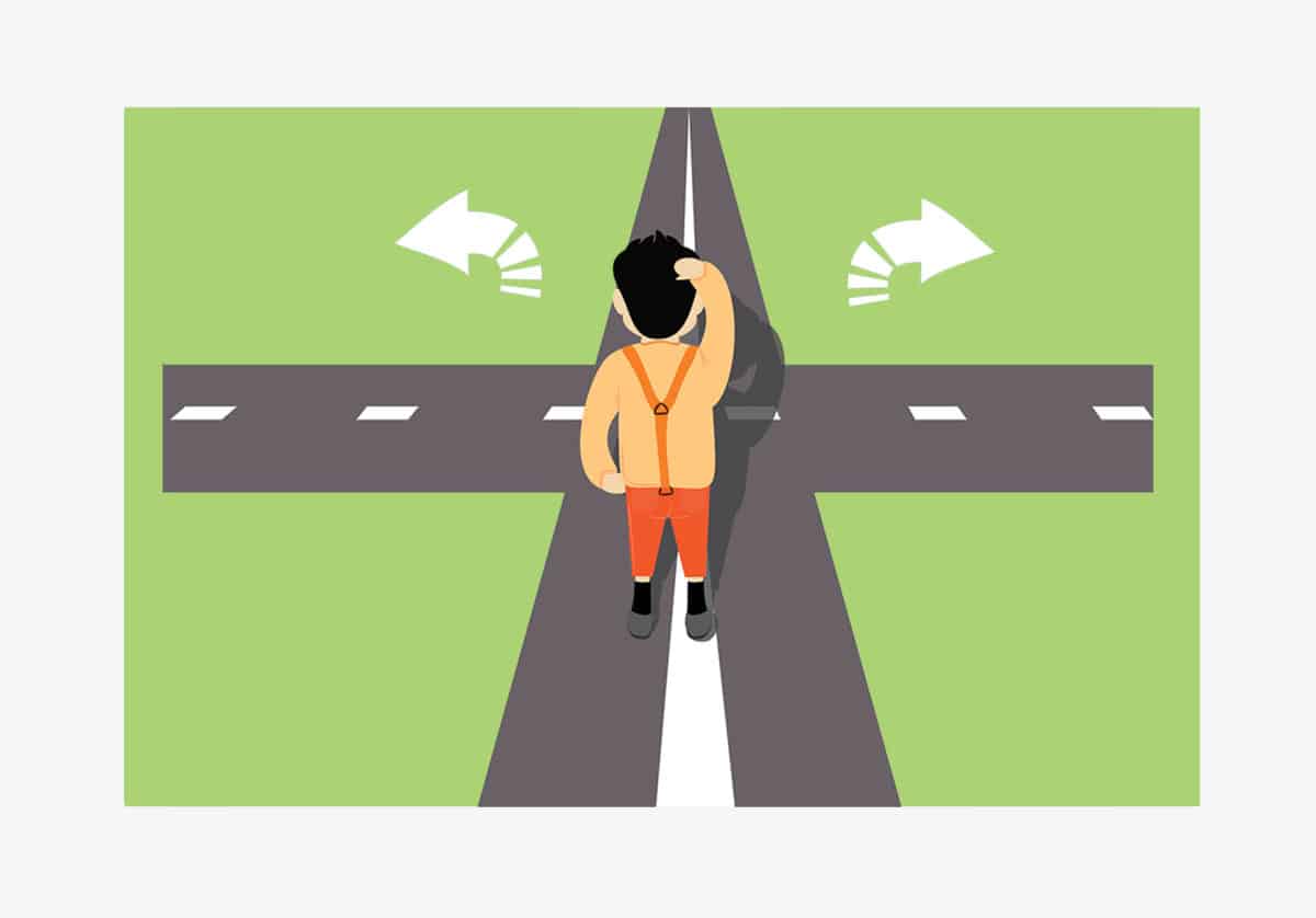
The common wisdom among conversion experts these days puts a heavy emphasis on eliminating distractions to increase conversions and presenting users with fewer options.
Barry Schwartz, in his beloved book The Paradox of Choice: Why More is Less, describes “analysis paralysis” and buyer’s remorse as an outcome of too many choices. He suggests eliminating choices to reduce consumers’ anxiety.
Similarly, Alvin Toffler talks about “choice overload” in his book Future Shock. He argues that too many choices that are equally good will make it difficult for consumers to choose, and ultimately send them fleeing.
Online business experts and bloggers have been sharing the same sentiment as gospel for some time now.
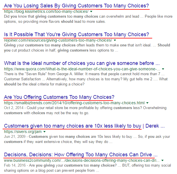
Consider how a quick search for “how many choices should you give a customer” brings the following results. Note how all of them are painting “too many choices” in a negative light.
So there you have it. Offering too many choices is bad. Offering fewer choices is good. Hence, giving just one choice must be the best way to go to increase conversions. Right? After all, that’s the fewest number of choices you can offer. If less is more, why mess around with anything else?
If you’re following this line of reasoning on your conversion pages, you might be in for a surprise.
Presenting just one option can actually hurt conversions and cost you potential customers, because of yet another, albeit less-discussed, phenomenon known as “single option aversion.” Put simply, when consumers are presented with just one option, they are less likely to choose, because it triggers an automatic desire to look for more options.
So, what’s the ideal number of choices on a landing page or sign up form to increase conversions?
In this post we will look for the answer to this long-debated question, and the conclusion we come to will provide an instant boost to your conversion rates.
Why a Single Option is Not Always the Best Choice?

It’s certainly true that customers appreciate when the options are narrowed down to a selected few. All the hype about decision fatigue and analysis paralysis, or whatever catchy term you want to call it do hold some merit.
But strip it down too far, and they will not appreciate when there’s no other option. That’s because consumers do, in fact, like to make decisions, so long as they are not overwhelming decisions. Consumers like to have some options so they can have the experience of making a free choice.
Let me explain.
In one behavioral science study, participants were divided in three different groups and asked to purchase DVD players.
The first group was presented a single option, which was to buy a Sony DVD player. The second group was also given a single option, to buy a Philips DVD player. The third group was presented with both of these options and given the opportunity to choose.
Guess what?
Just 9% from the first group and 10% from the second showed any intention of buying.
In the third group, however, 32% chose Sony and 34% went for the Philips DVD player.
That is a 650% increase in the conversion rate, just because this set of people had more than one option. Having no alternatives prevented a large majority from buying the product.
See where we’re going with this?
Users are less likely to buy or sign up if they are presented with just one option. They will be left unsatisfied with the consumer experience, itching for more options, better alternatives that might be out there waiting.
This means if you’re looking to improve your conversion rate, sometimes all you need to do is add another option.
Let them make a choice.
It’s as simple as that.
It doesn’t have to be an equivalent choice. Simply having any other option will curb that natural instinct to look for alternatives.
How Does it Work?
Consumers like to make comparisons and ensure that they are getting the best deal. They feel more satisfied after making a decision after they have weighed the alternatives. That’s the reason comparison sites have managed to do so well.
Let’s see exactly how it works on a website.
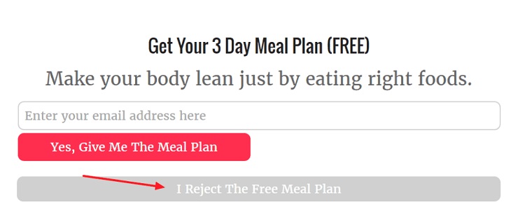
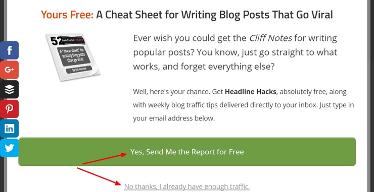
You may have noticed something similar on a number of website pop ups these days. As soon as users are presented with two choices, their minds start weighing the options. Namely:
- Saying yes to a free cheat sheet for writing blog posts that go viral
- Saying no because they already have enough traffic
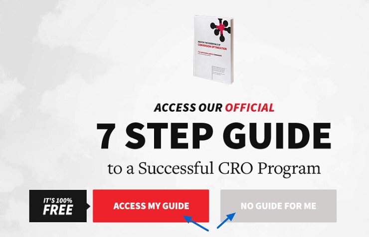
Websites will often present a fairly absurd or even comical second option like, “I already have enough traffic,” which is intended to make it easy to choose the one that you are aiming for. I know it might seem like it’s not a true set of options, and that it’s pretty obvious you’re simply nudging them to pick the affirmative one. But even the visual presence of two choices provides a release valve for that pesky trapped feeling known as “single option aversion.”
A couple of other tools I like to use to further nudge the decision-making process are a full-screen pop up or a welcome mat.
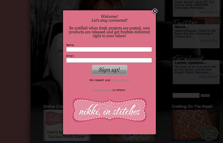
Full-screen pop ups can be highly effective. Here’s one story of a blogger who saw 1,375% growth in signups after using the following pop up:
This version resulted in 7,473 sign ups compared to just 643 coming from the sidebar form in the same period of time (even without the second choice included!).
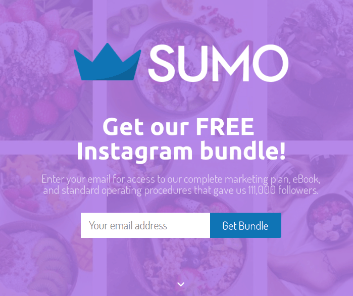
You can also consider using a welcome mat, which is a full-screen call-to-action that appears on top of your content when someone lands on the website. It is a little less annoying because it looks like a part of the page and doesn’t pop-up into your face like that creepy clown in the box.
Also, the visitor doesn’t need to look around for cross button, they can simply click on the scroll down button if they don’t want to sign up.
Again, even without the multiple choice strategy put into effect, a welcome mat like this one can improve your conversion rate by 70%.
Source: Sumo.com
One word of caution, full-screen pop ups can affect your SEO, because Google doesn’t like interstitial ads. It has recently shifted to a mobile-first index and full screen pop-ups are not really mobile friendly. They take up the entire space and users have to find and carefully tap the small dismiss button to see original content. If you are using a pop-up, make sure that it covers only a small space on the screen and it is easy to dismiss.
You can also set these popups to appear after the visitors have spent some time on your website. These are a little less irritating than the ones that instantly appear when someone lands on the website.
What About More Than 2 Options?
Not a bad idea.
In fact, this allows you to leverage not only single option aversion, but yet another type of aversion entirely, which can help you land even more customers and increase conversions. This is known as “extreme aversion bias” and it goes like this:
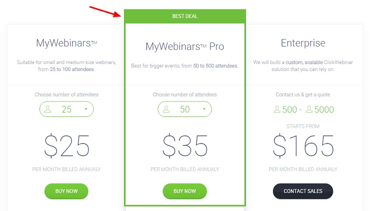
People like to play it safe and avoid extreme options. When given three options, they will usually take the middle path.
This is something you see quite often on SaaS pricing pages, often presented as three plans with an emphasis on the mid-range option.
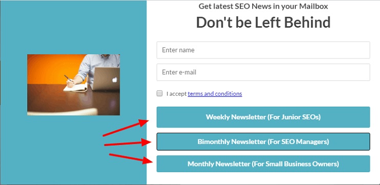
Again, don’t get stuck with three options model just because it’s the most common. Try four or five options and see if it makes a difference.
You can also use it in signup forms, which will add some novelty factor, since we don’t see too many pop ups or signup forms with more than two choices.
So now that we’ve countered the myth that one choice is ideal, does that mean the more options we have the better?
Actually not!
As mentioned earlier, too many options can indeed result in analysis paralysis or choice overload. This was famously demonstrated in a study by Sheena Iyengar, the author of the award-winning book “The Art of Choosing.”
The classic example is one in which two displays were set up in grocery stores, one with 24 varieties of jam and the other with just six. The one with more choices attracted a bigger crowd, but it was the one with limited options that resulted in more sales.
So while it’s necessary to give some options to provide your audience with a sense of control, you should avoid giving them too many, because it can cause decision fatigue. So that means, as with most things, we need to find that sweet spot to increase conversions.
So What’s the Optimal Number of Choices?
Famed Psychologist George Miller suggests that the magic number is seven, plus or minus two. That’s how many options our mind can process at a single time, according to Miller’s landmark research from the 1950s.
However, it’s really hard to give a universally powerful number that works for all circumstances. Like any other sales or conversion techniques, you will have to conduct some A/B tests, and try different combinations to find what clicks with your audience.
When in Doubt, Personalize:
Instead of trying to figure out the magic number, you can consider personalizing the number of options.
This is what’s known as guided selling. It’s pretty much the same principle that retail stores use, with the help of in-person sales associates. At least the smart ones do. Here’s an example:
I recently had to purchase a new laptop.
I went to a shop with a beautiful display of shiny, brand new laptops in different colors and sizes. Each one has a tag with price and specs described. The sales staff was there to answer if you had questions about a particular machine. I looked around, but couldn’t make up my mind and left.
The next shop didn’t have quite the stellar display and they had an equally overwhelming array of products, but they did something different. One of their sales reps invited me to sit down with him, and he then asked about my preferences and needs. It went something like this:
Salesman: What do you intend to do the most with your laptop? What is your main use?
Me: I will be using it for work that involves a lot of browsing, research, and typing. Other than the browser and word processing software, I might need to run additional programs at the same time.
Salesman: What are your top three concerns like pricing, screen size, processor, portability, etc.?
Me: The speed, price, and the battery backup time. The weight or portability is not an issue.
Salesman: How much are you willing to spend?
Me: Something in the range of $500 – $1,000?
After a couple more questions that barely took a minute or two, he went and brought with him three different laptops that fit my requirements. That process simultaneously took care of the decision fatigue, but it also left me with some options to choose from, empowering me as the consumer.
I am writing this post on one of those laptops.
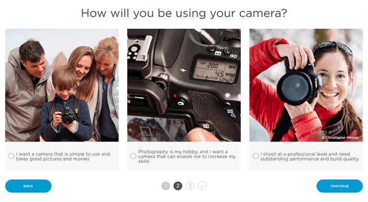
Now watch the same technique at work on Canon’s website.
They have a very large inventory of cameras, but their camera selector narrows it down to a selected few that match your needs and requirements. You can set up a similar automated adviser on your website that asks questions and presents a list of option, while keeping the visitors’ preferences in mind.
The moral of the story?
I suggest you don’t stick to just one option on your product page when trying to increase conversions. But don’t use the standard three-tier pricing model either. Try different combinations, offer personalized ranges of options, and see what kind of results you get.
Soon you’ll have it all figured out.
Have you ever experimented with the number of options on your conversion pages? If so, what turned out to be the magic number? We look forward to hearing your thoughts.
