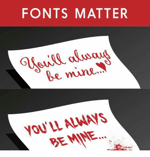
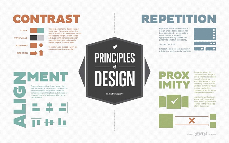
One thing we’ve always prided ourselves on at Foundr is that we prioritize great design in our magazine, content, and products. It’s one of a handful of areas where we spare no expense.
Thanks to the efforts of our fantastic art director we’ve developed branding that we believe is both easily identifiable and impossible to ignore.
While I’ll happily admit to my inability to distinguish a Rembrandt from something my kid cousin made in kindergarten, I know for a fact that good design is one of the most important factors for any startup’s success. Yet strangely enough, graphic design is one of the last things that entrepreneurs often choose to invest in.
When you take a look at companies like Apple, Airbnb, and Fitbit, one of the major reasons they’ve become so successful is their attention to design makes them impossible to ignore.
In this post, I’m going to delve into the five reasons your startup needs to start making design a top priority. I’m not saying every founder needs to be an artist or a great designer themselves. But we do believe that investing in professional designers is crucial to a company’s success.
But first, what exactly do we mean when we say great design?
On the surface, great design is defined by how good something looks. But when you dig a little deeper, you’ll find out that exceptional design is so much more than just a beautiful logo, or a slick website, or even how a product looks.
Someone we’ll come back to a lot in this article is Steve Jobs, whose understanding of design was legendary, and made Apple what it is today. Jobs once said, “Design is not just what it looks like and feels like. Design is how it works.”
So now that we’ve gotten that out of the way, let’s start talking about why your startup needs to prioritize great design.
Design attracts attention
The number one reason you should start taking visual design seriously is because it is the number one way to distinguish yourself from the crowd. We live in a world where the average person encounters over 5,000 marketing messages and advertisement a day. That is a lot of noise you need to cut through.
Humans are primarily visual creatures, and we rely most upon our sense of sight as we interact with our environment. In fact, 90% of all sensory information that the brain receives comes from our eyes, with 80% of our memories determined by what we see.
While we might disagree on what the definition of beauty is, it has been scientifically proven that we can, on a subconscious level, understand and distinguish between what is good design and what is not.
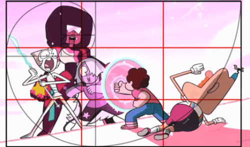
It’s the reason we often find ourselves naturally attracted to images that use properties of the “golden rectangle” or the “fibonacci spiral.” We also resonate with consistency, from typeface to spacing, to color schemes. At a basic level, everything from images to buildings that make use of these core design principles somehow feels right.
But that doesn’t necessarily mean that something has to follow the classical rules of good design in order to stand out. Sometimes bending, or even outright breaking, those rules can be the ticket to get you to stand out from the crowd.
Let’s take a look at the classic example of Apple taking the world by storm through the power of design.
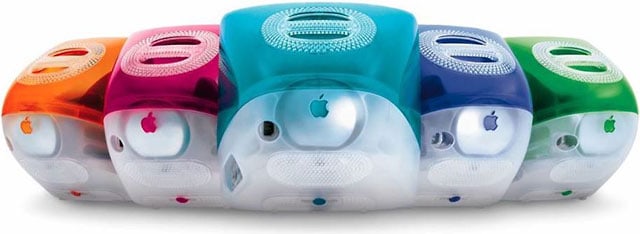
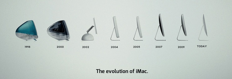
In 1998 Apple decided to give the average household computer a facelift. In late August, Steve Jobs unveiled the iMac G3 to the world, determined to deliver the household computer out of the hands of tech enthusiasts and business people and into the world of the average person.
Jobs understood that one of the main impediments to people buying computers was that they simply looked ugly. Up until that point, most household computers were usually beige plastic, clunky boxes, with little thought put into appearance.
In order make computers cool to the average person, Jobs knew that he had to make computers look cool.
And he succeeded.
Immediately, a whole set of people who weren’t interested in computers began to take notice. They could clearly differentiate between an Apple computer and an IBM or a Sony machine. Soon, home computers became synonymous with the Apple brand.
By taking into consideration the visual appeal of its product, Apple was able to immediately distinguish itself from the rest of the competition in one artful stroke.
Design communicates ideas
Great design is all about tapping into that visual part of the human brain and communicating as much as possible within one glance.
The first impression on a potential customer isn’t based on the first time they actually use your product, but the moment they lay their eyes on it. Within 50 milliseconds people will start subconsciously forming an opinion of your product, your business, and your brand based entirely on how it looks.
According to Consumer Reports, how much a new user trusts the credibility of a website is based more on its aesthetic elements than its actual content.
Did you know that the human brain processes images 60,000 times faster than it does text?
Not only that, the human brain doesn’t possess the innate ability to decipher text. It makes sense, after all, considering the fact that cave paintings have been around since the dawn of time and the first recorded written language didn’t appear since 3500 BCE.
It turns out that pictures might be worth more than a thousand words after all.
That potency of images manifests in multiple ways. Whether you realize it or not, the color and shape of something can subconsciously elicit certain emotional responses from you.
A study from Berkley found that we inherently associate certain colors with good or bad. For example, the color blue we often see as “good” and associated with health. Whereas the color white is often closely associated with purity and cleanliness.
It’s why you’ll often find products like surface cleaners heavily using these two colors in both their products and advertisements. It’s all so when you see it, you instinctively feel like you can trust it to do its job well.
When it comes to our own branding, the reason Foundr puts so much emphasis on design is that it is the first thing people see when they encounter us. In less than one second, we need to let those wandering eyes know that we are professional, we’re modern, and that we deserve your attention. It took time and work to get there.
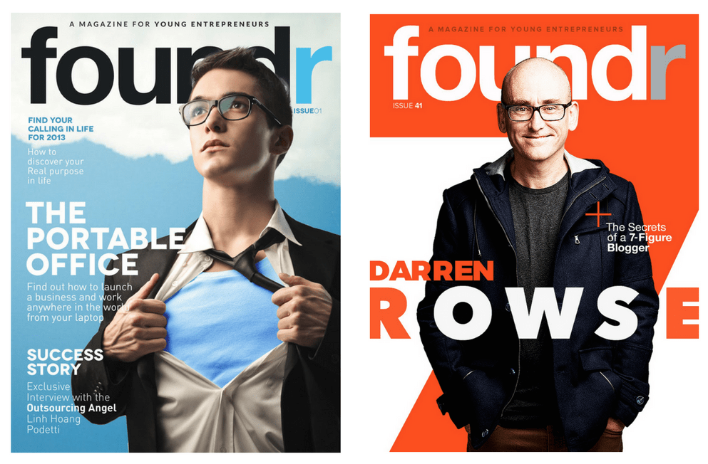
Just compare the cover of our first issue of Foundr magazine to one of our most recent ones.
You can see some of our branding even in the early issue, right off the bat. But you’ll notice here and with a casual look through our archive of covers, we’ve consistently pushed the boundaries of the magazine’s appearance. And that has made all the difference to people browsing iTunes and the App Store.
Great design triggers a range of positive emotions towards a brand, and it’s how we immediately separate ourselves from any other in our niche. It doesn’t matter how great your content may be, or how awesome your product or service is. You’re going to need your foot in the door first, and to do that you need great design.
Even if you’re not at a point where you can hire professional staff or consultants, there are loads of resources out there for marketers to use to create great looking graphics, from using Canva to create social media images to using Venngage for all your infographic needs. Even if you don’t want to do it yourself there are sites like Fiverr and Upwork that allow you to hire a graphic designer on any budget.
In today’s world, having professional-level design is more important than ever. It’s the one way you can immediately separate and distinguish yourself from the rest of the crowd. Just as people can immediately recognize good design, people can also immediately recognize bad design. It signals to people that you don’t take yourself seriously, so why should they?
Design makes you more memorable
Did you know that the majority of our memory is based on visuals?
One study found that visuals can improve learning by up to 400%. And another study found that people can only retain up to 10-20% of written or spoken information after three days. But we can retain up to 65% of that information if it was paired with a relevant graphic.
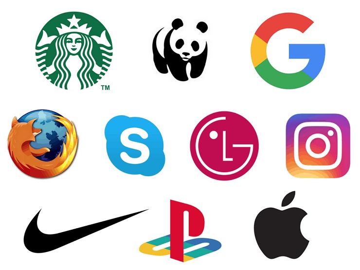
Our brains are simply hardwired to remember and retain visual information more than anything else. Let’s do a quick experiment, can you tell me the names of all these brands based on their logos alone?
I’m going to go ahead and guess that all of you probably got at least 90% of that right.
Having a distinctive logo is so important to branding, precisely because we are visual learners. That’s also why it’s so important for you to make sure that your design is consistent as possible.
It’s why businesses like Cadbury are trying to trademark their particular shade of purple. While it sounds ridiculous to hear that a confectionary company is trying to legally own a particular shade of purple, you can see where they’re coming from.
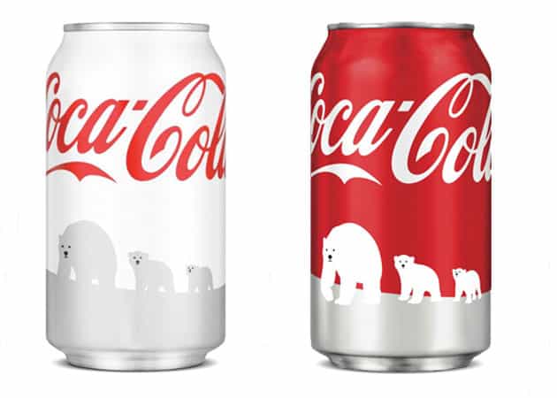
There’s a reason why, when you see a certain shade of red you instinctively think, “Coca-Cola.” It’s because Coca-Cola has been using the exact same shade of red since the 19th century!
When they tried something different while partnering up with the World Wildlife Fund and changed their design from the classic red to to a snow white design, they experienced a significant backlash.
The white cans looked too similar to the silver colour associated with Diet Coke and led some users to accuse Coke of attempting “trickery” or “blasphemy.” Even though Coke officials deny changing anything but the design of the can, there were multiple allegations that even the taste was different coming from the white cans.
Creating a strong brand and building an attachment with your audience relies heavily upon your visual design. Being consistent means that your customers can immediately pick your product out from the crowd, no matter the content being delivered.
Just take a look at Apple and all their products. No matter what it is they’re selling, whether it’s the Macbook, the iPhone or iPad, you can immediately tell which one is from Apple. You know you’re going to be getting that unique Apple experience at the first look.
Having great design can be so important, in fact, that it can even become an essential part of your unique selling proposition, or USP. Every company needs to distinguish itself from the competition, to provide a reason a customer should pick you instead of an otherwise very similar product. Consistent, appealing design in your branding can single handedly set you apart.
Design increases conversions
Let’s take a quick look at the evolution of your average-looking website.
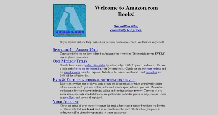
Back in the 90s, if you happened to find yourself cybersurfing the information superhighway, as I believe they called it, you were likely to encounter websites like this:
This is what Amazon’s first website looked like back when they launched in 1994. It was typical of most websites back in the day. They were text heavy, featured bland color backgrounds and there wasn’t much to look at.
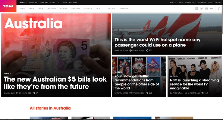
Twenty years later, and your average website will often look something like this:
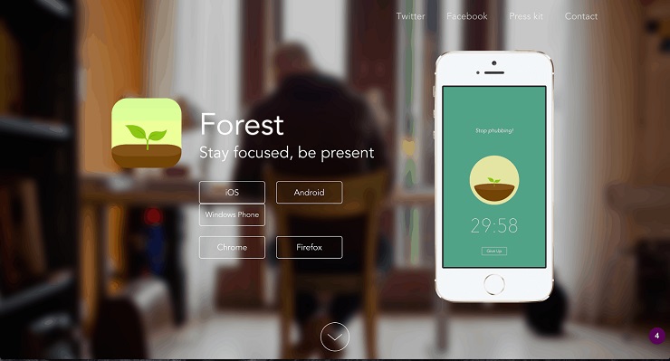
Or this:
So why the change?
Well there are a number of reasons behind this, like technology getting better with CSS, and more options for customization, for example. But perhaps the greatest reason more and more businesses are paying extra attention to how their homepage looks is simple:
Great design is no longer seen as something that’s nice-to-have. Design has established itself as a fundamental component of every good marketing strategy.
Click HERE to find out more about Foundr Version 1.0
Around 65% of senior marketing executives believe that visual assets are essential in communicating and promoting their brand’s story. According to the 2015 Social Media Marketing Industry report, 34% of marketers selected visuals and graphics to be their most important asset in content marketing, just behind blogging at 45%.
Content that has relevant images get 94% more views than content without relevant images. Infographics have been shown to be shared and liked three times more than any other type of content.
Remember that design and visuals speak to us on an instinctual level. Our eyes can’t help but be drawn to design elements like movement or contrasting colors. By applying even the most basic elements of design into your marketing strategy you can drastically improve your conversions.
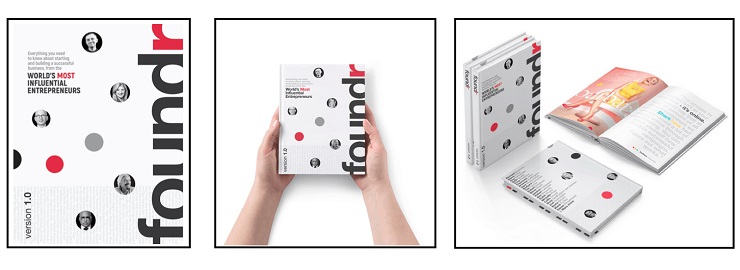
Something we’ve found with our recent marketing efforts for our new print book, Foundr Version 1.0, is that images that feature a human element tend to get a much higher rate of shares and engagement. If you take a look at these three promo graphics we made, which one do you think gets the most shares?
It turns out that the middle image, the one with the hands holding the book, received the most shares and engagement by a wide margin. Which shouldn’t be that surprising when you consider the fact that we’re hardwired to respond to human features like faces, eyes and hands.
The reason that image does so much better than the others, though, is because it gives the viewer that instinctive sense that they’re holding the book themselves. The point of view shot works great for conversions because it subtly implants that warm, cozy feeling of the book already being in their possession.
If you want to people to click on your sales button more often, stay on your page for a bit longer, or share your images more, you need to start taking design seriously.
Design improves user experience
Something you might not know about me is that for the longest time, before I ever started working at Foundr, I was actually a cocktail bartender. I was pretty good at it too, and picked up a couple of awards here and there for my cocktails.
One thing I learned very early on was that being a great cocktail bartender wasn’t just about making a great tasting drink, but the experience you gave your customer.
If customers wanted something that was tasty, or had a lot of alcohol in it, there were much cheaper options out there than a fancy cocktail. The reason people order cocktails isn’t necessarily about the drink, but the experience that comes with it.
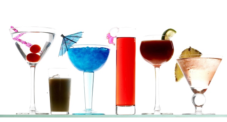
Have you ever stopped and thought about why all cocktails aren’t served in the exact same glass?
There are some functional reasons behind it, like stemmed glassware is used for wine and martinis because you need to control the temperature of your drink without ice. The stem is there so you won’t hold the glass itself and affect the temperature of the drink.
But the main reason most cocktails aren’t served in the same glass is because the look and shape of the glass affects how a customer experiences their drink. Remember, certain designs communicate certain ideas to people.
A stemmed glass often gives off a dainty or fragile impression. Whereas a rocks glass appears more grounded and masculine. So the type of glass you serve a cocktail in actually alters the experience a customer has with that drink.
The reason I bring this up is to highlight how great design does more than just grab people’s attention, but how it also influences how the user experiences any given product.
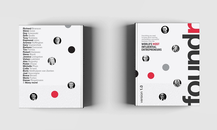
In order to further understand the importance of how something looks affects the end user experience, let me quickly deconstruct for you the design of our upcoming book Foundr Version 1.0.
While we do have thousands of hours of content on our blog alone, we also know that there is just something inherently different about the user experience of reading a book. There’s something about actually holding a physical book in your hand and flipping through the pages.
Scientifically speaking, our brains process information differently when reading from a book as opposed to reading from a screen.
A major reason we’re producing a book is because we want to give our community a different experience when it comes to consuming our content, something more personal and tangible than interacting through a screen. It’s why we’ve spent so much time debating things like what type of paper stock we should be using, or the thickness of the cover.
Get a sneak peek to the first 20 pages of Foundr Version 1.0 here!
It’s because we understand more than anyone else how something looks and how something feels drastically influences your experience with it.
You could imagine a scenario in which we just reproduced the exact same text in an e-book or plain text, but it just wouldn’t be the same. The information wouldn’t be experienced or retained in the same way. We want to inspire people, excite them, allow them to take in the images and text and want to return to them later, and to remember the entrepreneurs’ lessons all the better.
All of that wouldn’t happen with blocks of text. We know this book will bring the content to life and infuse it with Foundr’s ideals and our familiar look and feel.
Click HERE to find out more about Foundr Version 1.0
Conclusion
So does this mean that to be a great entrepreneur, you need to rush out to art school? Or that you need to have the superhuman sense of aesthetics of Steve Jobs and Jonny Ive? No way.
But when you’re starting your own business, and you get to the stage when you’re sketching out expenses, there may be a tendency to sort of brush over the design budget—to think, eh I’ll get to it when I can get to it, or I’ll figure it out myself.
At the end of the day, however, your attention to design may be just as important as any of the core functions of your product or service. Coming out with weak branding may be harder to bounce back from than a missing feature or even buggy code.
So get out there, make something beautiful, and give your customers an unforgettable experience. They deserve it!
Are you baffled by design? Have no idea where to start? Or maybe you have some great advice of your own. Let us know in the comments!
