Imagine going to a clothing store to buy a new shirt. When you walk in, you can’t seem to find any rhyme or reason: Shirts and shoes are thrown together, clothes aren’t organized by color or size, and you don’t even know where the fitting rooms are. Would you stay and keep looking for what you need? Probably not.
Now imagine a different clothing store. This time, when you walk in, a friendly employee greets you and asks if you need any help. You tell her the size and color of the shirt you’re looking for, and she directs you to the part of the store where you can find your perfect fit. You’re in and out of there within minutes, new shirt in hand.
Your website is your online store, and the user experience, just as in the brick-and-mortar store example above, can make or break a sale. If a visitor lands on your website and can’t find what they’re looking for, they’re probably going to bounce. And because we live in a digital age where we expect things to happen fast, they’re probably going to leave swiftly.
EXCLUSIVE FREE TRAINING: Successful Founders Teach You How to Start and Grow an Online Business
In fact, studies have shown that people form an opinion about a website’s visual appeal in just 50 milliseconds. And 38% of users will stop engaging with content that is unattractive in its layout or imagery.
So what’s a busy business owner to do? You’re in luck because we’ve got expert advice for you today from Unbounce co-founder Oli Gardner.
He’s the guy who’s analyzed almost 100,000 landing pages, written 300 blog posts about landing pages, and is responsible for 250 million conversions. Gardner sat down with us to share the worst website design mistakes he’s encountered in his career and how to fix them.
Watch the video below and then read on as we dive into the details of each of the design mistakes he talks about.
“Every business needs marketing and to be marketed,” Gardner says, “and landing pages are one of the keys to unlock performance.”
If you want to unlock performance for your marketing, here are the four website design trends you might need to steer clear of.
1. Unedited WordPress Themes
You’ve got this great idea and you need to launch your business website fast. So what do you do? If you’re like many scrappy founders, you’ll probably buy an inexpensive WordPress theme, throw up a site, and call it a day. Bad idea.
While Gardner thinks WordPress themes are a great solution for those who need to quickly launch a site, the problem is that these themes are often loaded with so many unnecessary features in an attempt to be appealing that they end up getting weighed down. This is something known as “bloated code.”
Theme designers are salespeople; they know that the more features they can list on their landing page, the more bang for their buck the customers think they’ll get. But with WordPress themes, more is not necessarily better. Bloated code can slow down your site and hurt your conversion rates.
On the backend, you can turn off unnecessary features, but you must have the technical knowledge to do that.
Solutions:
- Know what to look for. Generally, you want to avoid drag-and-drop site builders. While they’re easier to set up for the non-technical, they add a lot of unnecessary code, and if you ever switch themes, you might end up with messy shortcode all over your site. Also, look for “SEO-friendly” labels on WordPress theme sales pages. Typically, this means the developers put thought into making it optimized for Google, which could help your search traffic.
- Seek the help of an experienced developer. While you don’t need to have your site built from scratch, you can hire a developer to customize your WordPress theme after you buy it.
- Run speed tests and A/B tests to make sure your site is optimized after installing your theme. For speed, you can use PageSpeed Insights and Pingdom. For A/B testing, try Crazy Egg.
2. Scrolljacking
“One of the worst offenders is scrolljacking,” Gardner says.
You’ll know you’ve been scrolljacked when you’re trying to scroll normally through a webpage but can’t stop at the exact point you want; the page will start moving for you and jerk your cursor around. It’s a frustrating user experience for anyone.
When Gardner judged a contest for landing page templates in Unbounce, he immediately disqualified any participants who had scrolljacking on their websites. “It was that bad of an experience,” he says.
Solution: Stick with the traditional scroll, unless you’re doing it for artistic reasons (and even then, the user experience will suffer). If you want to see it done right, UI/UX designer Christina Paone reviewed some examples of scrolljacking that were done either for creative experience or storytelling purposes.
3. Inline Field Labels
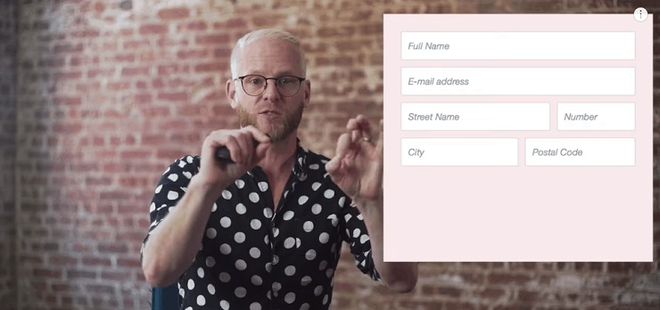
Inline field labels serve a helpful purpose: These labels say things like “email address” or “city” so that you know what information to type into each particular field. The problem, however, is that once you click inside the field, the label disappears, and you might forget what it said. To be reminded, you have to click out of the field to see it again, which is a bad user experience, especially on mobile or on really long forms.
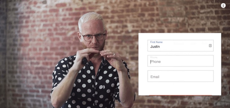
Solution: Floating fields. After people complained about inline field labels, a new solution appeared a few years later. Now, if website designers do it right, when you click inside the field, that label doesn’t disappear; instead, it shrinks and moves up to the top so it’s always there and you know what you’re supposed to type.
“That’s an example of a bad trend turned into a good experience,” Gardner says.
4. Conversational Forms
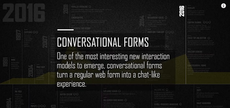
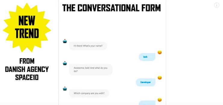
At the end of 2016, Gardner saw a new design trend emerge: conversational forms. Because he wanted to follow his own advice, he decided to validate this new design trend to see if it was good for conversion or not.
Created by Danish Agency SPACE10, a conversational form is a script that you put into your page to turn a regular lead gen form into a chat window. Each form field becomes a question, and it’s like you’re having a conversation with someone rather than filling out a form.
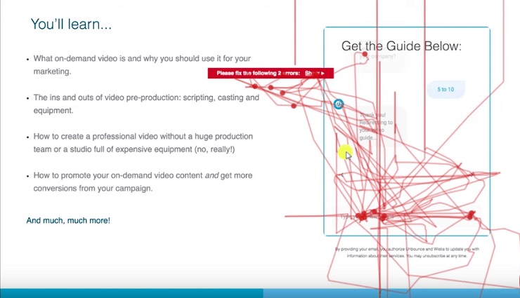
To test it out, Gardner put a conversational form on an Unbounce landing page and A/B tested it using Hotjar to capture video of how people interacted with the page.
Within five minutes of launching the page, Gardner’s first visitor arrived—and the results were painful. Gardner watched the chaotic user experience unfold right before his eyes: lots of clicks, jumping around, an error message, and a page refresh.
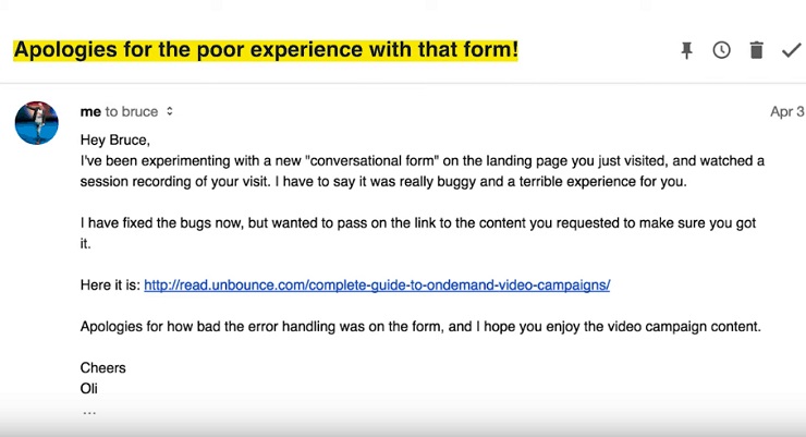
Because Gardner felt so bad about the terrible user experience, he emailed the visitor to apologize.
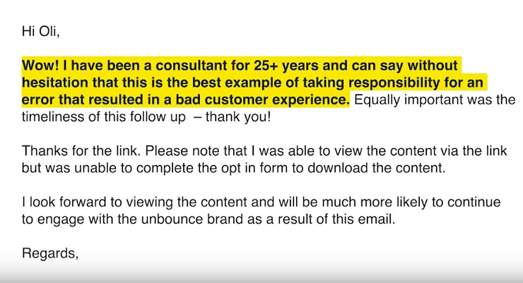
Within minutes, Bruce replied, saying, “This is the best example of taking responsibility for an error that resulted in a bad customer experience.” He even thanked Gardner and said he was much more likely to continue to engage with Unbounce.
“This is a bad experience turned into something quite wonderful,” Gardner says.
Solution: If you’re going to use conversational forms, A/B test first! Follow in Gardner’s footsteps and install Hotjar to watch how users interact with your pages before you decide if you want to keep the chatbot or not.
Even though Gardner’s A/B testing showed that conversational forms, in this case, were a dud, some businesses have seen great success with them.
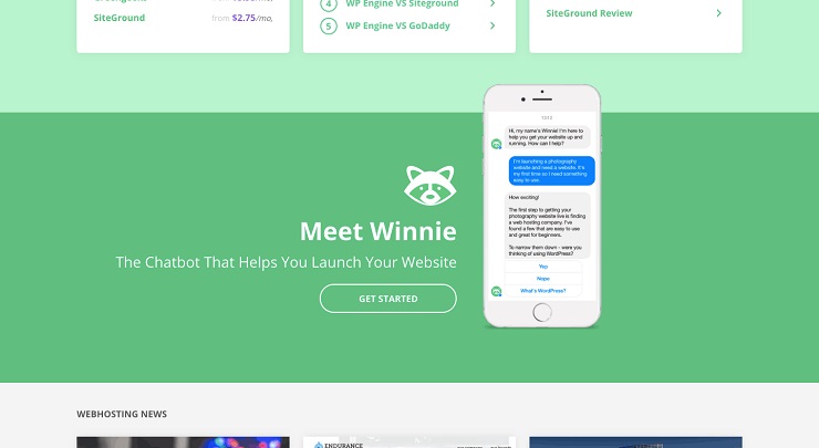
For example, Website Hosting Insider’s chatbot, Winnie, was designed to help customers decide on the best hosting provider for them. Winnie asked questions that helped users narrow down their options based on their needs; this resulted in a whopping 72% clickthrough rate on their affiliate link.
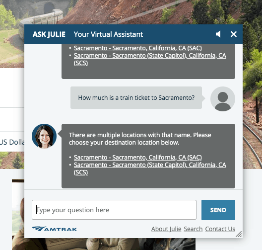
Another example of a chatbot done right is Amtrak’s Julie. She’s helped generate 30% more revenue per booking.
As you can see, chatbots can improve the user experience when done right. One problem could be that people add it to their site to be trendy, without A/B testing it and without putting much thought into how it can help their visitors. As Aaron Brooks writes for Venture Harbour, “It’s not because the technology itself is lacking, though. Instead, it’s got more to do with people jumping on the bandwagon and making a half-hearted or misguided effort to implement it.”
EXCLUSIVE FREE TRAINING: Successful Founders Teach You How to Start and Grow an Online Business
Empathy Before Trendiness: Think of the User First
Overall, Gardner insists that it takes empathy to do optimization because it’s all about making things better for the user.
Here’s a recap of the four worst website design trends that he talked about in his video:
- Unedited WordPress themes – These tend to have bloated code that slows down your site and wrecks conversions.
- Scrolljacking – This defies a user’s expectations and can become confusing and frustrating.
- Inline field labels – When a label disappears when a user clicks into a field, it can be annoying if they forget what they were supposed to fill out in the form.
- Conversational forms – If done poorly, these can create a chaotic user experience where the visitor doesn’t know what they’re supposed to do to get the content or answer they need.
When it comes to website design and optimization, don’t just do what’s trendy. Keep your focus on the user first, and better conversion rates are sure to follow.
What’s one of the worst design trends you’ve seen? Leave a comment below!
