Instagram is one of the most modern powerful tools to generate sales and put your business on the map. Take Sunny Co Clothing, for example, which grew their fan base from just under 8,000 to over 750,000 followers in less than 48 hours.
But as the Instagram marketing space grows ever-crowded, and customers become more acquainted with it as a commercial platform, companies are faced with an increasingly difficult challenge—retaining followers.
Not convinced? Check out the continued decline after Sunny Co’s rise to fame. A piece of viral content put them on the map, but they failed to live up to their followers’ expectations in the long run.
Sure, you might know many Instagram growth strategies, or maybe you’ve even grown a notable following already.
But once you’re there, you’ve got to give your audience something that will make them stick around and get to know you. Deliver great content with a consistent theme and aesthetic, and you’ll turn that initial Instagram love into loyal followers, customers, and profits.
To make sure you know how to grow your account and keep your followers, I’m going to provide the following step-by-step, highly interactive, detailed guide on how to have a good Instagram feed.
Table of Contents
Step 1: Who Should Your Instagram Feed Appeal To?
Step 2: Choose an Overarching Instagram Feed Aesthetic
Step 3: Include Your Graphic Design(er) in Your Instagram Feed Theme
Step 4: Instagram Feed Tips to Promote Your Product
Step 5: Putting it All Together—The Perfect Instagram Feed
How to Use This Guide: At the end of each step you’ll find an action item to help you apply what you learned in that particular section, and by the end, you’ll know how to put the pieces together so you can start rocking a stunning feed today.
Step #1: Who Should Your Instagram Feed Appeal To?
Marketing is all about knowing your target audience and knowing what they love, hate, care, or laugh about. The better you know your target audience the more effective you will be.
Planning your Instagram feed is like planning the perfect trip (your feed) for your perfect travel companion (your target audience). You must ask yourself:
What kind of journey are you taking them on?
What does it include? What would your companion want to see?
What gets them excited?
What would they want to tell their friends and family about?
Ideally, your analysis of your audience should help you organize your “postable content” into defined topics, so called “content buckets.” Content buckets are defined topics that identify the types of posts your audience would love to see.
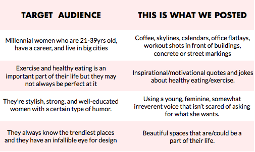
This is how this analysis could look like, once arranged side by side in an audience/content table:
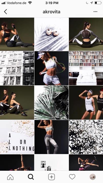
The example above is from my California-based activewear brand, which I shut down in 2016 when I relocated to Europe. While the account is no longer in use, the feed shows pretty clearly how I applied what I found out in my own audience/content table.
As you can see, the target audience for my brand was millennial women (like my models), who live in big cities (fourth photo on the grid), and like healthy eating (coconuts, second image on the grid). They’re well-educated (library, sixth photo on the grid) and strive for a better self and healthy habits (“All or nothing,” 10th photo on the grid).
The better you know your target audience and the more concise you are in the types of content you can post, the more targeted your following will be and the more they’ll like the content you post.
Action Item #1: Fill in your own audience/content table and create your content buckets.
Make a table like the one you see above. On the left side, you should define and characterize your target audience to the best of your abilities, while on the right, you should create the corresponding content buckets (aka, the types of posts your audience could love).
You can start by answering the following questions, but feel free to add whatever you feel is important:
- Demographic: Which generation are they? What’s their age range? Where do they live? What kind of job do they have? What kind of educational background do they have?
- Lifestyle: What do they like to do in their free time? How do they feel when they’re doing that? What is important in their life? Do they have kids? How important is family, healthy living, food, working out, travel, or personal success? What are the kinds of status symbols they’d like?
- Personality: How do they behave? What do they care about? What would make them smile?
Now you have to brainstorm the correlating types of content you think your target audience would like so you can create buckets. Make them as concise and descriptive as possible.
Want More Instagram Followers? Sign Up For Our Free Masterclass.
Learn How to Go From 0-500K+ Followers in 12 Months! Join our FREE Instagram Masterclass!
Step #2: Choose an Overarching Instagram Feed Aesthetic
This is an important one, because it determines the first impression your Instagram feed will make on a new user, which in turn will determine whether they’ll hit that “Follow” button or not!
First impressions matter more than ever, because five seconds is all you have to convert users into followers. The more consistent you are in your aesthetic and the better your overall feed looks, the easier it will be to achieve that goal.
After all, for users, it all comes down to whether you like the content and whether they can rely on you as a reliable source of great content.
Humans are creatures of habit and while they don’t think this explicitly, it’s all about consistency and “knowing what you get.” If your feed consistently shows images they like, following will become a no-brainer for them.
Here are some Ideas for developing a cool Instagram feed aesthetic for every niche:
Feminine & Girly
Filled with lots of pink and cute images (kitten!), it is a nice Instagram feed aesthetic for a younger, mostly female crowd (think college girls to young professional women under 30). It is often used for beauty products or brands that show a lot of skin (swimwear, lingerie, etc). Brands going for a little more mature crowd tend to use nudes/skin tones instead of pink for a feminine but not girly look.
Glossier – Make Up Brand
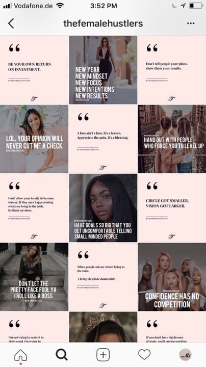
The Female Hustlers – Entrepreneurship
Glamorous & Posh
There are a million and one possibilities to make a feed look glamorous and posh, from showing status symbols (expensive cars, wine, suits, or luxury products) to showing a lifestyle that is associated with wealth. Regardless of the content, most glamorous visuals tend to be rich in color and contrast.
Murad Osman – travel blog
King 90210 – entrepreneur
Minimalist
Minimalism seems to be the uber-trend of the 21st century, so far. From Apple products to modern architecture, and the hippest fashion brands, you can see it almost everywhere. Typical characteristics are the limited use of color and the focus on simple graphic elements such as clean shapes and lines.
Minimalissimo – interior design
Michaela Lynn Taylor – photographer / freelancer
Dark & Sensual
There are many ways to express sensuality. It’s defined as the enjoyment, expression, or pursuit of physical pleasure. While many fashion and lingerie brands focus on this kind of Instagram feed aesthetic, it’s also used for food, music, or any other industries that appeal to your senses.
Gather and Feast – food
Bohemian & Romantic
Another common aesthetic that is almost the opposite of minimalism. It is playful, rich in detail, and common themes are nature (deer, trees, flowers, branches, etc.), music, or objects of everyday life. Bohemian aesthetic comes in all kinds of colors but they’re usually not too bright or vivid.
Humphrey & Grace – Photography
Healthy & Natural
As the name suggests, it’s all about health and nature. Bright and happy colors, lots of nature (trees, flowers, natural smiles, animals, sunsets, outdoor activities etc.) and fewer edited photos in general.
Paosfitworld – Fitness Blogger
Nutritionstipend – food and nutrition blog
Action Item #2: Select your ‘Target Instagram Feed Aesthetic’ and gather example images for each content bucket.
Choose one or two aesthetics from the suggestions above. Note from the description what characterizes this aesthetic and start looking for content that fits both this aesthetic and the buckets you’ve defined in Action Item #1.
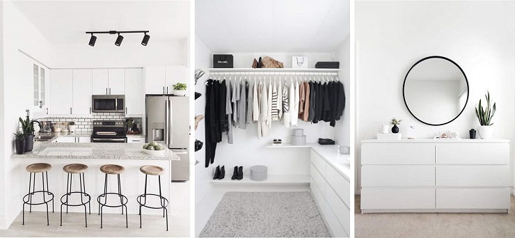
Your goal is to have between one and five examples of content for each of your buckets. This means, if you’ve decided on a mixture of minimalist and feminine/girly as your aesthetic, and you have a content bucket called “home decor,” your examples for this bucket could look something like this:
Sources: Pinterest, Pinterest, Pinterest
Once you’ve picked out aesthetically fitting content for each of your buckets, you should put (some or all) of them together on a moodboard. Just make sure you still have space left because we’ll be adding to it in the next steps.
A moodboard is simply a collage of images that all focus on the same theme. You can print out your images and add them to a corkboard to see how they all fit or use an online program like Canva. Later in this article, I will discuss how to bring your branding elements together in your moodboard.
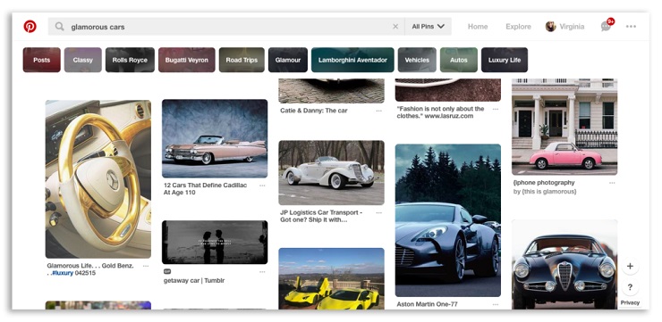
PRO TIP: To find your images, try using Google image search, Twenty20, and especially Pinterest to fill your buckets. Simply enter your aesthetic and bucket name as the search term and they’ll yield great results!
Source: Pinterest
Step #3: Include Your Graphic Design(er) in Your Instagram Feed Theme
Let’s talk quickly about graphic design and building a brand. When you started your business, you most likely also created a logo, maybe even with the help of a professional graphic designer, because you know that great design is important.
You selected colors, fonts, and decided how the logo should look.
Your Instagram feed is just as much part of your branding as your logo or website. So let’s talk briefly about the basic rules of graphic design that you must absolutely consider to create a consistent brand experience.
Colors & Fonts:
Colors are extremely important, because they elicit emotions and create an atmosphere.
It’s quite common that the color combination of a brand’s Instagram feed will be similar to their other branding. In the images below, each company’s branding is displayed on the left and its Instagram images are to the right.
The Skimm – news outlet and digital newsletter
KitKat – Product business
Duni Cheri – Lifestyle blog
Beats by Dre – Product Business
Another way you can make sure your Instagram feed is “on brand” is by using the right fonts. Your logo, branding guide, and website will guide you in which fonts to use.
In general, there are five points to keep in mind when choosing fonts:
1. Is it easy to read?
2. Does it remind you of any other famous logos? Some fonts are very recognizable and using a similar font will immediately create a mental link between your brand and the other brand in your customers’ minds. Consider the Walt Disney font, for example. Imagine a clothing brand called “Wearable Designs” using the following logo:

It would have customers thinking of Walt Disney right away. So be careful when choosing fonts and make sure to test with your potential customers whether your font elicits any mental connections to other brands.
3. Should you use sans serif? For a clean and minimalist look.
4. Should you use serif? More old school and elegant, it conveys authority.
5. What about handwriting or brush scripts? This can look romantic, natural, and a little DIY.
Action Item #3: Merge your branding with your moodboard.
Now let’s have you add the individual pieces of your branding to the moodboard you set up earlier, starting with little swatches of your brand colors, examples of the fonts, and any kinds of logos or graphic elements.
You should also sort out all and any content images that you liked but that don’t fit your branding. That could include images with colors that aren’t harmonious with your brand’s colors or images, etc.
If you have any content that contains writing (such as quotes or memes), try recreating them using on-brand colors and fonts.
Example:
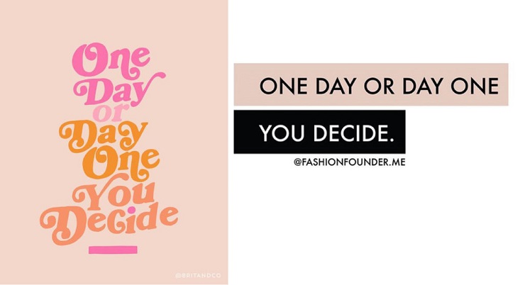
The left image of this quote is from Britt&Co, which I saw on Pinterest. It’s nice but it’s too bright, too happy, and not really “fashionable,” which is why it didn’t fit my branding (remember, I’m targeting fashion entrepreneurs).
So I recreated the quote on Illustrator in my brand’s colors and font so I could post it on my FashionFounder.Me Instagram feed, and it blended right in!
Side note: I typically use the same font in all of my quote images, but you don’t have to do this. It’s not a problem to throw in quotes in different fonts here and there if your brand’s personality allows for it. Just for planning purposes, I prefer to use only branded quotes. If you are going for a clean, minimalist, simple Instagram feed aesthetic, keeping the font the same would contribute to this overall look.
If your brand and voice is playful and open to jokes, you can totally “break the rule” occasionally and throw in a hand-written quote, even if your brand font is a serif, serious kind of font. It all depends on your branding, and requires a little bit of finesse.
Rule of Thumb: if you’re breaking the branding with a different font, then keep all other aspects (colors, textures, etc) as neutral or on brand as possible.
Want More Instagram Followers? Sign Up For Our Free Masterclass.
Learn How to Go From 0-500K+ Followers in 12 Months! Join our FREE Instagram Masterclass!
Step #4: Instagram Feed Tips to Promote Your Product
In Step #1, you’ve already defined what kind of “things” your audience wants to see (e.g. coffee, cars, flowers, quotes, etc.), and now is the time to plan your individual pieces of content and the types of images you could create.
Sometimes people find it hard to bring variety into your feed, especially if you only have one main product. To help you get started, here is a list of “image types” that will help you come up with a greater variety of posts for your feed.
Product Shots
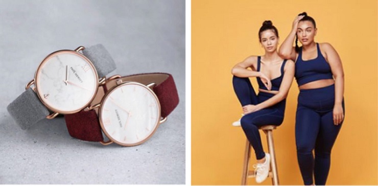
The typical content for any ecommerce store is going to be product shots. They highlight the product and only the product. The background should be just that, a background, and not distract from the product itself.
It could be a subtle texture, a contrasting color, or, most typically, a white background.
Micro Shots
Micro shots are close-ups of things that you want to draw attention to. They create focus and attention to detail. Micro shots are perfect to communicate what your product is all about.
Macro Shots
You guessed it, they’re the opposite of micro shots, and show you, your product, or whatever the focus of your account is in a larger context.
Flatlays
Flatlays are photos taken from afar, showcasing a carefully styled setting. They’re wildly popular in the food, office, fashion, and lifestyle niches.
Anything that can be styled and presented in a visually pleasing way offers the option to be shown as a flatlay.
Instructionals
Instructionals and informational content are extremely popular in the beauty and fitness niche. It’s basically the miniature version of a “how to” blog post or YouTube video, and many brands such as Charlotte Tilbury (makeup) or Dr. Jen Esquer (fitness) use it to successfully market their products.
Quotes & Memes
Quotes and memes are common and popular on Instagram, and if used well, they can create quite a loyal following, especially for service or information businesses.
To use them successfully, they should fit your niche both visually and in terms of your message. They should elicit emotions or depict an inspirational lifestyle for your target audience.
That’s why The Female Hustlers (they sell women-focused entrepreneurial swag), which is targeting strong female entrepreneurs, used an image of a strong group of women in the background and language like “babes” or “slay.” While Millionaire Mentor, which is targeting male entrepreneurs, posted the inspirational quote paired with an image of an expensive car.
A Note About Quality: It goes without saying that the quality of your images is of utmost importance. Blurry images or photos with other photography mistakes (wrong exposure, off-color, etc.) are a total no-go and should be avoided at all costs.
Action Item #4: Plan Out Your Posts
In step #1, you decided on your content buckets (the general topics of content that you want to post), and in #2 and #3 you selected a few examples that fit each bucket and your target aesthetic.
In action item #4, I want you to look at the image types shown above and start brainstorming ideas for the content you want to post to promote your product or service.
Choose at least three image types (or all of them!), and start gathering examples. Or even better, create your own images for each of the ways you can show your product.
Pro tip: if you don’t want to spend time taking and editing pictures, or you feel like your photography skills aren’t up for the challenge, you can reach out to micro-influencers (people with followings under 50,000) and ask them if they would be open to creating images for you in exchange for your product. Obviously, the more expensive the product, the more images you can ask for in exchange.
But make sure you’re clear on your expectations regarding deadline, quality, aesthetic, and when they’ll be allowed to post them.
The downside of this strategy is that you’ll typically only get lifestyle macro shots, leaving you to come up with a way to create or gather the other image types yourself.
Step #5: Putting it All Together—The Perfect Instagram Feed
Now that you know what your target audience wants to see (step #1), which aesthetic you’re showcasing on your feed (step #2), how to fit it together with your brand’s identity (step #3), and what kind of individual content you can post (step #4), you’re all set to create the perfect Instagram feed.
This is how you bring it all together:
Take a good look at the moodboard, where you’ve collected the findings from action items #1-3, and the images you’ve created in action item #4. They should have a consistent look and feel, even while unsorted.
This last step is all about planning out your feed and getting things in order.
I highly recommend getting a scheduling app that allows you to see your feed the way you would see it if you had posted it to your Instagram already. My personal favorite is the app Plann, because it shows your history and planned grid exactly the way it will look later.
Whichever app you go with, just make sure that you can see how the feed will look once you put the individual content together. This is crucial as you’re checking your aesthetic.
One word about flow and composition: I’m not a fan of posting very similar images in a row, neither do I like a feed that looks too planned (e.g., every second image is the same “type”).
I prefer a more “natural” look, but I guess that’s up to everyone’s individual taste.
To show you what I mean, I have two screenshots of feeds that are similar: the first one is from my current endeavor, helping fashion entrepreneurs (who happen to be mostly female) start their business, while the second one is The Female Hustlers, who are also targeting women entrepreneurs.
While they’re both using quotes 50% of the time, I find that the first one looks less planned and strategic and more spontaneous, and generally easier on the eye, because I use four or five different (but branded) templates for the account
(Note: The Female Hustlers have since changed to a slightly different format using a variety of different but branded quote templates.)
That way the feed looks a bit more natural and creative, which is important when targeting visual people such as fashion entrepreneurs. But again, it’s a matter of taste.
To figure out what appeals the most to you and your ideal audience, check out your competitors’ accounts to see how they create flow, movement, direction, and repetition in their feeds.
Keep the lessons in mind, but never copy. After all, this is all about creating an authentic experience for you brand, not stealing someone else’s.
Now it’s time to upload your content into your planning app and play around with the images until you find them to be in the right order.
Generally speaking, I like to switch things up in terms of focus and image type, combining micro and macro shots with flatlays or videos, but keep the colors consistent, at least across each row of the feed.
Keep in mind that as you post more content, images rotate from the first, second, and third spot in a row on the grid, so be careful when transitioning to other color schemes so as to not cause any harsh transitions.
Want More Instagram Followers? Sign Up For Our Free Masterclass.
Learn How to Go From 0-500K+ Followers in 12 Months! Join our FREE Instagram Masterclass!
Make Your Perfect Instagram Feed a Reality
Congratulations, you’ve made it!
Throughout this post, you learned how to determine what your audience loves (Step #1) and what kind of aesthetic your feed will have (Step #2).
In Step #3, you merged it with your branding to create a cohesive look and feel, in Step #4 you started to create content to promote your products in a variety of ways, and in Step #5 you put everything together.
Now you’re ready to roll and start posting the best, most consistent content to your Instagram account. Even better, you’ll never have to ask yourself, “What am I going to post today?!” You have your buckets, and all you have to do is refill them once a month with content.
Having a consistent feed will not only help you convert users into followers and retain them in the long run, but it will also make managing your feed so much easier!
High five for this double win!
Let me know your favorite insight from this post, including your Instagram handle so I can go check it out!


