Design is so much more than a pretty face.
While entrepreneurs obsess about which ads will draw the most traffic, which software will maximize conversions, and whether their copy will seal the deal, they often overlook one of the most critical drivers of success—page design.
The wrong design can leave users confused, unsure of what to do next, and scrambling to leave the site, hemorrhaging sales and conversions.
The right design can seamlessly guide the user to take the actions you want, like clicking the button, opting in to your list, or buying your product.
To unravel the dark arts of high-converting page design, Foundr flew Unbounce co-founder Oli Gardner into the studio and asked him to unpack five, high-converting website design principles to live (and die) by.
After nearly a decade of building and critically analyzing over 100,000 landing pages, Oli knows how to design websites for maximum results. Watch the video below to see how he does it and keep reading below as we explore the main highlights.
EXCLUSIVE FREE TRAINING: Successful Founders Teach You How to Start and Grow an Online Business
Use the Principle of Direction to Highlight Critical Info
One of the most fastest ways to see if your page design is helping or hurting conversions is to run what Oli calls “The 5 second test.”
This simple exercise is done by sitting a person in front of a blank computer screen, setting a timer to five seconds, and then showing them your landing page. Once the timer hits zero, you take the page away and asks questions about what they saw. You can ask things like, “What was the page about?” or “What were you supposed to do?”
Oli loves this test because it’s a good way to see if your page is instantly highlighting the most important information to visitors. Because the truth is, five seconds is about all you’ll get. So if you can’t make your point quickly and clearly, it doesn’t matter how enticing your offer is. Visitors won’t see it.
This test is also a good way to measure one of the essential principles of high-converting web design: direction, or how a visitor’s eyes move throughout a page.
Whenever a visitor comes to a page, they’re immediately looking for cues telling them where to look. Direction describes how the different pieces of page design work together to guide the visitors’ eyes from one point to another. It can have a profound impact on conversions.
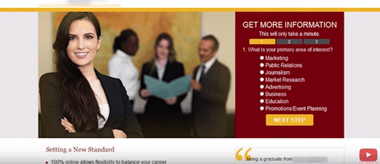
For example, Oli worked with an education client on boosting the conversion rate of their landing page. The original landing page looked like this:
Notice how the woman in the photo is staring directly at you and there are no strong elements on the page guiding you to the core action they want you to do (select an area of interest).
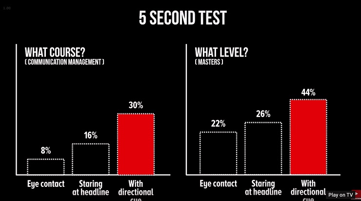
Oli ran the 5 second test and confirmed this to be true. Only 22% of page viewers knew what level the program was. Worse, only a mere 8% of viewers could recall the course being taught.
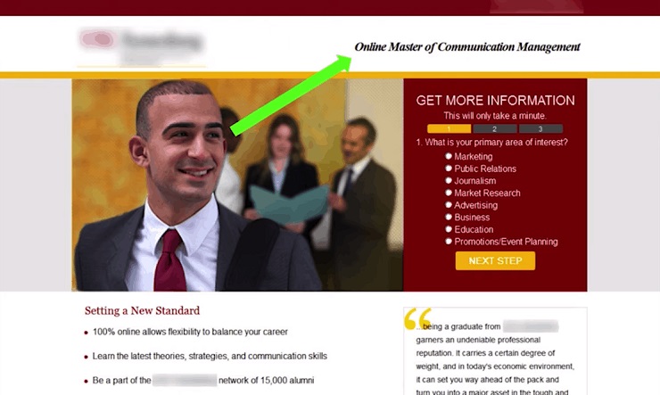
So Oli decided to use the design principle of direction to fix this. At first, he added a photo of a person looking toward the headline. Then, for an even more dramatic effect, he added a green line, showing users where to look on the page, like this:
He ran the 5 second test two more times and instantly saw an improvement in visitor recall. In fact, with the directional cue, the number of people who knew what level the program was doubled. And the number of people who could recall the course increased by 275%!
Here are the results:
“That’s how important direction and guiding visitors eyes through the page is,” Oli says. Imagine being able to almost double a page’s performance just with a simple photo swap.
So if you want to boost conversions on your page, consider these direction-based design tips:
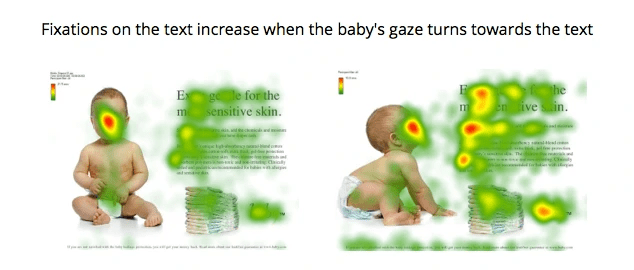
- Use eye gaze to your advantage. If you have a photo of a person on the page, make sure they’re facing toward the action you want to take. Science confirms this. There have even been eye-tracking studies that show people tend to follow the gaze of the subjects in view and look in the same direction. See this heat-mapped example that shows what happens when the eyes face the viewer vs face the headline:
The takeaway for your landing pages: Put eyes toward your call-to-action. Viewers’ eyes naturally go there.
- Vary the size of page elements. Your eyes normally gravitate toward the largest element on a page first. So consider varying the size of photos and headlines. Try to use a hierarchy that guides readers naturally through where to look. In the example of the school above, the viewer is guided to look at the man in the photo first, whose gaze then pushes them on to the headline (the next important element). Consider these paths created by your page elements.
- Use colors and graphics to show people where to look. Bright color attracts the eye more quickly than a neutral color. For example, the neon green line in the photo is highly attention-grabbing and direction-driving. You can also incorporate things like a pointing finger or an arrow to create movement on the page and guide viewers where to look.
EXCLUSIVE FREE TRAINING: Successful Founders Teach You How to Start and Grow an Online Business
Contrast Colors and Elements for Instant Clarity
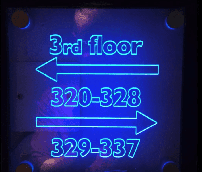
Oli shares an embarrassing story of the time he accidentally followed a woman all the way to her hotel room because of bad design. A sign was supposed to quickly show him where to go, but left him confused.
One of the biggest things problems with the sign in question was its lack of contrast. Here’s what it looked like:
Contrast is important in design because it helps your eyes differentiate between any two elements on a page. When there is little contrast, it’s hard to see how things are broken up, and even harder to know where to look.
The hotel sign, for example, has zero contrast in the text, arrows, and numbers. It all kind of looks the same.
All the elements are equally weighted, so it’s easy to glance at the number, think the third floor is to the left and the rooms are to the right. In fact, when Oli tested this, he found 33% of people went the wrong way when they glanced at this sign for five seconds.
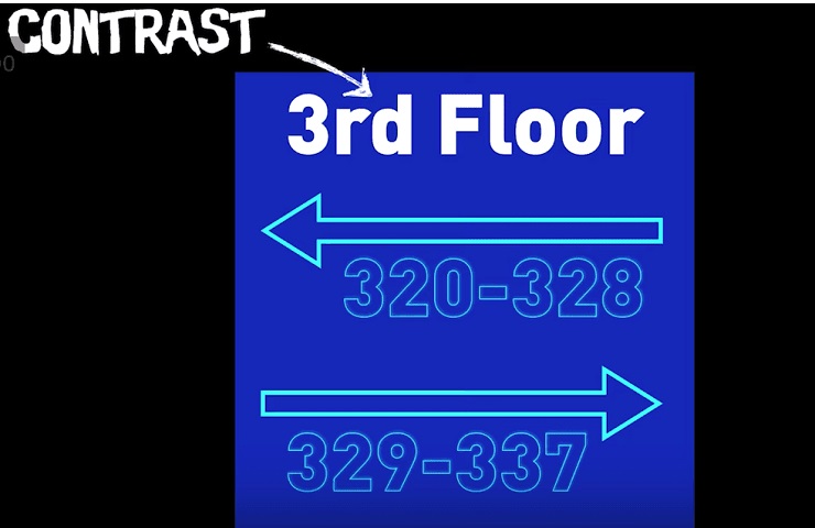
The reason is that the “3rd floor” element needs to be separated using contrast. It needs to be visually different from everything else on the page because it’s communicating different info.
So Oli mocked up a new design, where he made the text at the top a heavy white, and tested it again.
With contrast in the headline, it’s clear that “3rd Floor” is a unique element, making it far less confusing.
“These elements are semantically different, so you have to break them up for clarity,” Oli says.
If you’re not seeing the results you want with your website, you may need to consider adding elements of contrast into your design. This will allow you to more clearly communicate with visitors.
Consider breaking up elements of your page that are communicating different things and offsetting them with contrast. It’s a powerful conversion tactic.
“When you understand the contrast principle, you’ll see that boosting conversion rates is not about making your buttons all a certain color,” Oli says. “The color doesn’t matter if your CTA is #89B941 or red. Just make sure that it contrasts with the rest of the page. That’s how you get a lift.”
In other words, conversion rate boosts and split test results should start with questions around contrast, not just colors.
When you understand what contrast can do, you can probably identify two or three areas on any given page where the contrast could be stronger. Find them and test them out for an instant conversion lift.
Use Grouping and Whitespace to Turn Absence Into Power
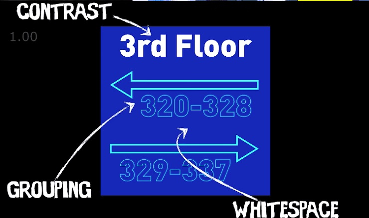
One of the other big flaws with the hotel sign’s original design is that all the elements are smushed together and centered. This leads to a total lack of clarity.
What’s needed is a good dose of grouping and whitespace.
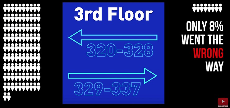
“You need to bring the numbers closer to the arrow that is relevant to them and put white space in the middle to clearly separate them,” Oli says.
With this simple tweak, the sign shows users where to go much more clearly. And the results reflect that. Oli ran the experiment again after incorporating these elements into the design. This time only 8% of people went the wrong way.
That’s a 75% decrease in confusion!
Translation: With a few design tweaks, you get more people doing what you actually want to do.
And that means if you have a landing page and aren’t taking these design principles into account, you could be leaving sales and conversions on the table. To better incorporate grouping and whitespace into your landing pages, consider these two rules:
- If you have elements communicating the same message, put them together. If you have elements communicating different messages, break them up. Your eyes can only take in so much information at once. And if your design is sending conflicting messages to the viewers’ eyes at the same time, you’re going to confuse people, just like having all the numbers and arrows mushed and centered did.
- Embrace whitespace. One of the worst things you can do with design is put too many things on one page. You might think you’re adding to the design by putting more and more things on your landing page. But in giving people dozens of things to look at, they don’t see any. Look at the changes Oli made to the sign in his mockup. One of the most significant things he did was remove excess sizing and overlapping elements. By creating whitespace, the page communicates much more information and it communicates it more clearly.
Intentionally Interrupt the Page and Eliminate Any Chance of Confusion
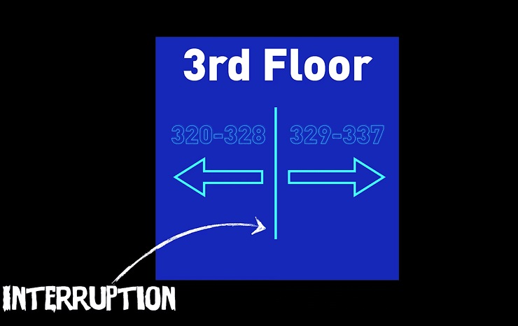
The final design principle Oli shares is interruption. This is where you use breaks and separators to dramatically increase the clarity of your landing page or design.
For example, with the hotel sign, he drew a line down the middle of the design and placed the arrows on the opposite sides. This makes it abundantly clear what the viewer needs to do. And it shows in the results.
Nobody—0% of people—went the wrong way when they were presented with this design. That’s how powerful interruption is.
“The key,” Oli says, “is to group things into what they need to communicate and make that a separate message. That makes comprehension easier and faster.”
The same principle can be applied to any website you’re designing to increase conversions and sales. Separate elements into distinct boxes and leverage page breaks where different ideas will be shared.
And if you notice a page is not converting, consider revisiting this design principle as a way to spot problem areas.
Ask yourself these questions to see if you could boost your conversions with an interruption on your website:
- Which elements of this page are similar and which are different?
- Are different pieces of the page broken up properly?
- Am I trying to communicate too many ideas at once?
- Could I add an interruptor to make the design clearer?
EXCLUSIVE FREE TRAINING: Successful Founders Teach You How to Start and Grow an Online Business
Increase Your Conversion Rates with These Design Tricks Today!
You don’t have to be a professional designer to use the principles of design to your advantage.
As Oli demonstrates, you can use these design principles to be able to instantly spot flaws in any page. And better yet, you can use them to boost the conversion rates of your landing pages, starting today.
Have you used any of these design principles? What have you found most powerful when increasing your conversion rate? And do you have an awesome page design we can check out?
Let us know in the comments! We’d love to hear from you.

 The takeaway for your landing pages: Put eyes toward your call-to-action. Viewers’ eyes naturally go there.
