When we talk about high-converting websites, we’re talking about design, right? Wrong! We can’t forget the importance of content that converts. You can have the most optimized website design in the world, but if the words, images, and videos aren’t doing their job, you’ll wind up with abysmal sales.
As a business owner, I often find myself on websites trying to determine if a product is the right fit for me.
As a writer, I know the importance of stellar content in converting visitors into customers.
And with both perspectives in mind, I have come across countless business websites that may have offered amazing products or services, but failed to convert me into a buyer because of their slipshod content.
If your website is getting solid traffic, but your shopping carts are collecting dust, I’m here to show you some website mistakes to avoid if you want to convert traffic into sales.
Now, some of the points below touch on content, while others touch on copy. What’s the difference? Basically, all copy (words written to make sales) is content but not all content (words, images, video, etc.) is copy.
With that distinction made, let’s jump right into these five content-related reasons why I might visit your website but refuse to buy:
1. Your Business Doesn’t Look Legitimate
Ecommerce faces a significant challenge compared to brick-and-mortar businesses: prospects can’t see you or your product in person. This can be a huge barrier to establishing trust that you are who you say you are.
When someone walks into a clothing store, for example, they’re often greeted by a smiling employee, and they can get a feel for the atmosphere and customer service the business offers. That goes a long way toward building trust, and very quickly.
But when someone visits your website, they’re missing all of those physical cues; you need to fill them in with great content that builds trust.
Here are some content pieces you could add to build credibility for your business:
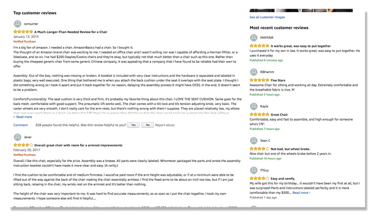
- Reviews. Why do you think Amazon has star ratings and reviews featured prominently in every product listing?
We as consumers love hearing about others’ experiences with a product! So if you have an ecommerce site, install a ratings and reviews plugin to increase conversions. Here are reviews plugins for Shopify and WordPress.
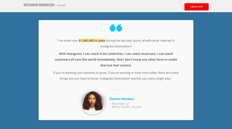
- Testimonials. Another piece of content that both service and product businesses can benefit from is testimonials. Reach out to your favorite clients or customers and ask them to tell you what they like best about your business. Then ask if you can display that on your website and marketing materials.Just how important are testimonials? MarketingExperiments ran an A/B test to find out. Adding testimonials to a page boosted the conversion rate by 25%. Consumers are hesitant to trust what a business says about itself (you’re biased, after all), but they will trust what other consumers who have used the business (your customers) say.At Foundr, we include testimonials on our course landing pages to let students share how our courses have helped them. Here’s one from Instagram Domination:
- Your physical location. This is the easiest little piece of content to add to the footer of your website and/or your contact page. It helps show that you’re a real business!
- Guarantees. If you can, offer a guarantee. There’s no better way to vouch for your product than to say you’ll give someone their money back if they’re not satisfied.Amy Porterfield prominently displays a 60-day, money-back guarantee on this course sales page, which helps to show confidence in her product:
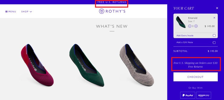
Similarly, if you offer free shipping or free returns, be sure to highlight this, particularly at checkout, like Rothy’s does here:
- Information about and photos of you and your team. People want to do business with people, not a website. Show your face to help them feel more at ease with the transaction. Share some personal details to humanize your brand. The perfect place for this is your About page, an often-overlooked page that can boost your conversions. Translation service Tomedes made some improvements to its About page and saw a 13% increase in conversion rate overnight!
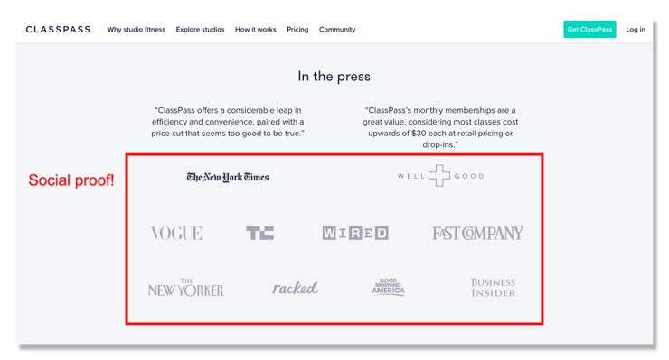
- Display media mentions. This is a big social proof indicator. If you’ve been mentioned in media outlets, create a press page or show those logos on your homepage, like ClassPass does here:
ATTENTION: We are launching a new conversions course that will teach you how to convert traffic into hungry buyers. Click below to get more info on the course and sign up for the waitlist!
Click here to join our Free VIP Waitlist to be notified when the conversions course launches!
2. Your Prices Aren’t Listed
For B2B services, there’s a lot of debate over whether to publicly display prices. Whether you’re a management consultant or a web developer, you’ve probably wondered at some point if you should be showing your fees on your website or not.
Of course, for product-based businesses, you almost always need to list your prices. (How weird would it be if Amazon made us add items to our carts without showing us the prices?) Exceptions here are high-ticket items, such as custom homes or luxury cars.
Some objections to listing prices on your website include:
- “My service is too customized to be able to offer a standard price.” In that case, I’d say list a starting price or a price range to at least disqualify those who can’t even afford your lowest price.
- “The potential client might have a budget that’s higher than my listed price, and I don’t want to leave money on the table.” To me, this brings up some ethical concerns about charging a client a higher price just because they have a bigger budget. Your prices should be grounded in real reasons; if they’re not, you’re probably determining your pricing incorrectly anyway.
- “I don’t want my competitors to see what I charge.” I honestly don’t see why this matters. If your competitors copy your prices, is that going to put you out of business? Or if they try to charge beneath what you charge to lure over your potential customers, that simply means they won the customers who were just looking for a good deal. Either that or you failed to show the superior value you provide over your competitor.
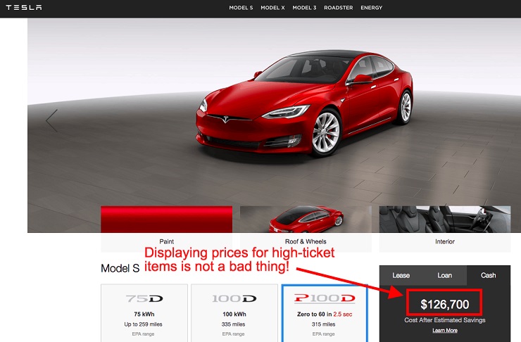
- “My product is a high-ticket item, and I don’t want to scare buyers away by listing my prices.” Hm…that’s interesting. Tesla lists the prices of its high-end electric vehicles, and last time I checked, Elon Musk was doing quite well for himself.
According to Nielsen Norman Group, users said that prices are the most important piece of B2B site information. Additionally, SafeSoft Solutions A/B tested a contact form with no mention of price against a contact form with the price prominently displayed. Which one had the highest conversion rate? The contact form with the price on it increased lead generation by 100%!
Here are three reasons I think you should list your prices on your website:
- It prevents wasting your time and the prospect’s time. In sales speak, showing your prices upfront will “qualify” your “leads.” In layman’s terms, showing how much something costs will scare away those who can’t afford it, making room for the ones who can. If you’re a service provider, you know it’s a huge waste of time to get 30 minutes into a discovery call only to find out your prospect’s budget is $1,000 below your fee.
- It prevents awkward situations. Besides the fact that it could waste both parties’ time, it can be uncomfortable, particularly for the prospect, when your prices turn out to be above budget.
- It helps the buyer make a purchase. As pointed out above, prices are a major factor in every buyer’s decision. As business owners, we provide information to help our prospects decide if they’re going to buy. Help them by giving them the information they seek upfront.
When I was looking for a business systems strategist to help me streamline my business processes, I knew my budget was set at a maximum of $1,000; I didn’t have room to budge. As I sifted through dozens of potential candidates’ websites, I immediately rejected any whose prices weren’t listed. It wasn’t worth the time (or potential embarrassment) of asking each and every one of them what their fees were.
So why withhold the information that matters most to a potential buyer? If you’re still in doubt, conduct your own A/B test and see if your conversions improve with prices listed on your site.
3. Your Blog is Weak (or Nonexistent)
There are so many benefits to blogging for your business, and one of the big ones is that it can help convert traffic into sales. Here’s how your blog can work for you:
Attract the right kind of customers (those who are looking to buy).
Your blog content should be crafted in a way that attracts relevant visitors and helps move them through the sales funnel, from awareness of a problem, to considering different options, to taking action and buying.
How do you do this? Think about where your ideal customer begins their buyer’s journey. Let’s say you sell accounting software for small businesses. Your ideal customer is a small business owner without an accounting department. Where might they begin their Google search? Keywords like “how to keep track of business expenses” or “do I need an accountant for my business” come to mind. That’s the awareness stage of the sales process. The owner has just become aware of the problem.
Next, it’s the consideration stage. The potential buyer is considering their options. Keywords at this stage might be “best accounting software for small business” or “software to track income and expenses”
Lastly, they’ll reach the decision stage where they are ready to take action and buy. Now your blog posts can be around keywords such as “Quickbooks vs. Xero vs. ” and compare the different options and eventually persuade them to go with yours.
By writing blog content that showcases your expertise and helps your visitor make a decision, you can boost your conversions.
Build authority with helpful blog posts.
Alternatively, even if someone doesn’t come to your website through one of your blog posts, they may go to your blog as a way to consider if they want to purchase from you. For example, when I search for service providers for my business, I want to get a feel for their philosophy and expertise. To do this, I head over to their blog. This is the best place, outside of talking to them in person, for me to get a feel for their expertise and personality.
Back when I was looking for someone to design the logo for my writing website, I came across a freelance designer who specialized in working with writers. When I was considering my options, I started looking at her blog. She had tons of blog posts with case studies of other writers she had worked with, photos of her work, and general advice for writers. I saw her as an expert in designing for writers—and I ended up hiring her.
Generate leads with your blog.
According to HubSpot, businesses that blog generate four times more leads than businesses that don’t. And more leads mean more sales! Most of the visitors to your business website are not yet ready to buy. They’re at the top of the sales funnel, and it’s your job to move them all the way down to the purchase decision. To do that, you need to make sure you capture their information so you can keep nurturing that relationship. Blogs are a fantastic way to do that because you are offering your expertise for free, and that will entice a visitor to hand over their email address in the hopes of getting more.
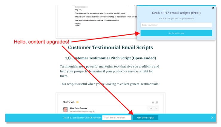
So how do you get them to hand over their email address? Content upgrades. A content upgrade, like a lead magnet, entices a reader to sign up for your email list. Unlike a lead magnet, however, a content upgrade is specific to that particular blog post.
For example, software company Groove wrote a blog post with 17 email scripts you could use to grow your business, but the scripts were included only as images in the blog post. To get the PDF of all 17 email scripts to copy and paste, Groove asked readers to enter their email addresses (a content upgrade). The result? Groove’s opt-in conversion rates were 400% higher than the norm for their lead magnets.
So don’t make the mistake of thinking a blog isn’t powerful. When used correctly, it can be your secret weapon to convert traffic into sales.
ATTENTION: We are launching a new conversions course that will teach you how to convert traffic into hungry buyers. Click below to get more info on the course and sign up for the waitlist!
Click here to join our Free VIP Waitlist to be notified when the conversions course launches!
4. Your Website Copy is Too Generic
Copywriting is all about crafting words in a way that will convince someone to buy—and let’s face it, many business websites out there aren’t very convincing. A common problem is that their copy is just too generic. They’re trying to be all things to all people.
Again, back to my search for a business systems strategist. I was super picky, and I wanted someone who knew how to work with creative freelancers and specialized in setting up systems to save them time and keep them organized. I got lots of interested candidates, but when I visited their sites, they seemed to target all the businesses and do all the things (virtual assistance, email campaigns, social media, etc.). I lost my confidence in them to really be able to understand my business and my needs.
Even if you can’t afford to hire a copywriter, there are a few guidelines you can follow to make sure your ideal customer knows you’re talking to them:
Define your ideal customer and the problem you help them solve.
Before you write a single word for your website, you need to know to whom you are writing and what problem you’re helping them solve.
Write a headline that directly addresses their problem and your solution.
When someone lands on your homepage for the first time, you want them to think, “Hey, that’s me!” They want to know they are in the right place. Usually, this can be achieved by simply stating a problem your ideal customer has and your solution.
For example, let’s say you sell eco-friendly glass water bottles to the earth-conscious consumer. Your homepage might start with a headline that says, “Tired of throwing away harmful plastic water bottles?” or “Want a reusable water bottle that’s good for the earth?” That ideal customer is going to answer with a resounding “yes!”
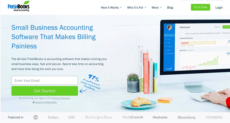
Here’s a great example of a headline from FreshBooks: “Small Business Accounting Software That Makes Billing Painless.” In just eight words, they’ve told me who their ideal customers are and what problem they solve for them.
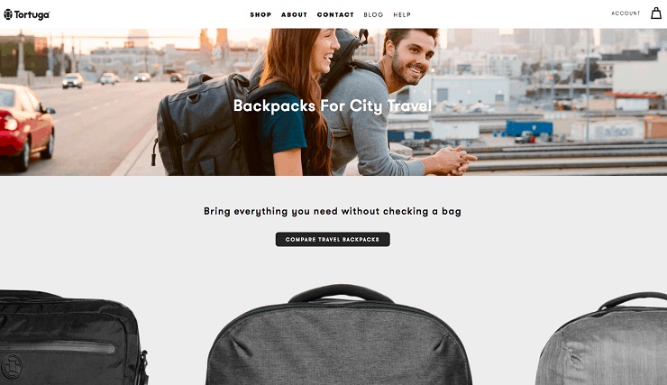
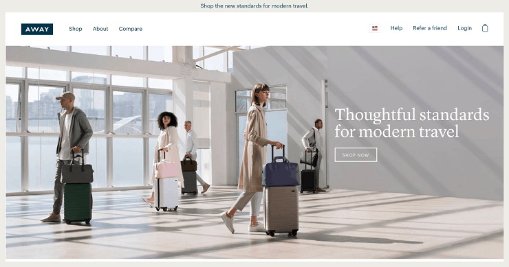
If all else fails, use this formula: “ for .” You can see this shortcut all over the internet.
Tortuga’s is “Backpacks For City Travel.”
Away’s is “Thoughtful standards for modern travel.”
Yeah, it’s simple. But it’s better to be clear than clever.
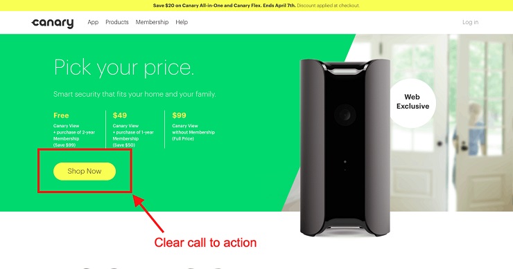
Have a clear call to action. What is the one step you want them to take after viewing your website? Try to keep it to just one action, not three or four. So maybe it’s “Book your free 30-minute consultation” or “Add to cart.” Whatever it is, say it! Can you tell what step Canary wants you to take when you visit its homepage?
5. You Didn’t Make it Easy for Me to Take the Next Step
Speaking of clear calls to action, let’s dig into that more. Sometimes I’ll come across a business website that carves out a clear expertise, complete with testimonials and accolades—but it doesn’t invite me to purchase.
Maybe they buried their contact info on some obscure page, forcing me to search for an email address as though I were on a scavenger hunt. Or maybe they didn’t tell me how I could purchase their product, leaving me wondering if it’s even in stock. For me as a buyer, it’s a confusing experience. Are they no longer in business? Are they no longer accepting new clients? What exactly do they want me to do?
Maybe you’re too shy to invite someone to buy. Perhaps you’ve been told being “salesy” is bad. But if you’ve followed the basic copywriting guidelines I mentioned above, you’ve already invited your website visitor into your brand story. They’re about to walk through the door, only to find it’s locked. You offer a solution that will help your ideal customer with a problem they’re trying to solve. Why wouldn’t you try to sell it to them?
If someone is on your website, they’re interested in your business. Make that next step so easy for them that they can’t help but take it.
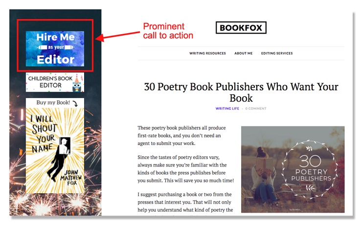
A great example of this is John Fox, a freelance editor. I was researching creative writing prompts when I came across a blog post he wrote (see how blogs help you attract your ideal customer?!). While I was reading that, I saw he offered editing services. And wouldn’t you know, I’m a writer seeking an editor! I emailed him shortly after that because he just made it so easy by actively inviting me to do that in his call to action, which is prominently displayed on every page of his website.
In his popular book Building a StoryBrand, Donald Miller talks about how most brands are too shy and either don’t try to sell enough or aren’t very direct in their calls to action. Your website must have a clear call to action. The CTA should be listed more than once and invite me to take the next step.
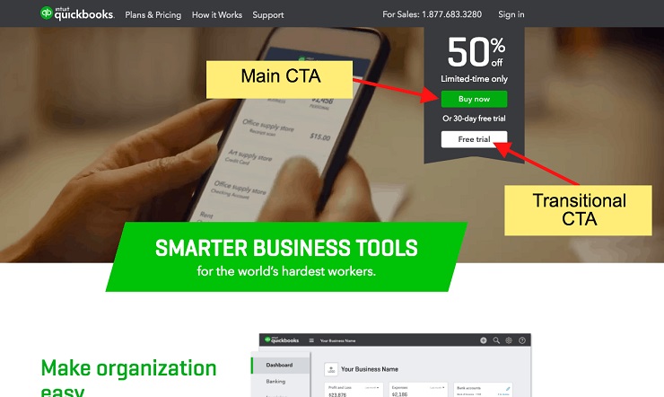
Miller goes on to say, in a blog post, that there’s another trick you can use to boost conversions: the “transitional call to action.” The transitional CTA lowers the stakes by offering a less risky option for those who are not yet ready to commit. So, while you should definitely still make the “Buy Now” your prominent CTA, you could also offer a transitional CTA that says “Try It Free for 14 Days” for those who aren’t yet convinced. One example Miller gives is QuickBooks. Check out how they implement it on their site with a “Buy now” button followed by a “Free trial” button:
ATTENTION: We are launching a new conversions course that will teach you how to convert traffic into hungry buyers. Click below to get more info on the course and sign up for the waitlist!
Click here to join our Free VIP Waitlist to be notified when the conversions course launches!
Uplevel Your Website Content to Convert Traffic Into Sales
Now that we’ve talked about some website mistakes to avoid regarding your content, did you spot any that you’re making? Maybe you’ve got a beautiful website. Maybe you’ve got lots of traffic. Good design and high traffic are great—but they’re meaningless to you as a business if they don’t convert buyers.
So if you want to convert traffic into sales, try these solid tips for improving your content:
- Show proof that you’re a credible business.
- Display your prices, even if it’s a starting price or a range.
- Write helpful blog posts that solve your ideal customer’s problem.
- Craft copy that speaks to your ideal customer.
- Give visitors a clear call to action.
Once you nail your content and streamline your design, you’ll have website visitors going:
What website content mistakes turn you off as a buyer? Share them in the comments!
