A logo provides a simple, memorable reflection of your brand’s value. So, as a brand evolves, it’s natural that the visual representation of the brand should evolve alongside it.
In a brand’s early days, you have a very limited view on what your brand is and what it will become. As a result, first attempts at a visual identity tend to be a little hit and miss.
Over time, your brand gains experience. Your audience grows. Your team grows.
You gain a deeper grasp of what your customers need. You see where you fit in the competitive landscape. You understand how your brand can deliver unique value. You communicate that value through more channels.
In other words, you have a stronger, more fully realized brand. And it raises questions on whether your old identity aligns with this new phase of the business.
The challenge is that capturing those changes in the right way can be difficult. So, before jumping into the sometimes turbulent waters of identity design you should be crystal clear on one big question…
Why Do You Need Logo Redesign Right Now?
Every creative process evokes subjective opinions. They’ll come from you, co-founders, team members, customers, casual bystanders, your family—everyone will have a thought. And those opinions can vary wildly.
Defining a clear “why” behind the process helps you navigate through that onslaught of perspectives and come out with a positive result.
The following are three motivating factors that would drive a logo redesign. They each impact different aspects of your visual identity. Understanding which of them apply to your situation will keep your efforts focused and define criteria for the success of your work.
Don’t Skip: How to Create a Marketing Plan (Template + Examples)
1. Your Brand Strategy Has Changed
This is the most important factor to consider with any expression of your brand’s communication.
Has your brand’s mission and positioning evolved? Are you serving the same customers and providing value in the same way?
If these things have fundamentally shifted, it’s an excellent reason to reevaluate your brand identity to determine if it’s still aligned.
In this case, your focus should be on the message of your identity.
A great example of this comes from General Motors.
GM’s CEO Mary Barra pledged a massive commitment to electric vehicles. By 2025, 40% of their vehicles will be electric.
By 2035, they will stop making gasoline-powered passenger cars, vans and sport utility vehicles completely.
This is a significant strategic pivot for one of the largest automobile manufacturers in the world.
So, it makes perfect sense that they would refresh their brand identity to reflect this new mission.
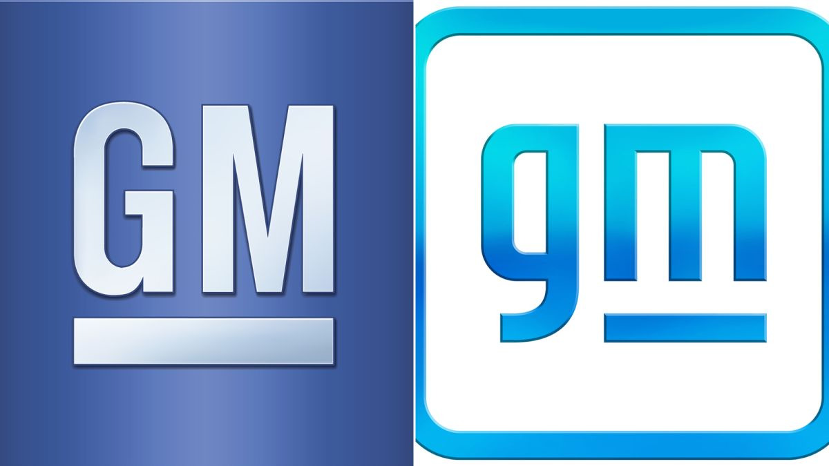
Their new logo mark aims to capture this strategy by:
- Creating a look that’s still bold and strong, but more inclusive (rounded edges, lower case letters)
- Shifting the primary color to a lighter sky-blue that aligns with the environmental impact they seek to make
- Transforming the ‘M’ shape to include a new double meaning. On its side, the M and the shifted underline create an “E I” referencing their larger campaign of “Everyone In.”
- As a hidden bonus, the negative space between the “E” and the underline reveals the shape of an electric plug.
We can all debate the aesthetic choices here, but the purpose is to express a revised message for the brand.
Questions to ask when a change of brand strategy drives your identity redesign:
- How has your brand’s mission evolved since the creation of your last logo?
- Do you service a new type of customer needs or provide new value?
- Has your position in the market shifted?
- Are you providing new forms of products and services?
- What aspects of your offerings lend themselves to visuals or words within a mark?
2. The Times Have Changed
Your brand doesn’t exist in a vacuum. While you’re hard at work refining and iterating what you provide customers, the world continues to evolve around you.
New styles and trends emerge. Customer preferences and expectations shift. And the sophistication in how you perceive your own brand aesthetic grows as well. What was once relevant and modern may now feel dated.
That misalignment can have an impact on your ability to connect with customers as they consider your brand’s identity alongside all the other brands that they engage with regularly.
In this case, your focus should be on the style of your identity.
An example of this type of shift comes from Burger King’s recent identity refresh.
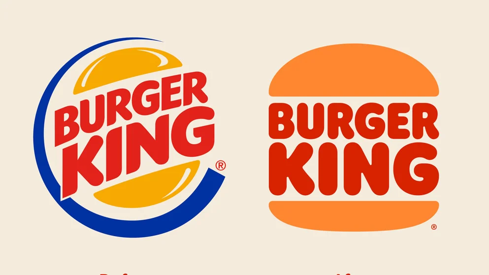
They created the previous iteration of their logo back in 1999. At the time, it was breathing new energy into the brand. The design flourishes gave the identity a brightness and depth that felt more dynamic and of the moment.
Two decades later though, aesthetics have shifted again. Their new logo mark aims to capture the times with:
- A return to a flat, minimalist design that’s grown again in popularity
- Classic colors that honor their history and past identity while still feeling vibrant
- A reflection of the brand’s current focus on simple, real ingredients in their food
The result is an identity that embraces a clean, classic aesthetic that, while inspired from the past, feels like the right style for today.
Questions to ask when a change of the times drives your identity redesign:
- How have design trends shifted since your last logo design?
- What about your style now feels dated?
- Does your color palette stand out (good or bad) in the competitive landscape?
- Do the graphic and word elements tell a relevant story for today?
3. Your Company’s Size Has Changed
As a brand grows, the number of channels it expresses itself through grows, too. In the early days, your brand identity may only show up in one or two places. A website, a business card, maybe an avatar on social media.
It’s fairly easy to manage brand assets. And if your logo doesn’t look perfect in each use, it’s not a big deal.
But over time, that becomes a problem.
Suddenly you have to coordinate ad campaigns, video spots, emails, and physical products. And you have a team of people who all need to use your brand’s identity in the right way for each medium.
Without that consistency, the association you’re working to build with customers across all your marketing becomes diluted.
In this case, your focus should be on the function of your identity. An example of this was Slack’s identity refresh from a couple of years ago.
Back in 2019, Slack had gone from an unknown startup to the fastest-growing business app in history, all within 5 years. With that incredible success came some challenges with their brand identity.
When they started up, they created a colorful play on the hash character as their logo. It was bright and had a unique feel due to the crosshatch of colors. Unfortunately, that design created problems as they scaled.
In addition to the mark’s odd angle, the use of overlapping colors and opacity created a palette of 11 colors. This meant it was hard to maintain consistent use across every environment.
As popular as it was aesthetically, functionally speaking, it wasn’t serving the brand’s needs.
Their revised logo aimed to fit with their new company size by:
- Simplifying the structure of the mark
- Reducing the palette down to four primary colors
- Creating a design that worked consistently across all mediums and backgrounds
- Making it easier to identify at all scales
The result sadly stripped away some of the unique qualities of the original, but it contributed to an identity that would suit the function they needed as they continued to expand.
Questions to ask when a change of company size drives your identity redesign:
- What aspects of your identity are most problematic?
- Which mediums do you need the identity to work within?
- Does your design work in both color and black and white environments?
- Can your logo maintain visual integrity at all necessary scales?
Keep Learning: Apply Marketing Metrics and Watch Your Business Grow
Choose the Right Type of Logo Redesign for the Right Type of Change
Logo redesigns are not all created equal. If the reasons for a redesign aren’t clear going in, it could result in focusing on the wrong aspects of your identity or trying to fix something that isn’t even broken.
Look at your brand’s identity through those three lenses of change:
- Change of Strategy: Does the message of your logo need to change?
- Change of The Times: Does the style of your logo need to change?
- Change of Company Size: Does the function of your logo need to change?
And these factors aren’t mutually exclusive. Your redesign needs may touch on two or even all three of them.
What’s most important is that you’re able to tease apart the reasons and the goals for the redesign. This keeps your efforts focused, provides criteria for evaluating the results, and makes sure the new design aligns with where your brand is headed.
Learn how to build a brand from scratch with our free training series.
